Bulltown Brewing
Bulltown Brewing is a non-alcoholic brewery out of Kalona, Iowa, built for people who want a real beer without the hangover. Fried Design Company built the brand from the ground up, strategy, identity, and packaging, around one idea: bold flavor, no bull. The result is an NA beer that looks like it belongs on the jobsite, not the yoga mat.
Services
Awards
Gold American Advertising Award
Share this page
Insight
Non-alcoholic beer has an image problem, and it's not about taste anymore. The category figured out how to make NA beer taste good. What it hasn't figured out is who it's for. Almost every non-alc brand points at the same customer: the wellness crowd, the marathon runner, the seltzer drinker who wants a label that signals clean living. That leaves out the person who just wants a cold beer after a long day and would rather skip the hangover. Bulltown is built for exactly that person, the jobsite, the garage, the backyard grill, not the yoga mat. The brand had to make non-alcoholic beer feel like it belonged in a working person's hand, in a category that keeps designing for someone else. Bulltown had one more thing going for it, and it was sitting right in the name. Kalona, Iowa has been nicknamed "Bulltown" since 1879, after a prize bull named Kalona. The founders spent three years formulating the beer before launch. The brand needed to live up to that patience and that heritage, and stake out territory nobody else in NA was claiming.
Solution
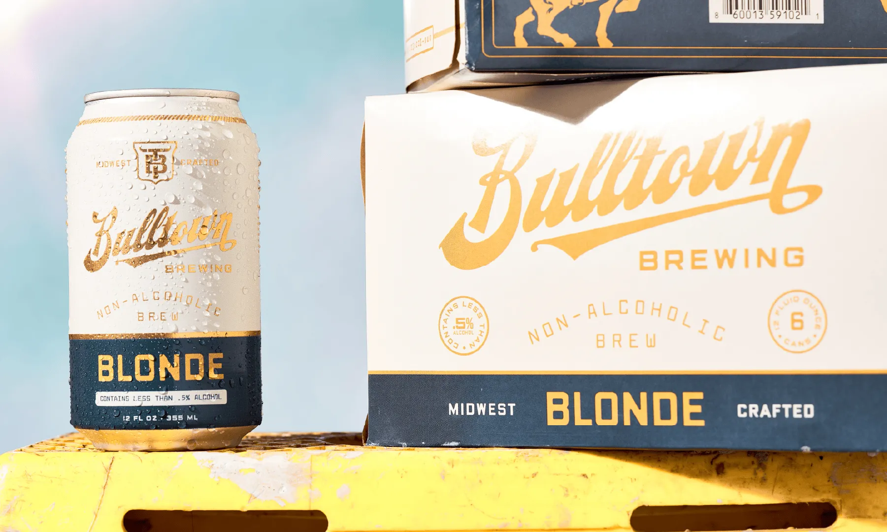
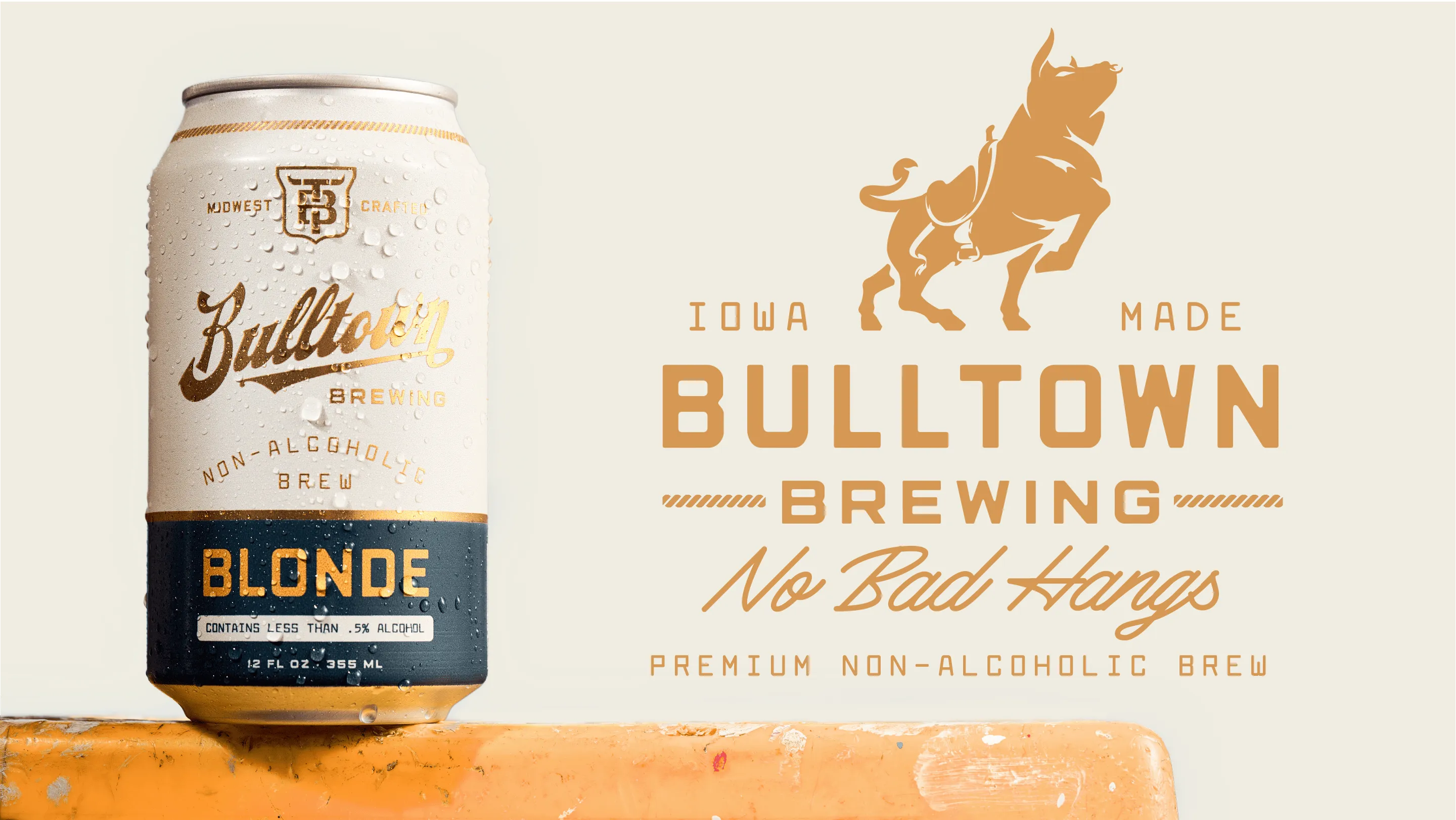
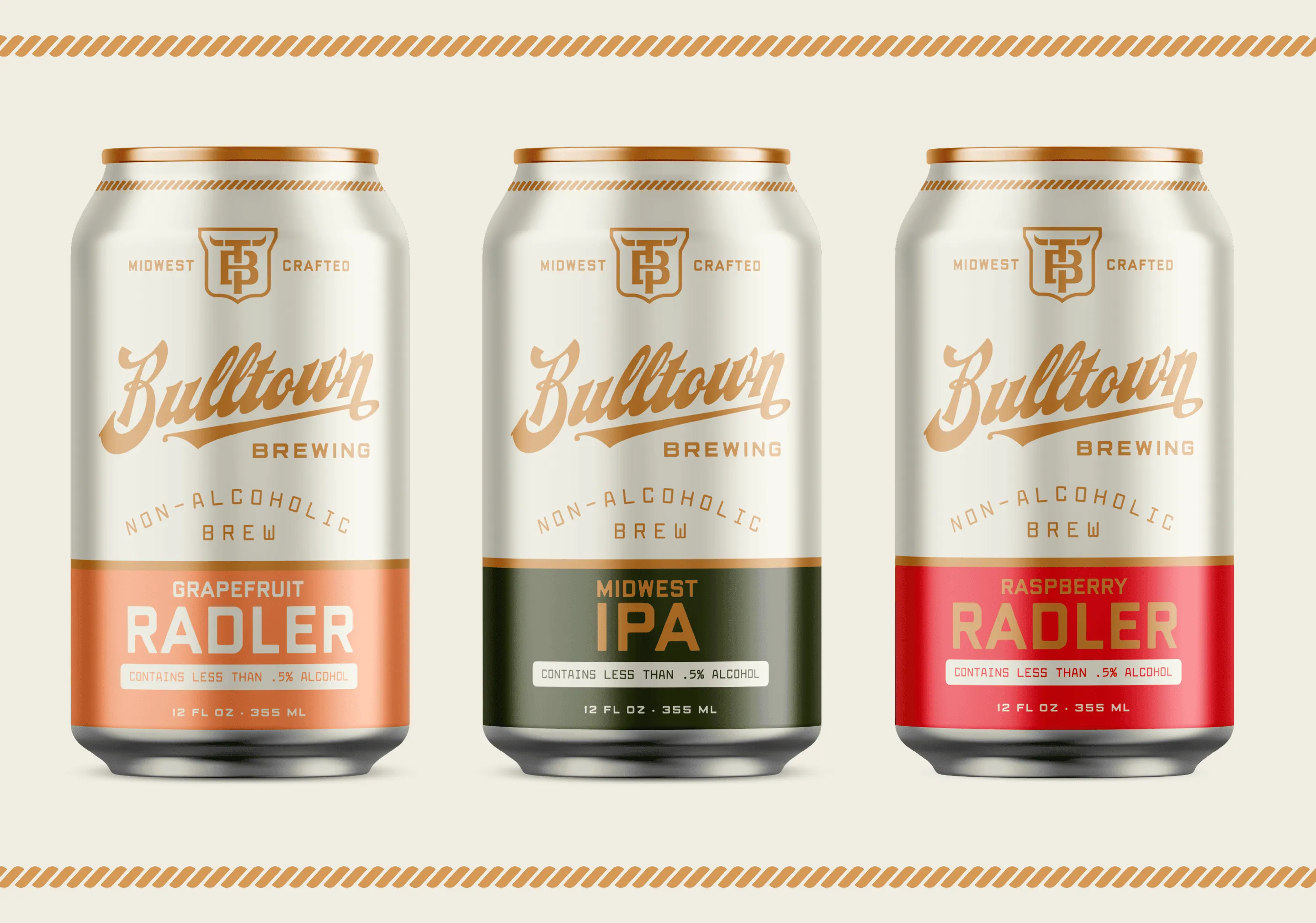
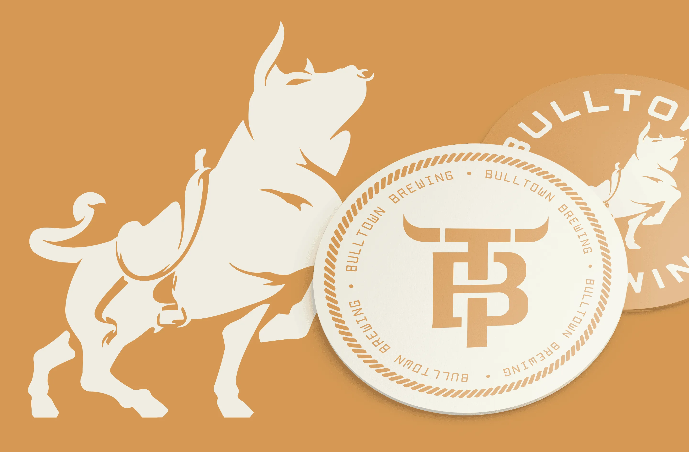
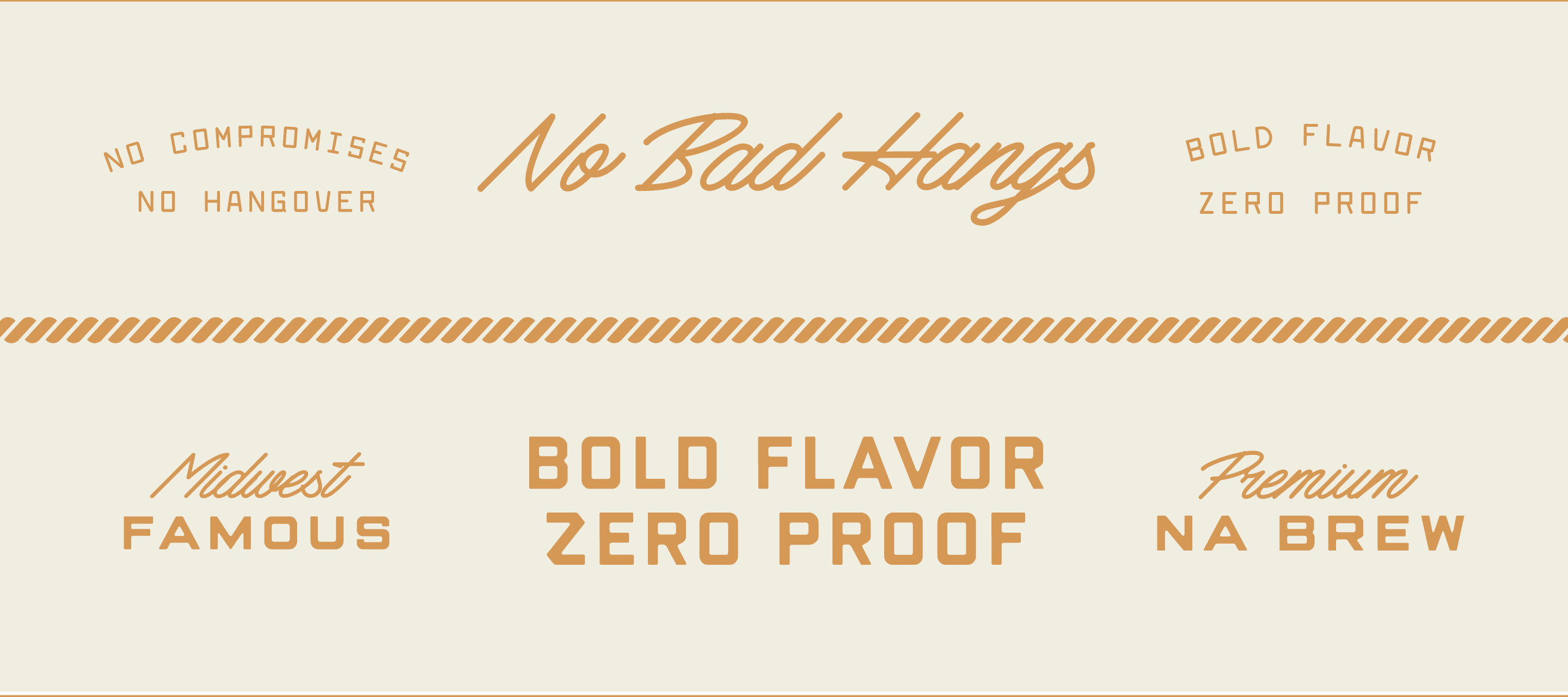
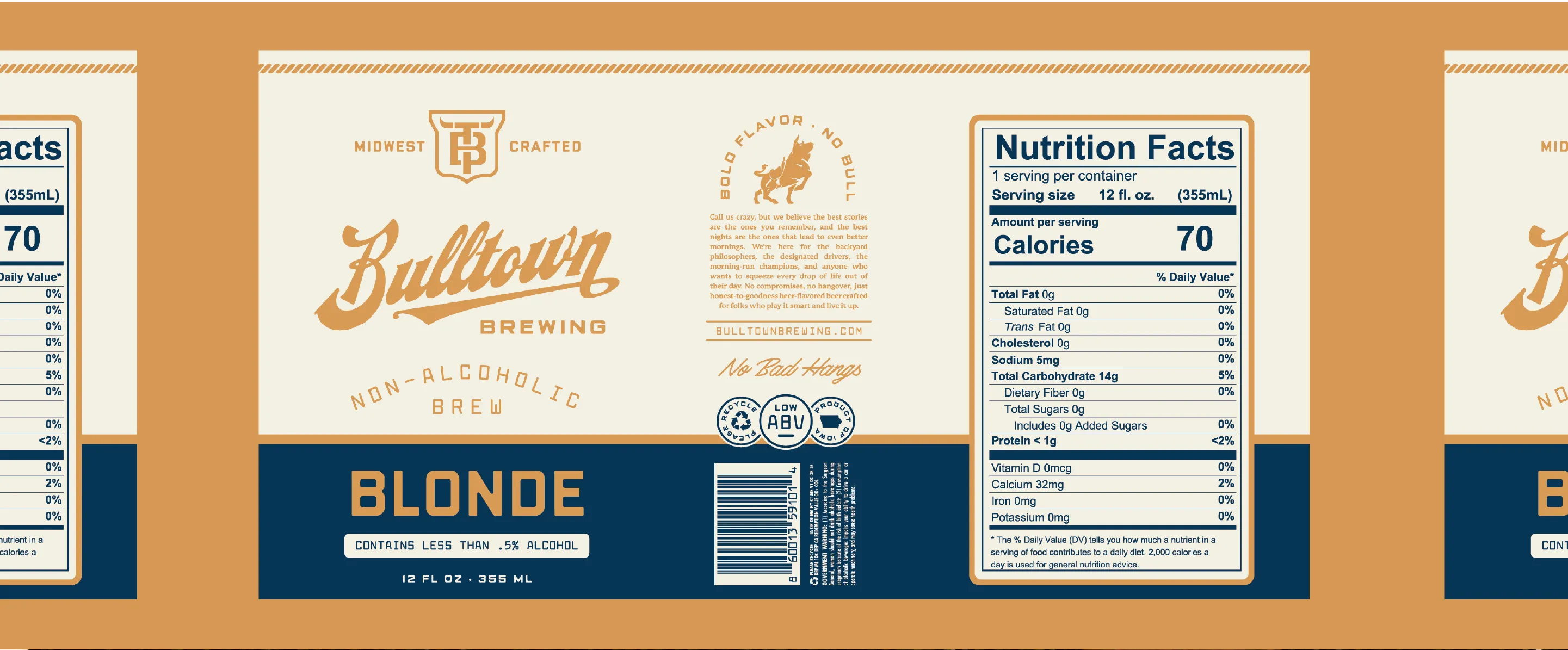
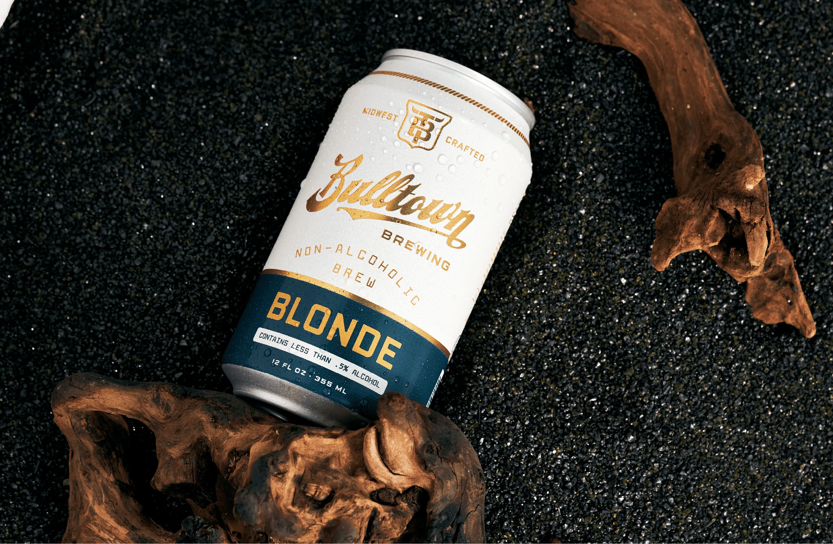
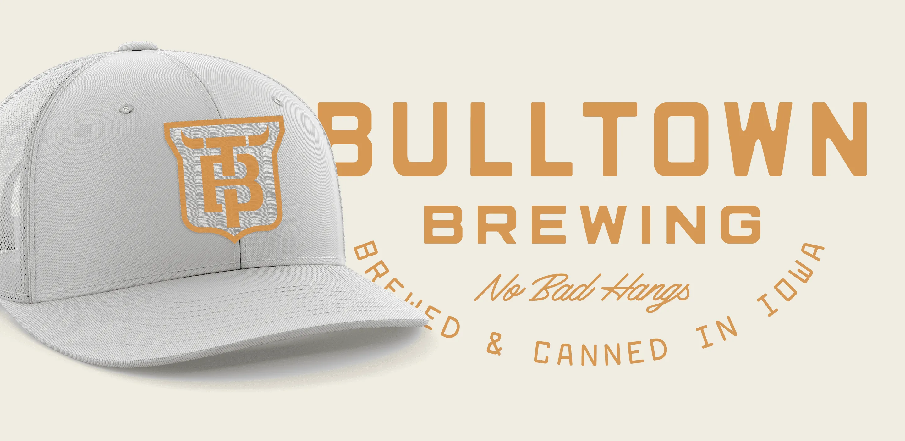
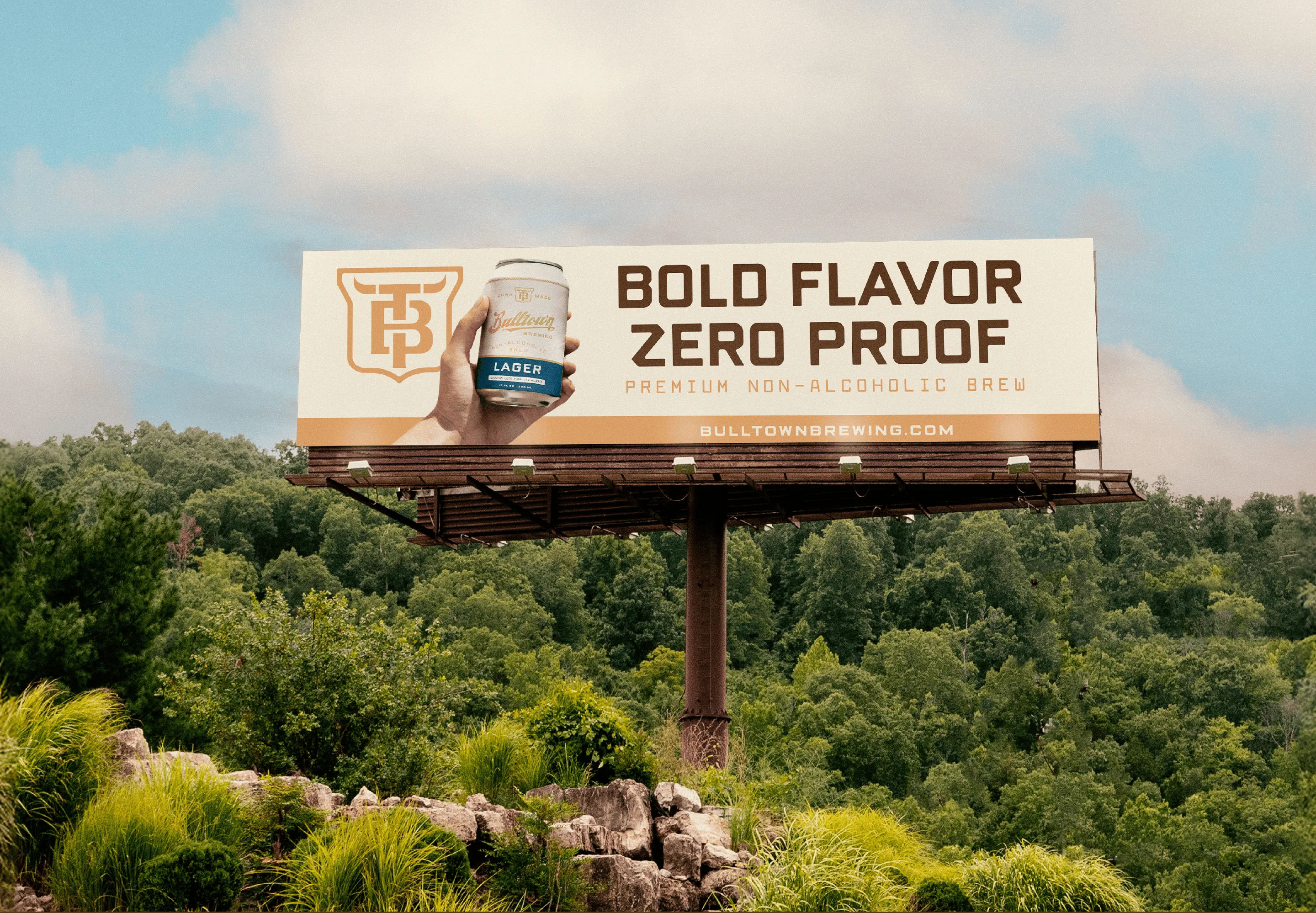
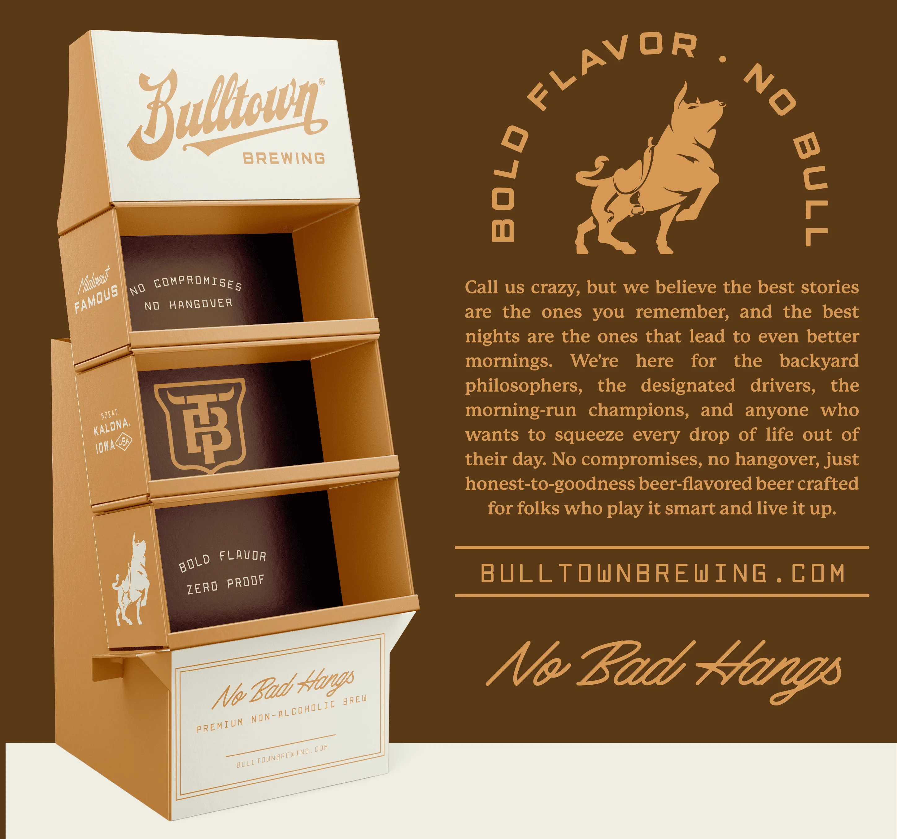
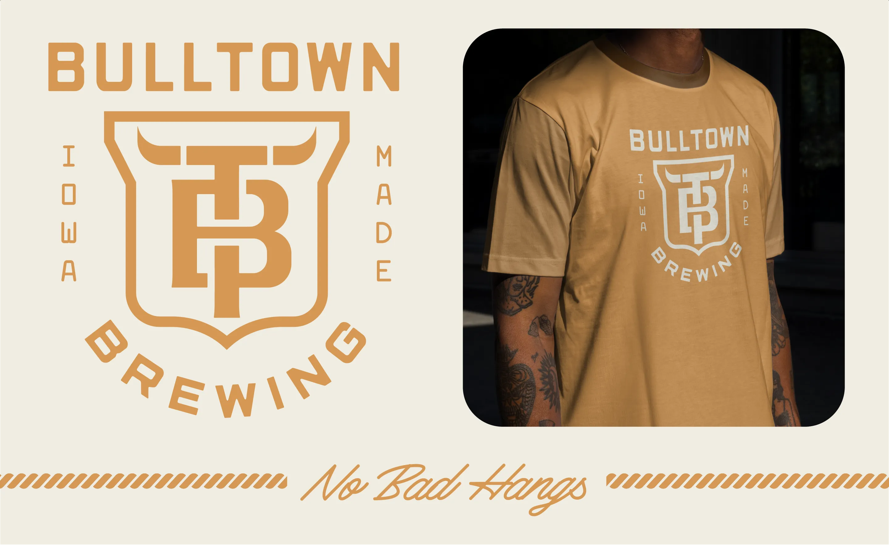
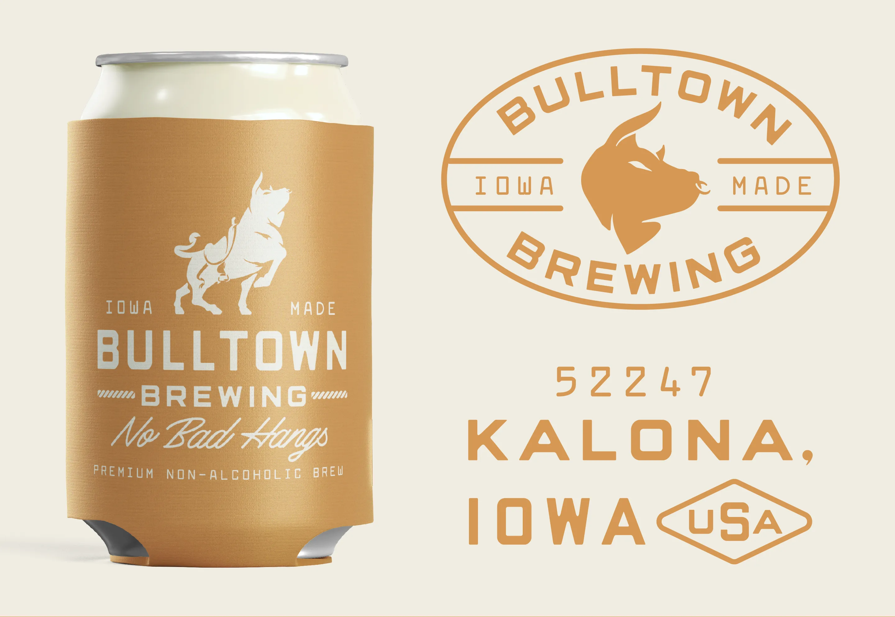
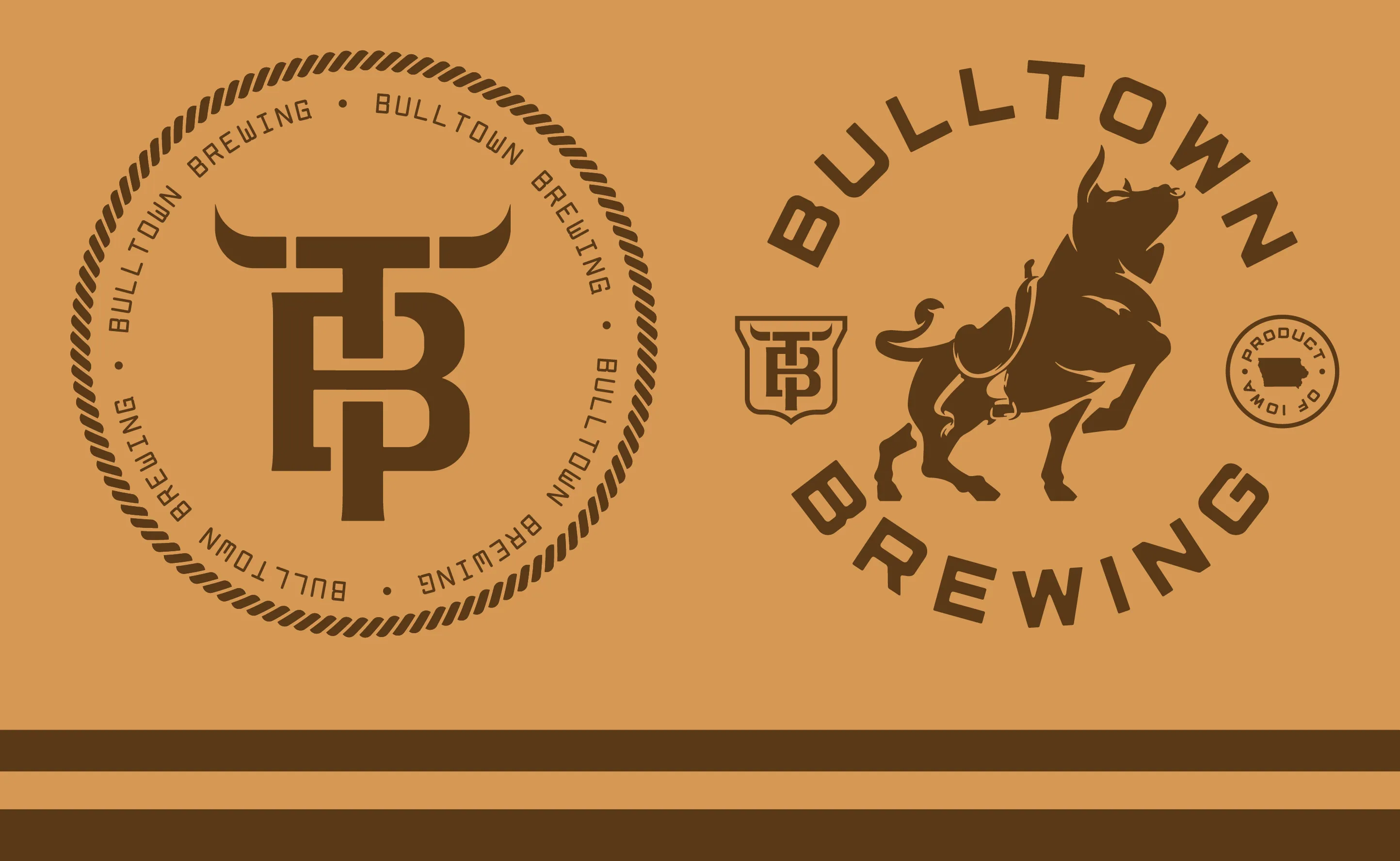
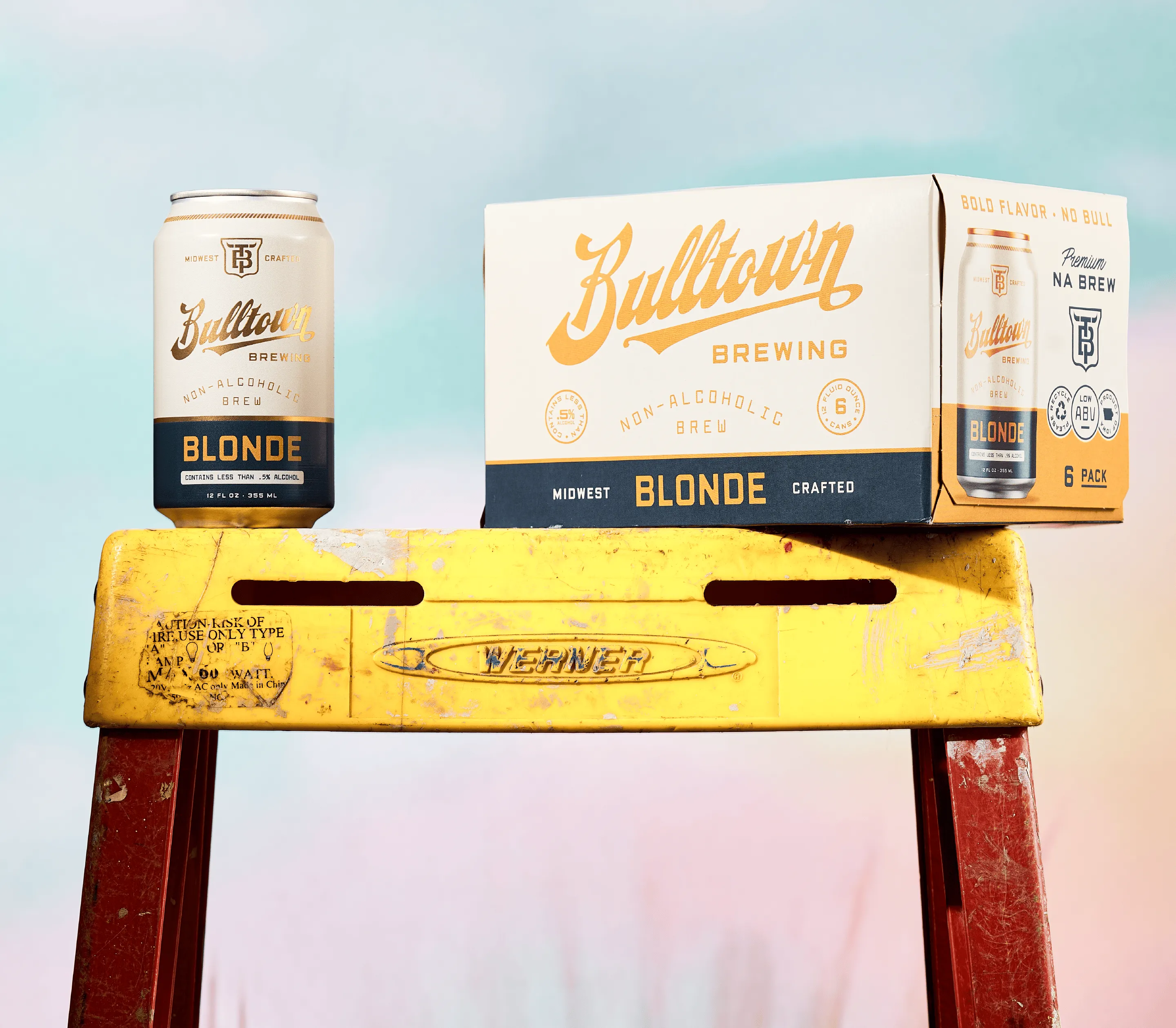
We built Bulltown from the idea out, and the idea was simple enough to put on a wall: bold flavor, no bull. Real beer for people who want the ritual, the flavor, and the camaraderie without the hangover, said with the confidence of a brand that isn't apologizing for being non-alcoholic. The identity is built on the town's own bull. A bucking bull mascot with real attitude, a TB monogram where the horns come off the crossbar, a family of badges and lockups, all pulled from Iowa and worked in gold, cream, and dark brown that feels more corner-tavern than health-food aisle. The script logo has the swagger of a classic beer brand, because that's the point: this is beer-flavored beer, and it should look like it. Nothing about the system reads as a compromise. Then we built it to sell. A full packaging system across the whole lineup, Blonde, IPA, Lager, and the Grapefruit and Raspberry Radlers, color-coded so the range reads as one family on the shelf while each beer stands on its own. Six-pack cartons, retail floor displays, out-of-home, hats, tees, koozies, and a voice that carries all the way through, from "No Bad Hangs" to "Midwest Famous" to the copy on the back of every can. We gave a three-years-in-the-making brand everything it needed to walk into a cooler and look like it had been there for decades. The result is a non-alcoholic beer with none of the apology. Bold flavor, no bull, brewed and canned in Iowa, built for the people the category forgot.
Explore more work