First State Bank
First State Bank spent 80 years outgrowing its own name. Founded in tiny Purdy, Missouri, the bank had quietly become a regional institution while its name still pointed at one small town. Fried Design Company led the full rebrand, strategy through launch, renaming it First State Bank of the Ozarks and building a complete identity around the region it actually serves.
Share this page
Insight
First State Bank had a name problem most businesses would kill for. It had simply gotten too big for it. Founded in 1944 in Purdy, a small Southwest Missouri town, the bank spent eight decades growing, absorbing a neighboring bank, opening branches across the region, until it was serving families, businesses, and farms in towns all over the Ozarks under a name that still said "of Purdy." That name was a liability in two directions at once. It boxed a regional bank into a single small town, and it undersold everywhere else the bank had earned a foothold. But the fix carried real risk. Eighty years of trust and heritage live in that name, and small-town banks win precisely because people believe they're local and they're theirs. Rename it wrong and you sound like you got bought by a conglomerate. The job was to grow the name to match the map without losing an ounce of the hometown trust that built the place.
Solution
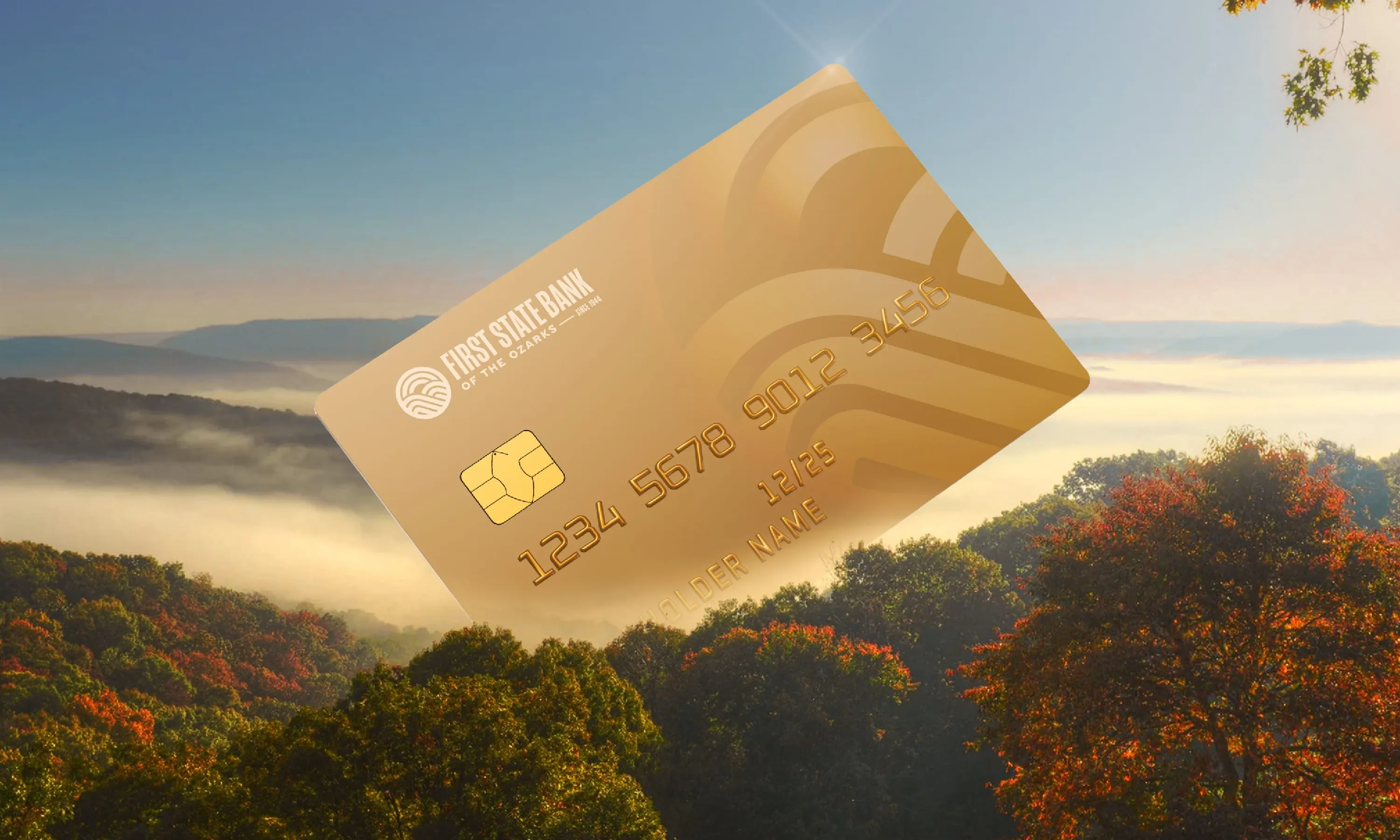
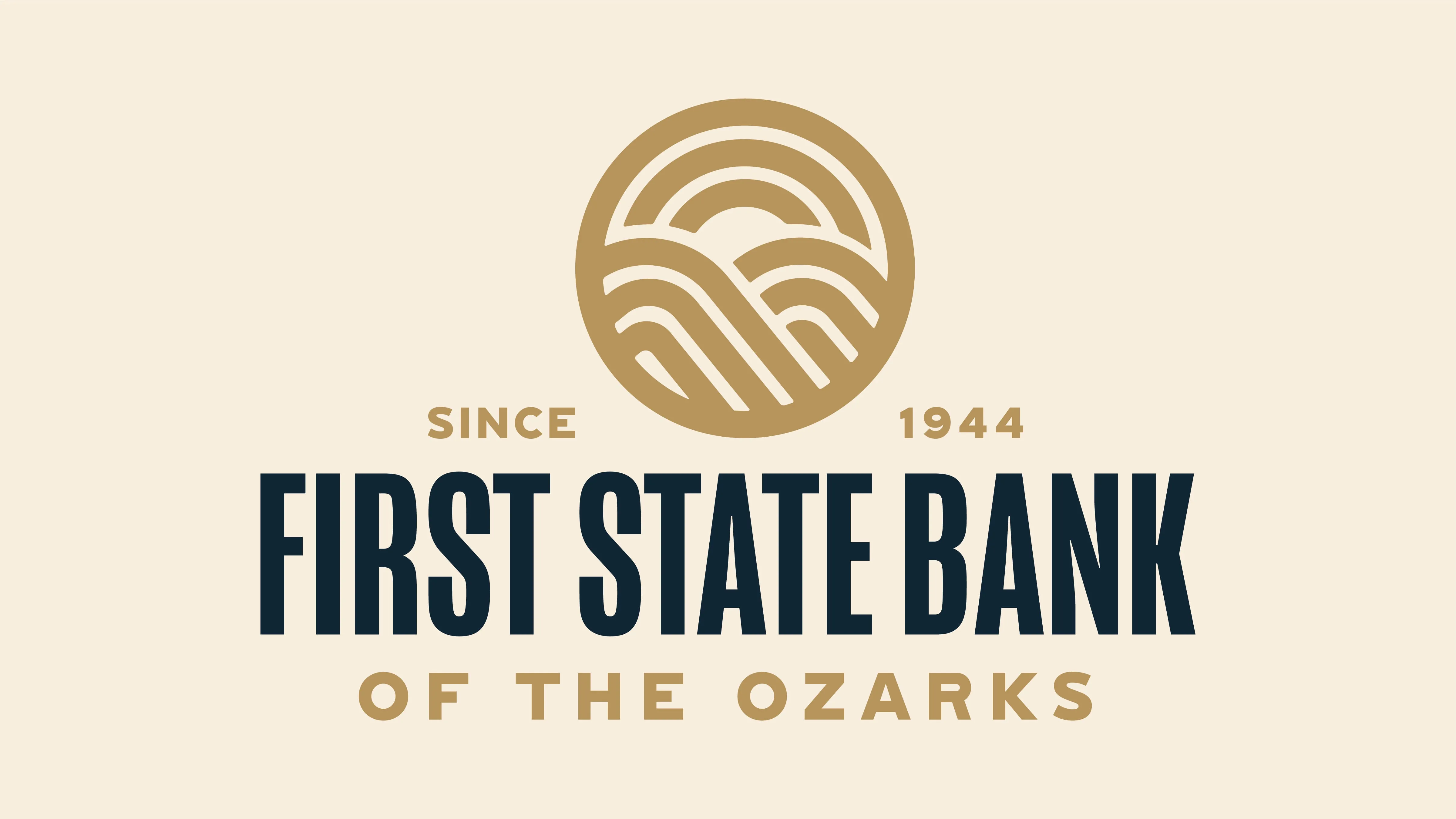
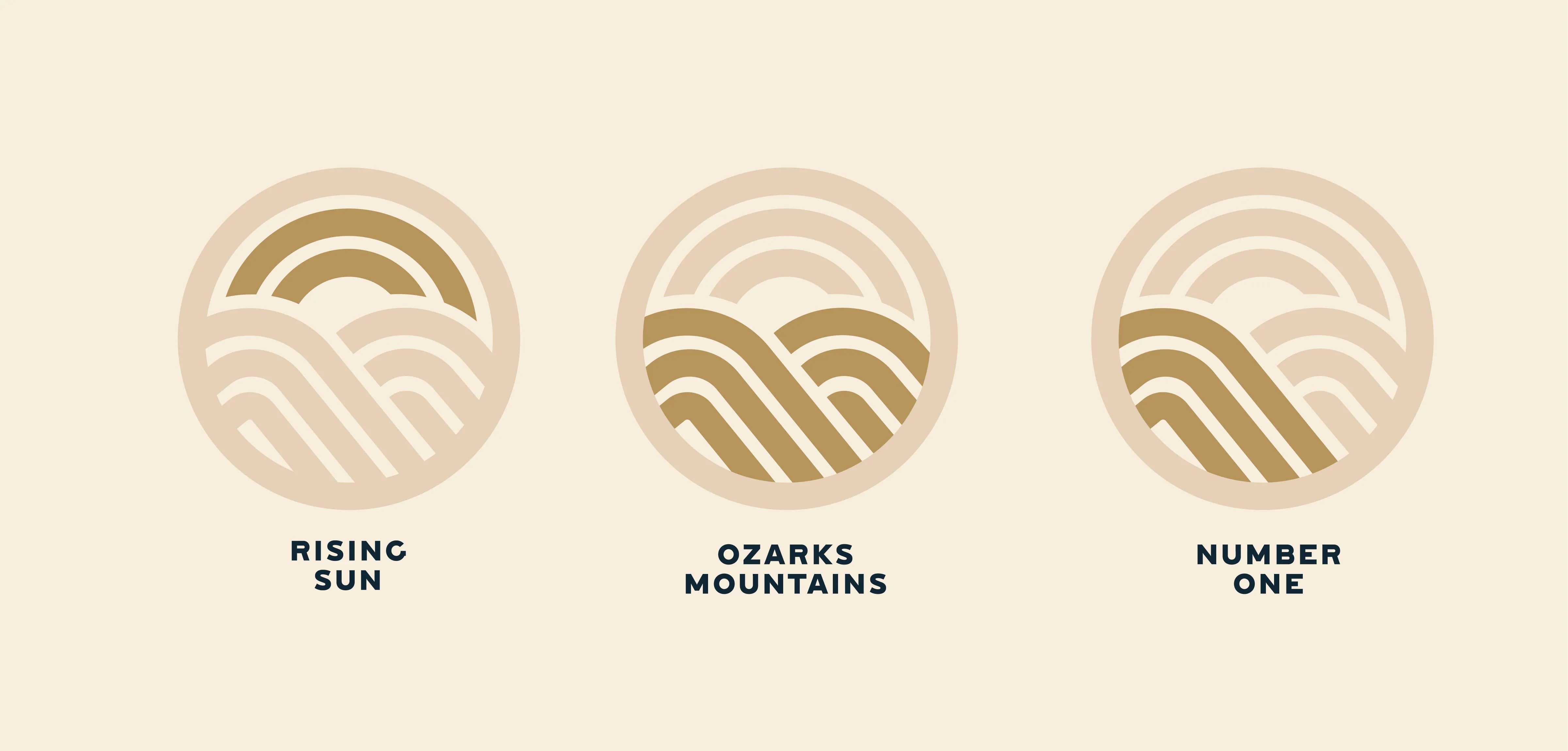
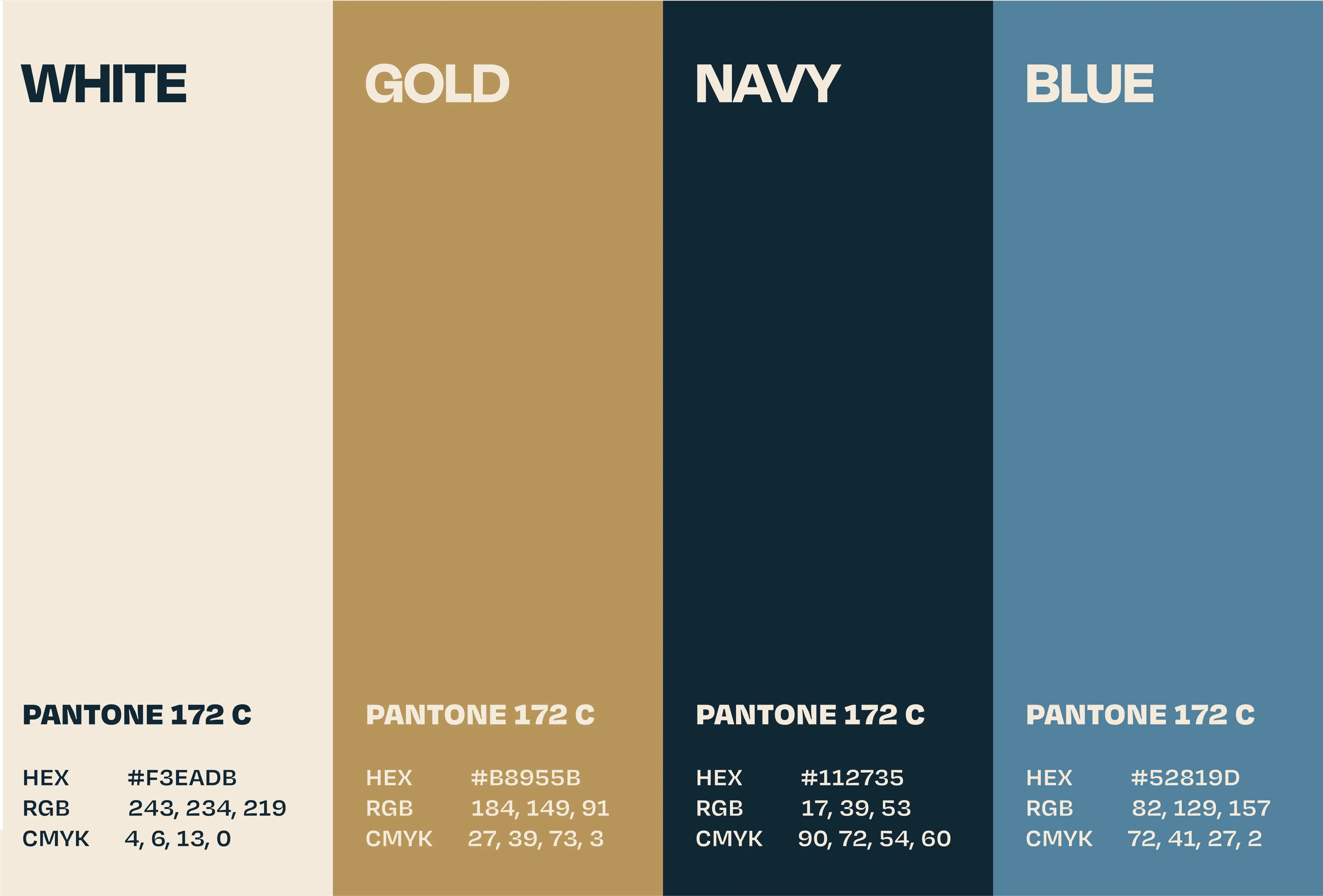
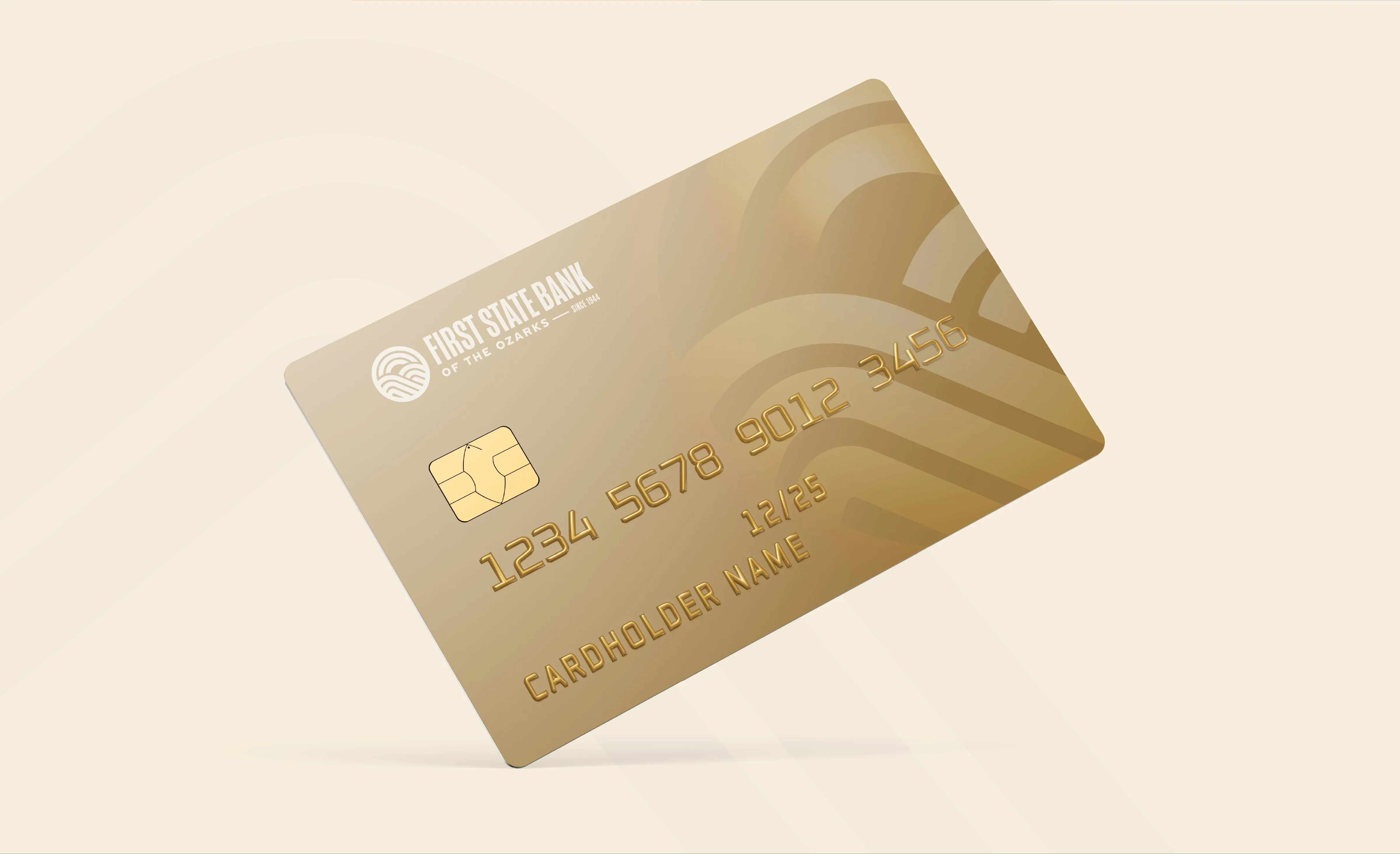
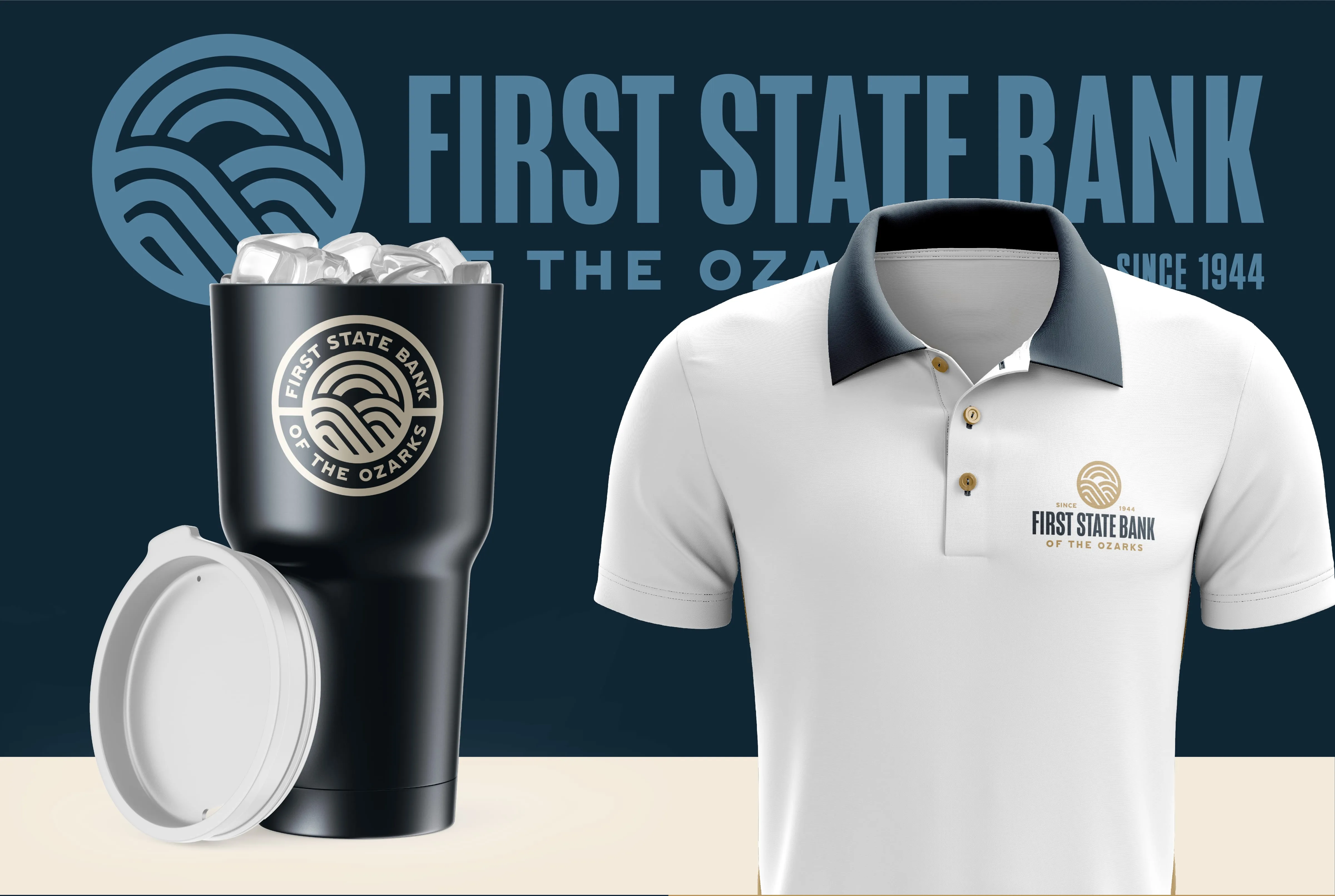
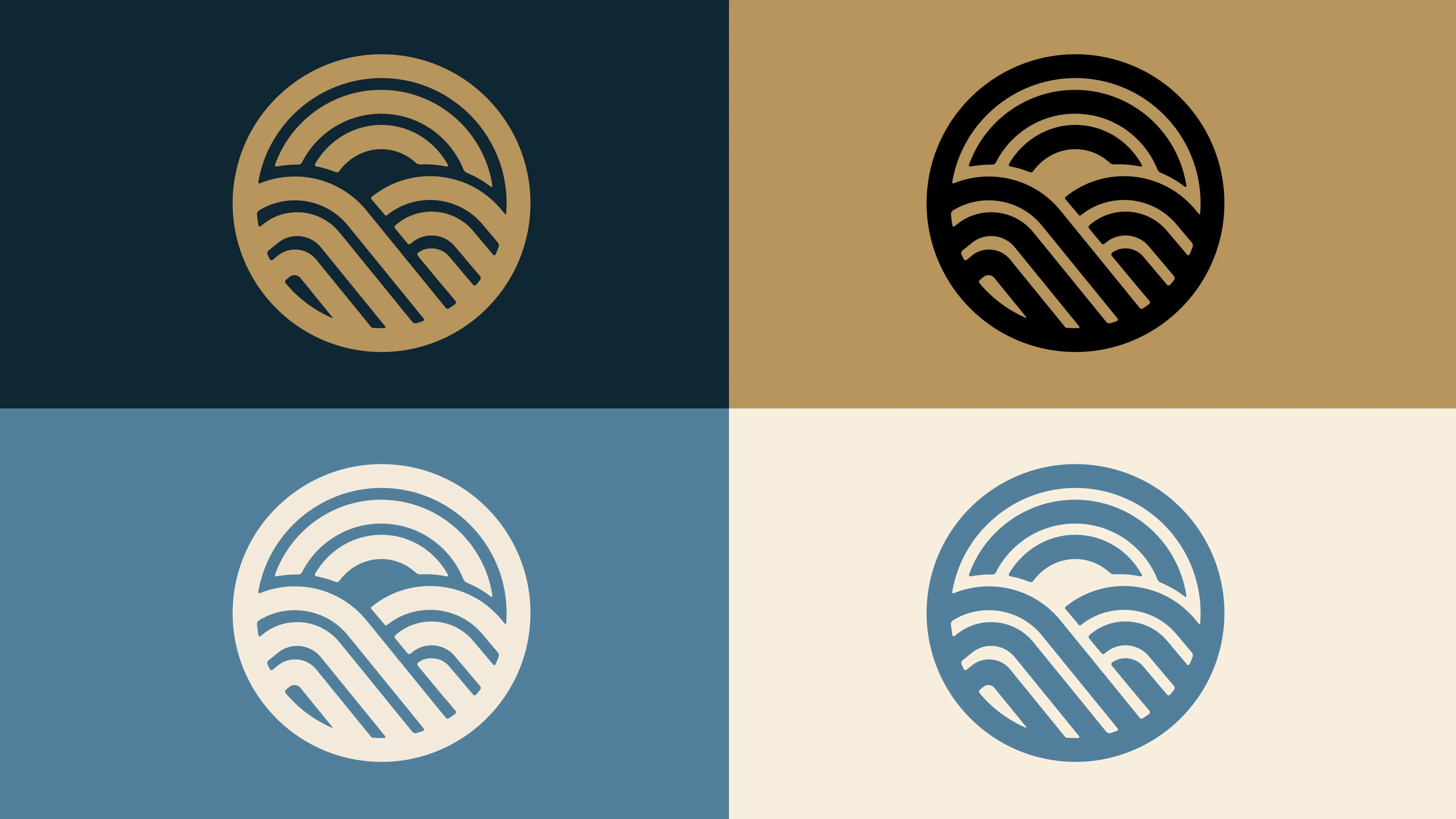
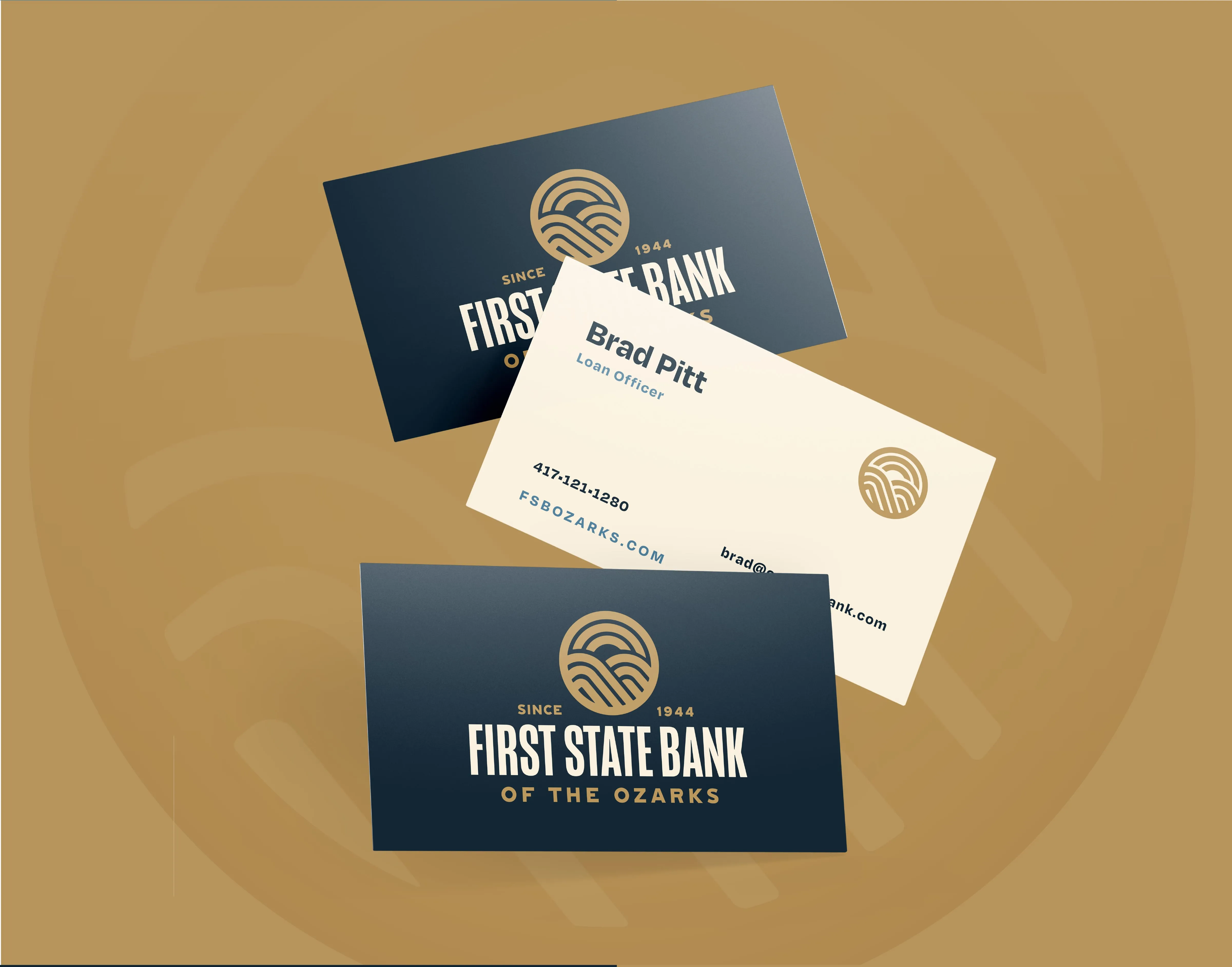
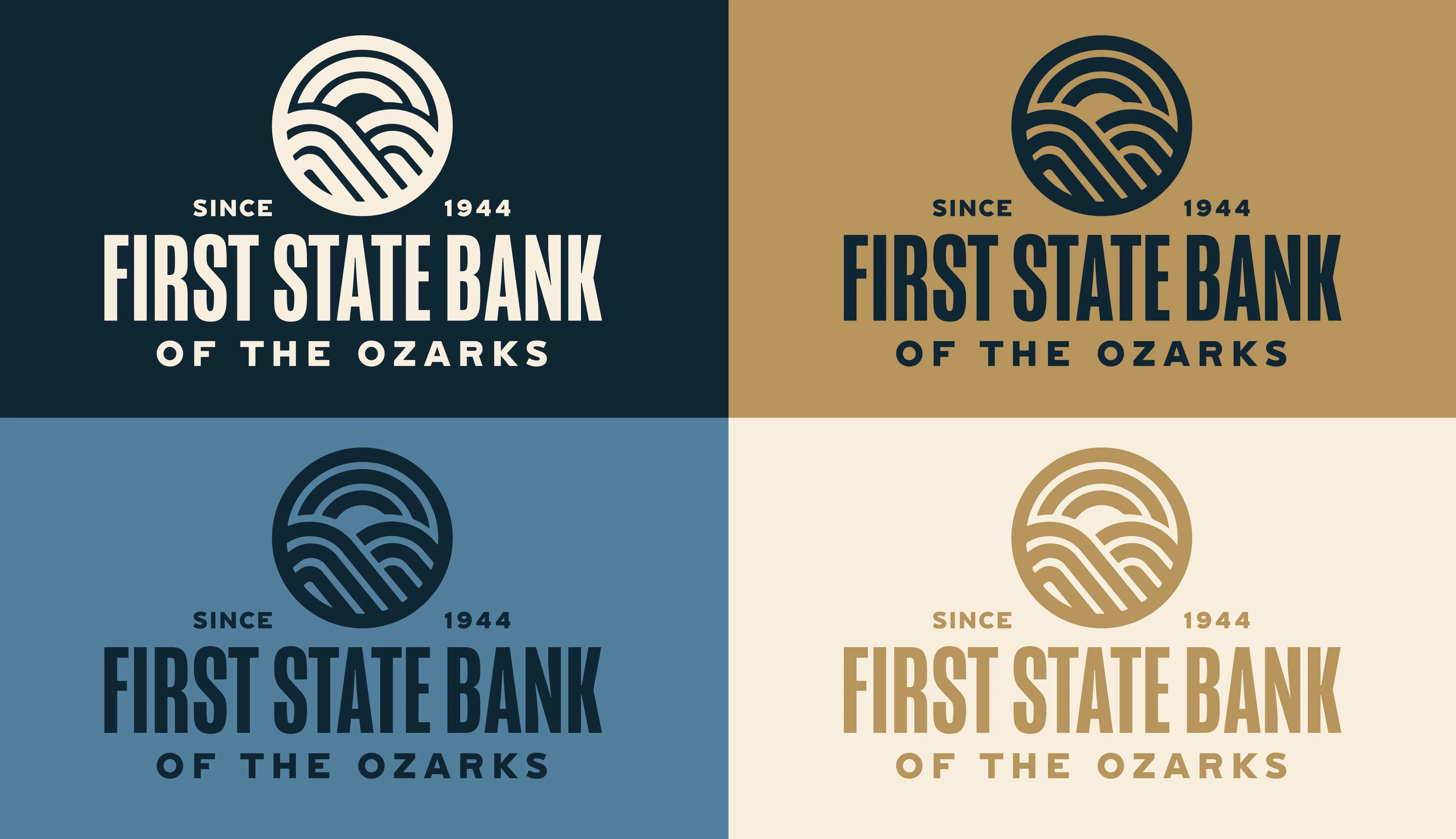
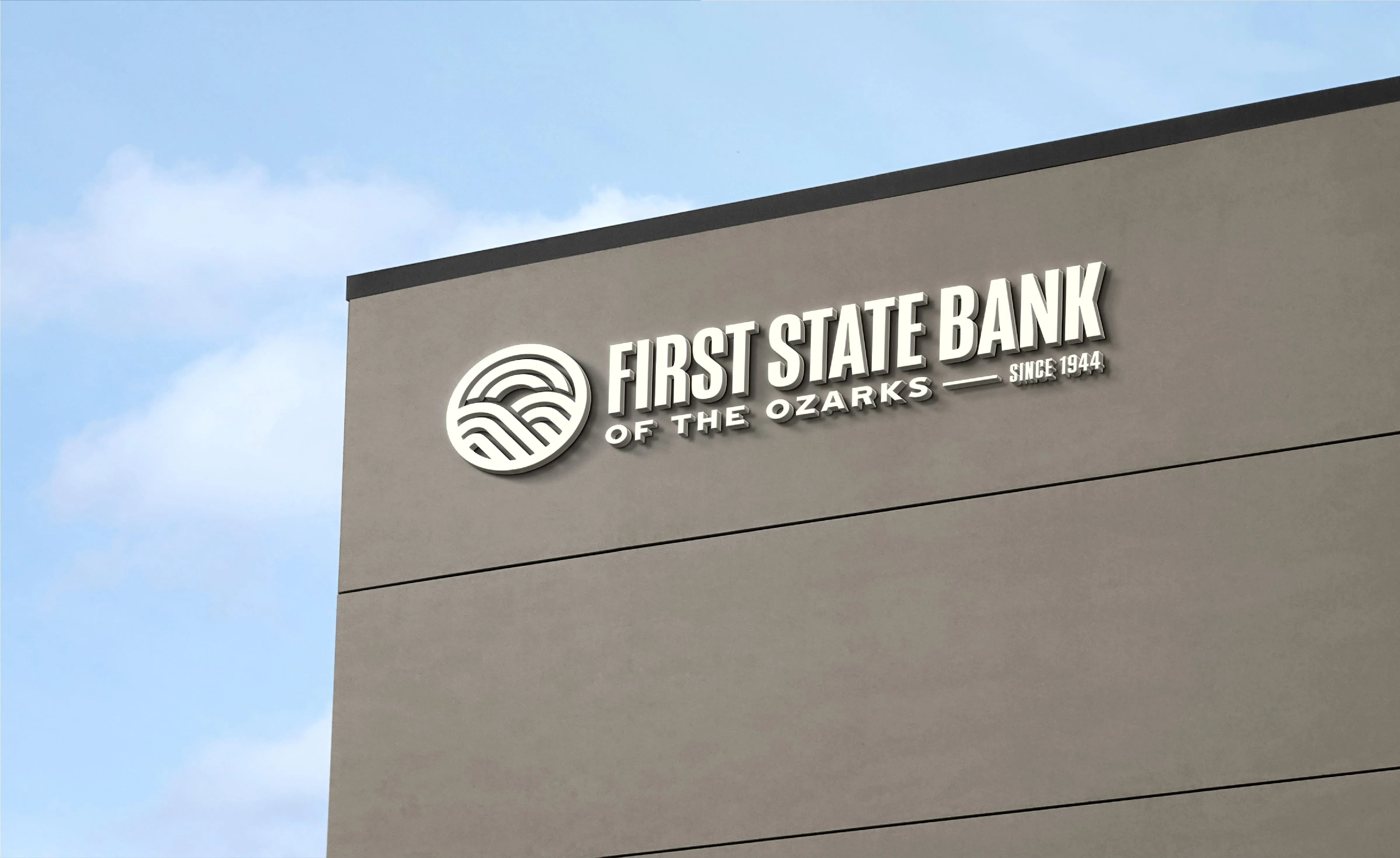
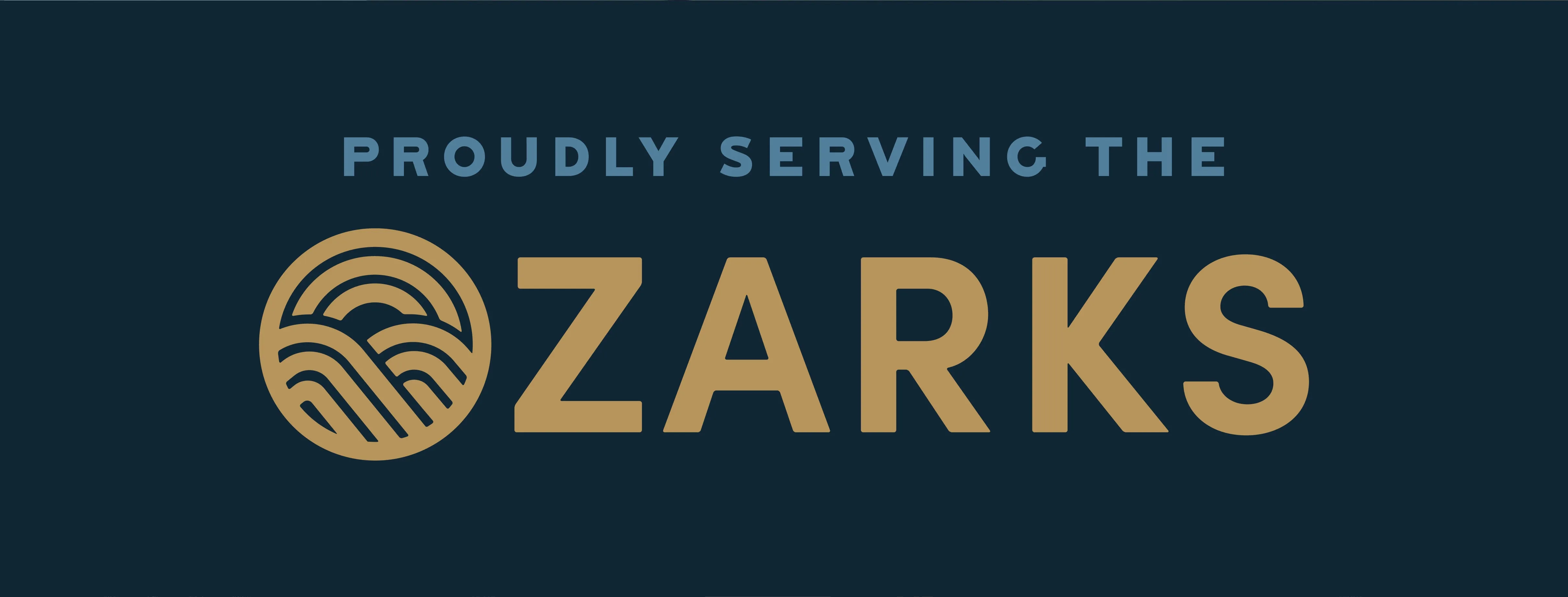
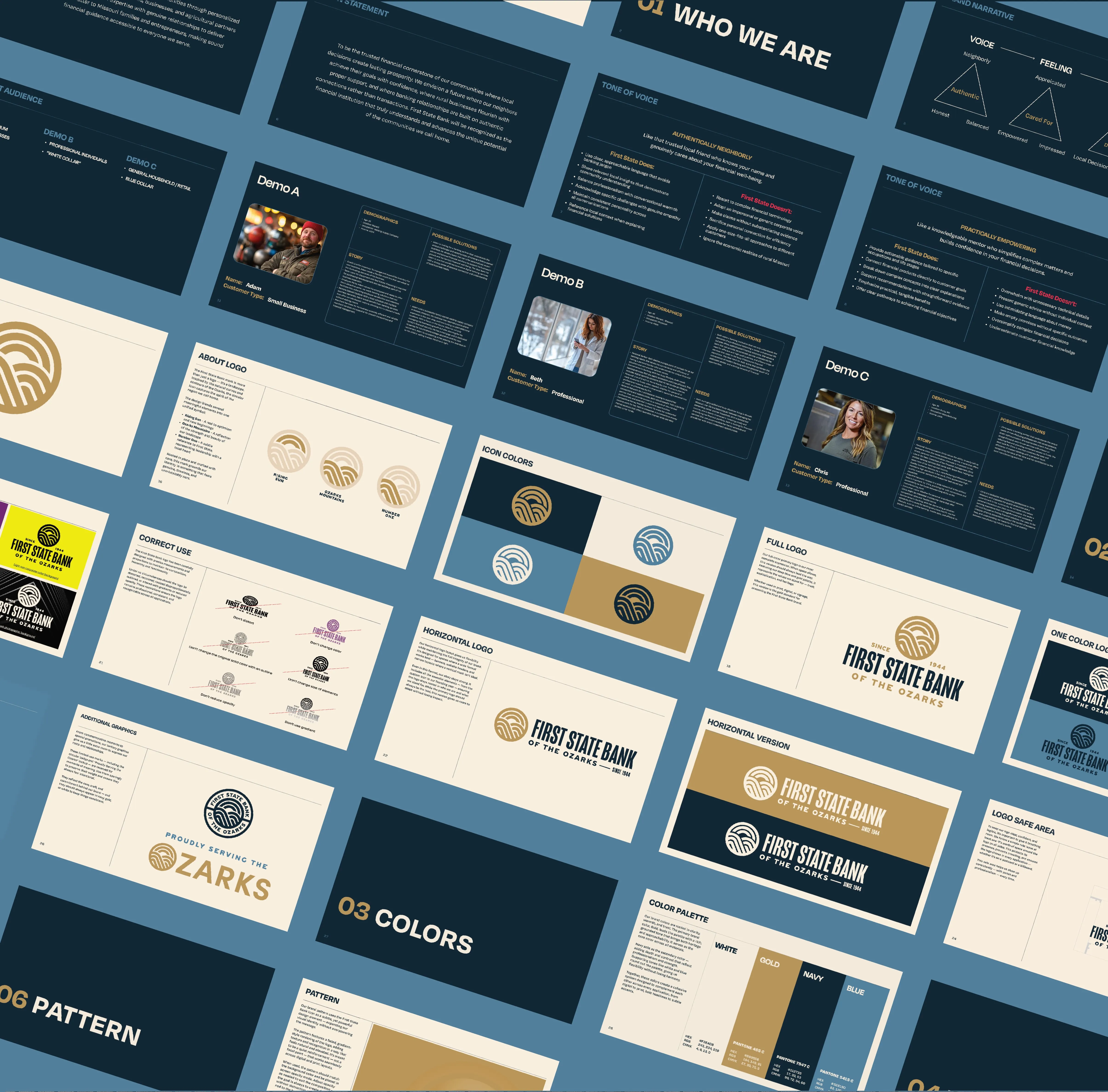
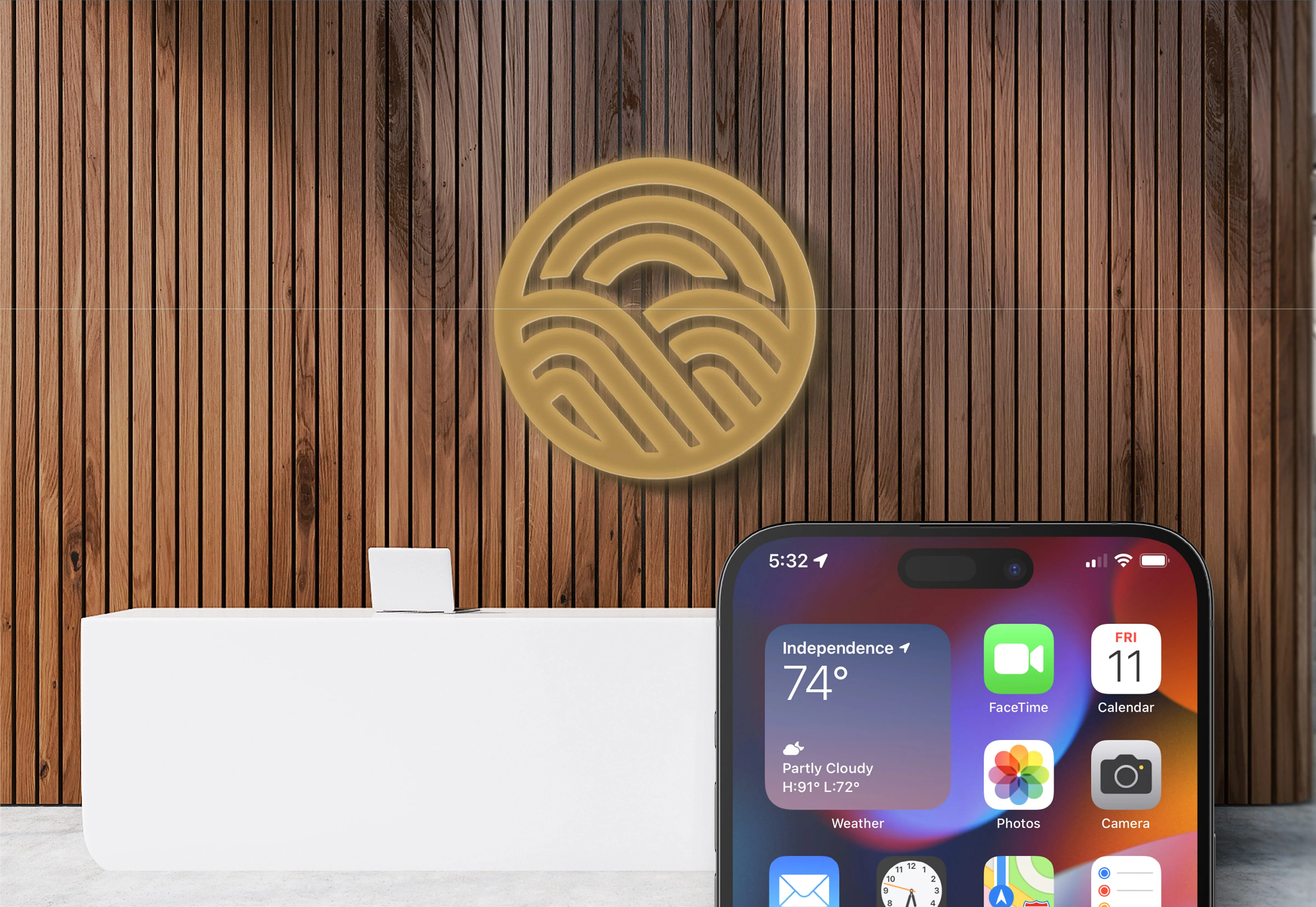
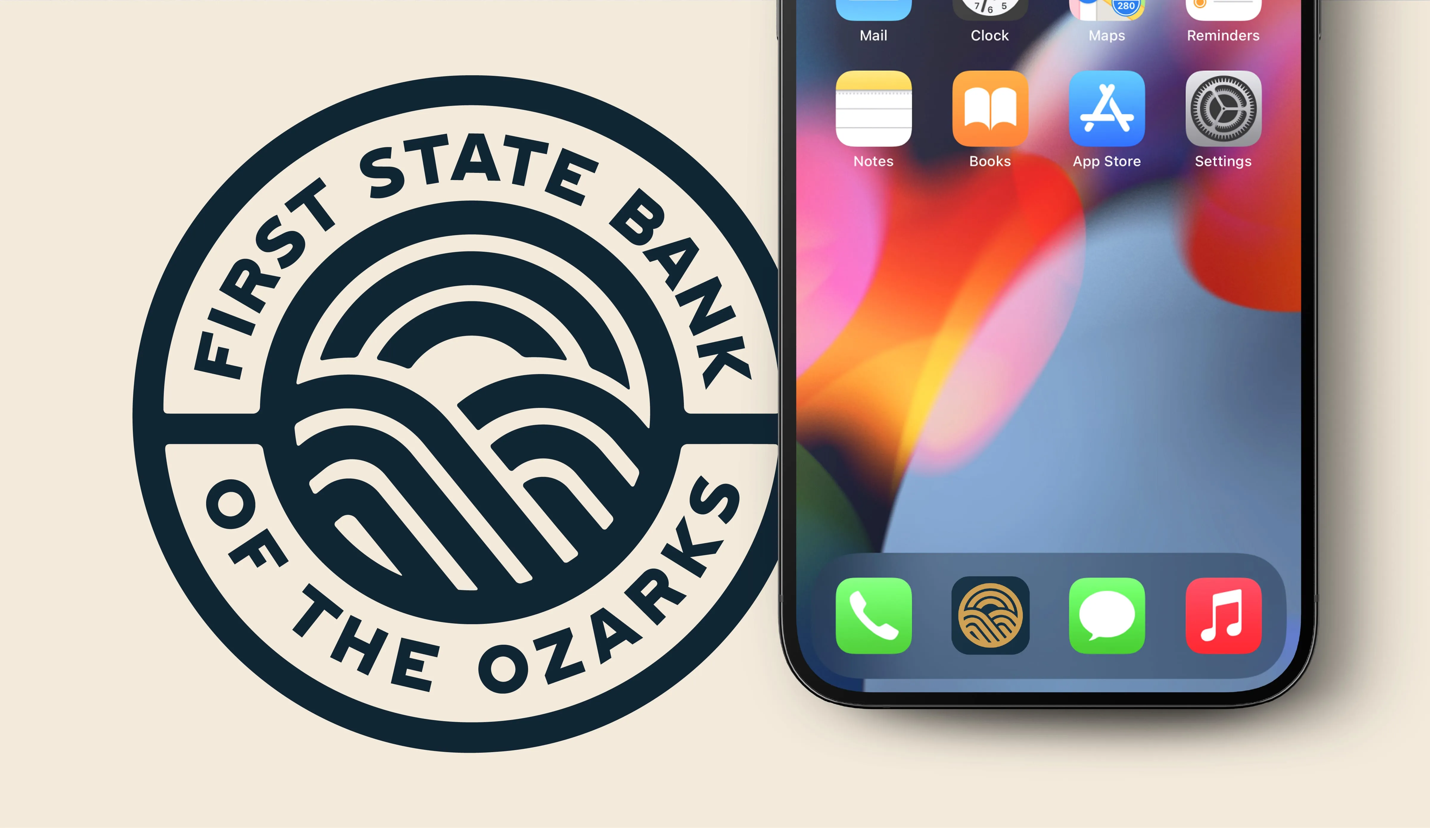
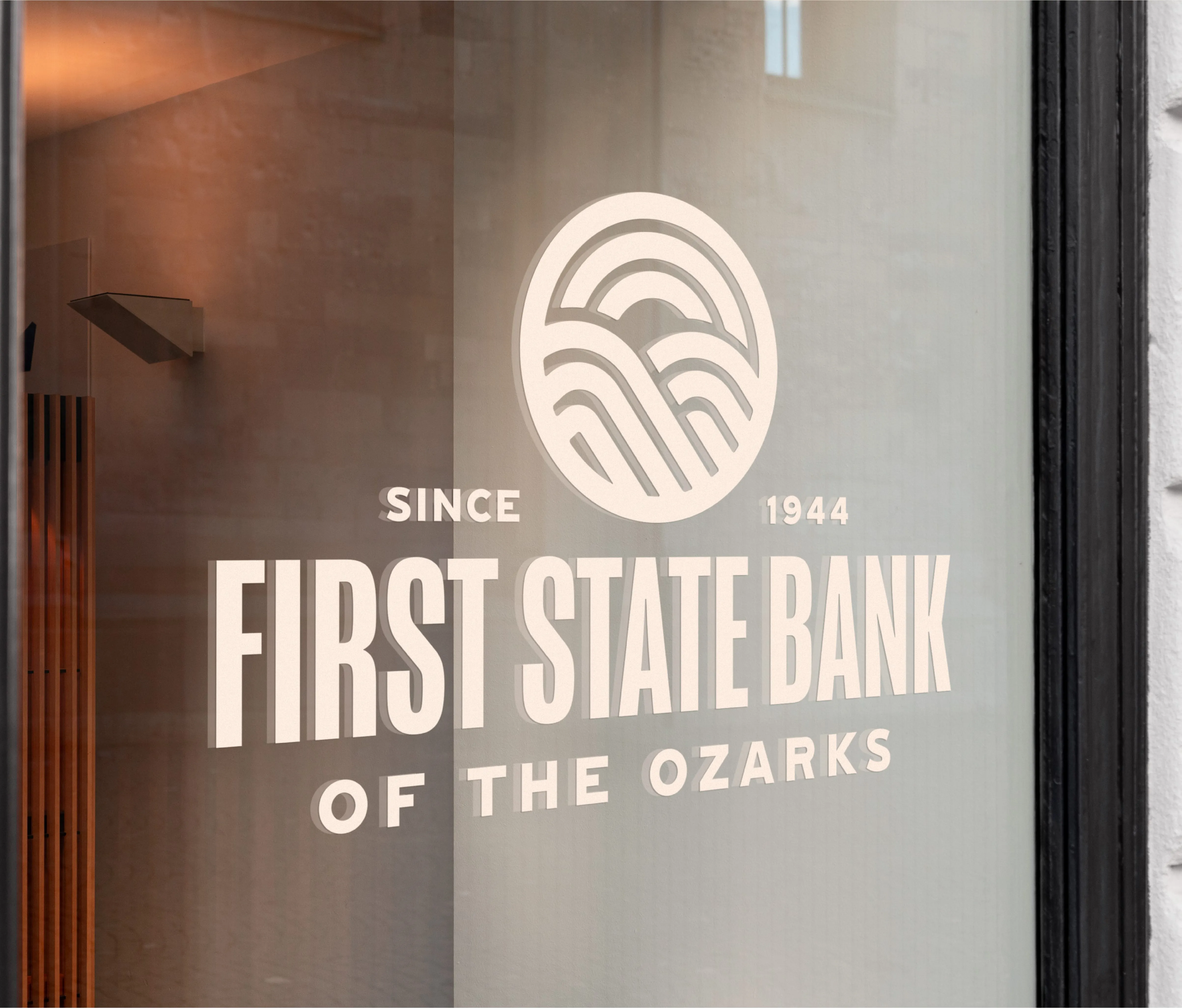
We led the whole thing, strategy through launch. It started by defining who the bank actually serves and how it should sound, the neighborly, plain-spoken, genuinely-local voice of a bank that knows your name, captured in a full brand narrative, tone of voice, and audience work before a single logo was drawn. The answer to the name was to keep the heritage and grow the geography: First State Bank of the Ozarks. Same bank, same 1944 roots, now claiming the whole region it serves instead of one town on the county line. From there we built the mark to carry the idea. One circular symbol that reads three ways at once: a rising sun for optimism and new beginnings, the rolling hills of the Ozarks for the region, and, held in the center, the number one, for First. Heritage, place, and name in a single mark. Then we built it out completely. A full color system in navy, gold, and Ozarks blue, custom typography, a flexible logo family from full lockup to badge to app icon, and a pattern language drawn from the rolling-hills motif. We took it all the way through application: debit and credit cards, building and window signage, business cards, branch environments, merch, and the digital front door, so a bank that had outgrown its name walked into its new one looking like it had been there since 1944. The launch line says the whole strategy out loud: Proudly Serving the Ozarks.
Explore more work