Kaleidoscope
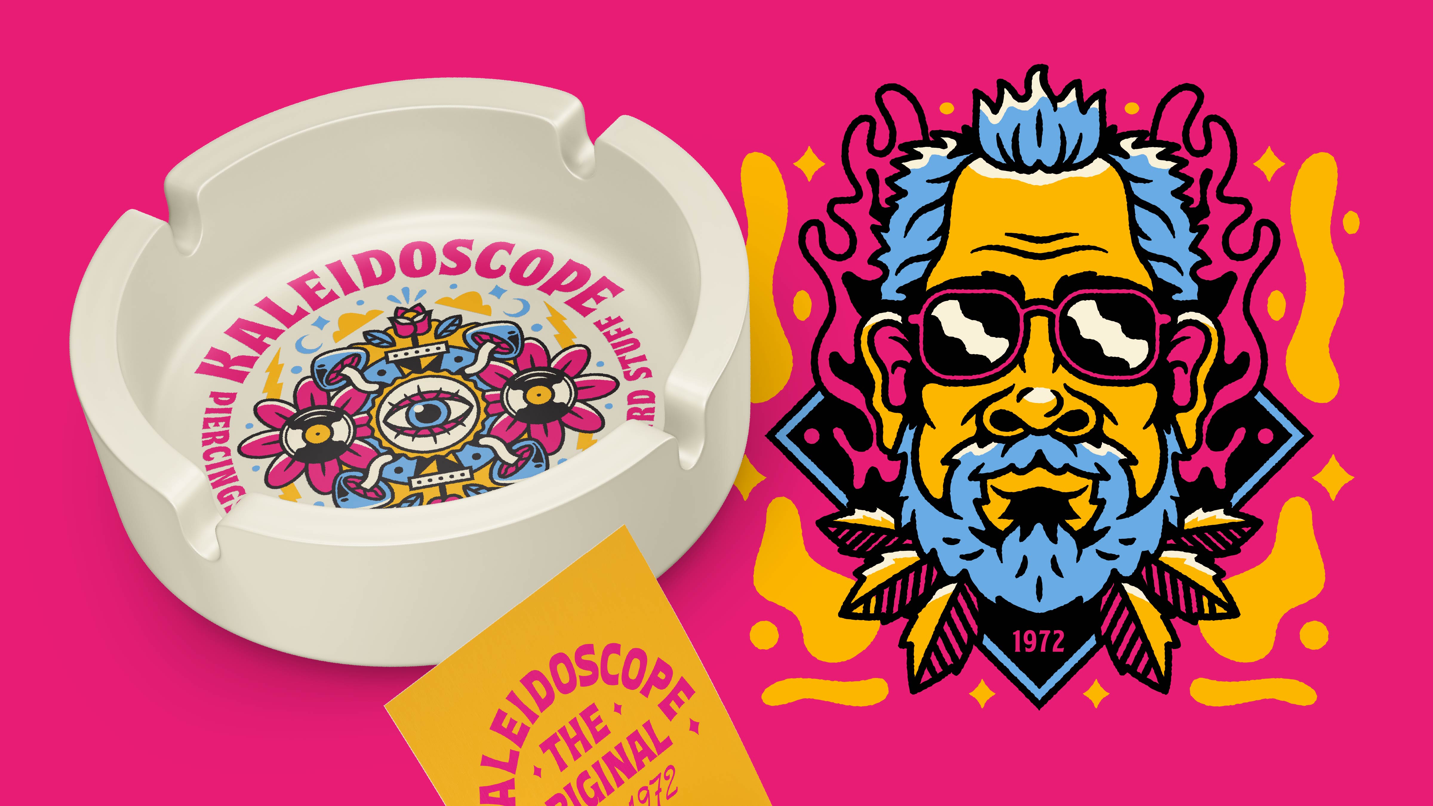
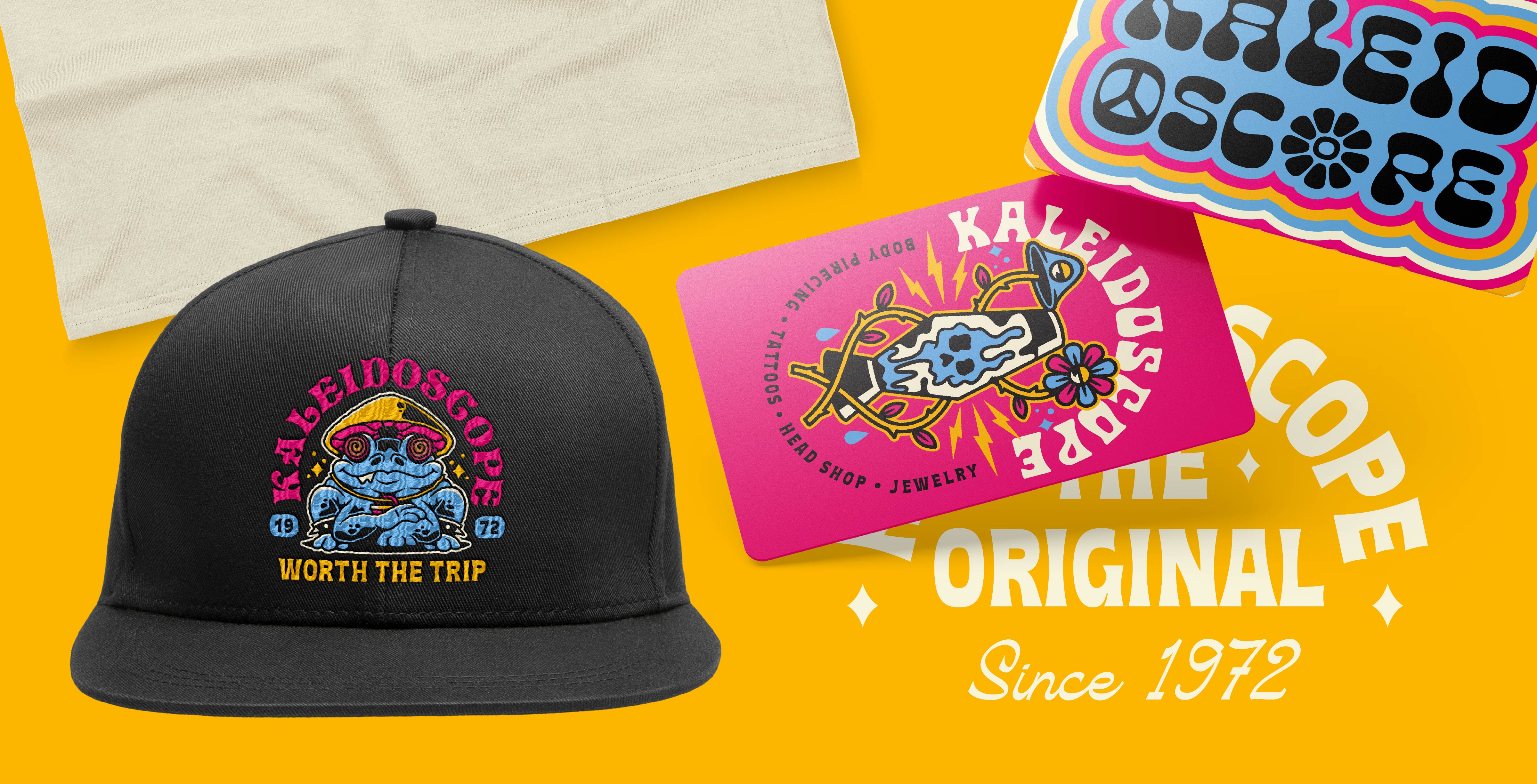
Kaleidoscope has been Springfield's beloved home of weird since 1972, a record-shop-turned-tattoo-piercing-smoke-shop that's never held one shape for long. Fried Design Company rebuilt the visual identity to finally match the place: a wild, shape-shifting system of psychedelic illustration, groovy custom type, and a mascot worth putting on a hat. Same shop everyone already loves, finally looking like it feels inside.
Awards
Gold American Advertising Award
Share this page
Insight
Kaleidoscope isn't a store you explain, it's a place you send people. Opened in 1972 as a record shop, on John Lennon's birthday, it's spent over fifty years shape-shifting into whatever Springfield needed it to be: records, then clothing and jewelry, then piercing, tattoos, a smoke shop, and a whole lot of weird stuff. Two generations of the same family have kept it the beating heart of the city's alternative scene, the kind of local institution people are genuinely protective of. A place with that much history and that much personality is a specific kind of thing to redesign. The identity had to be as wild and colorful as five decades of counterculture, hold a dozen different services under one roof, and do all of it without losing an ounce of what made people love the place. The gift was in the name. A kaleidoscope never holds one shape, and neither does this shop, so the visual system got to do the same.
Solution
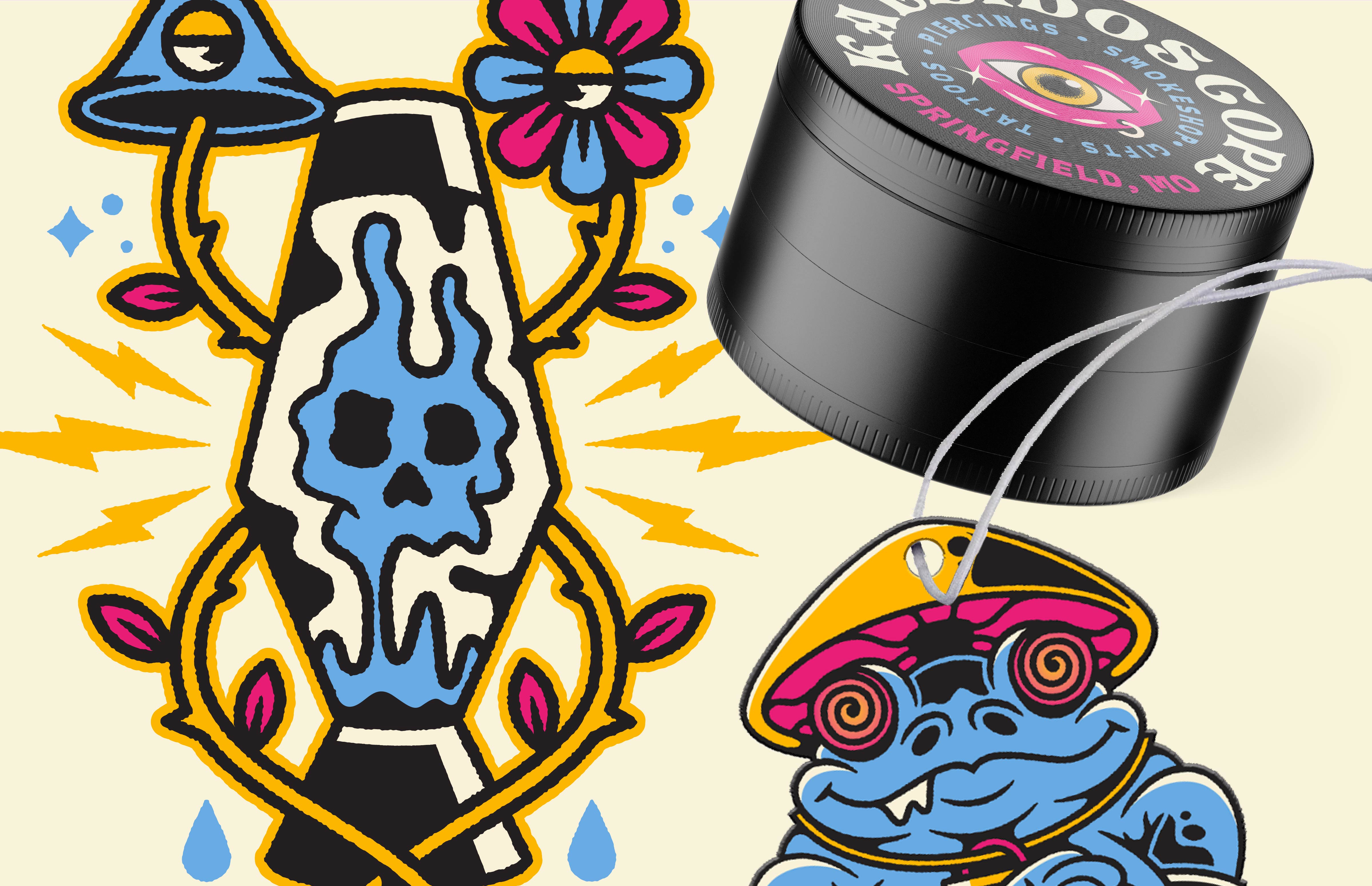
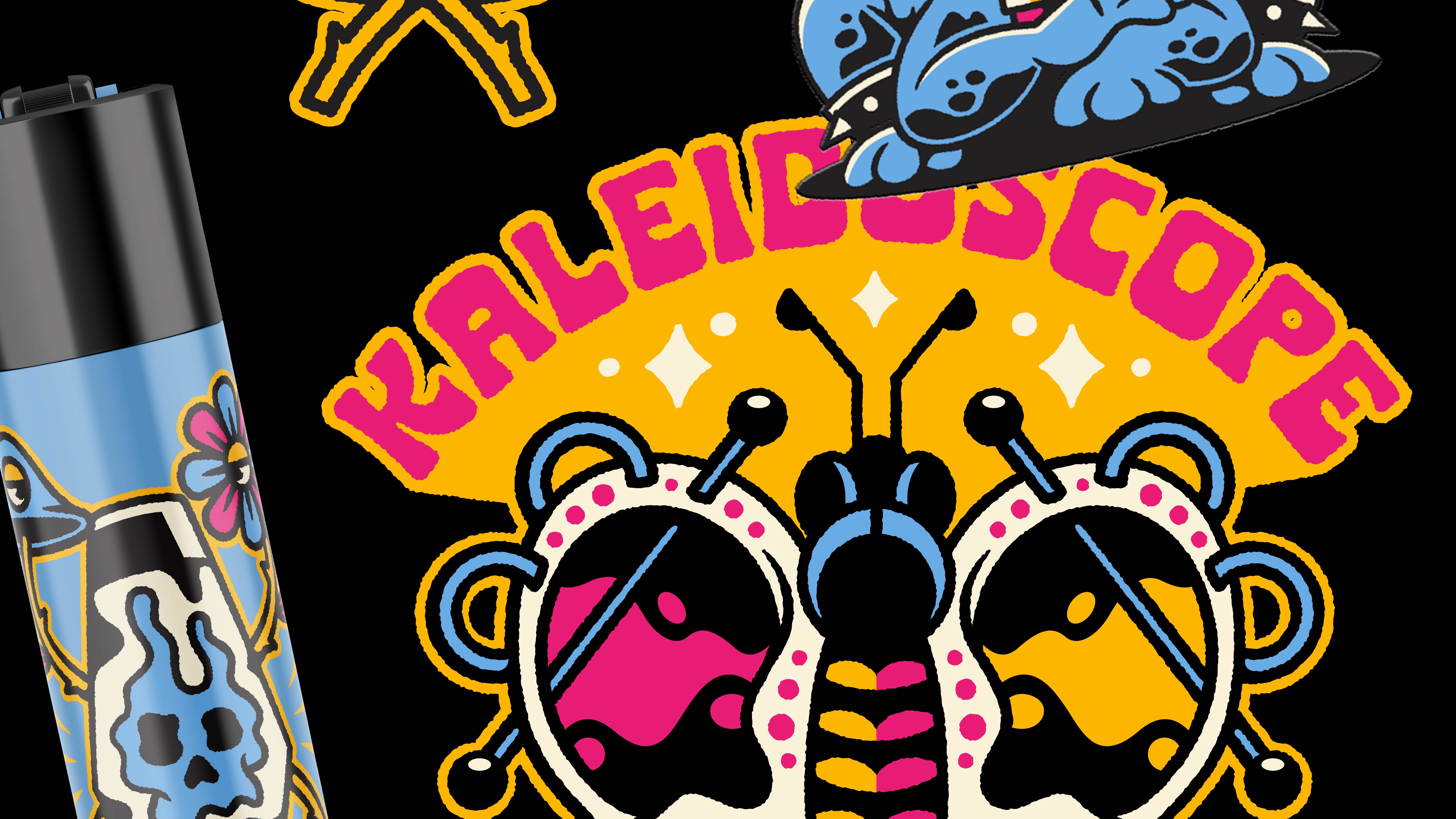
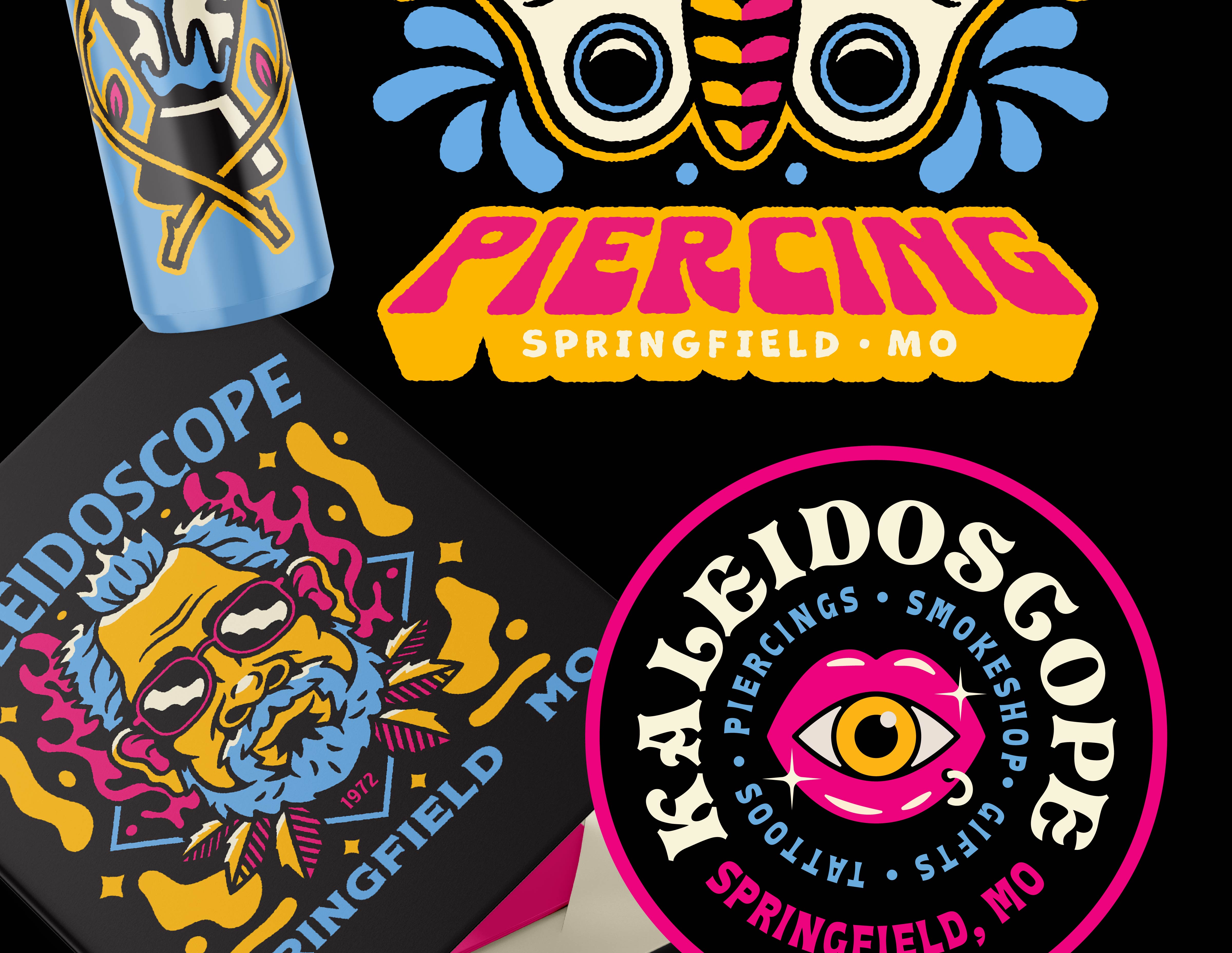
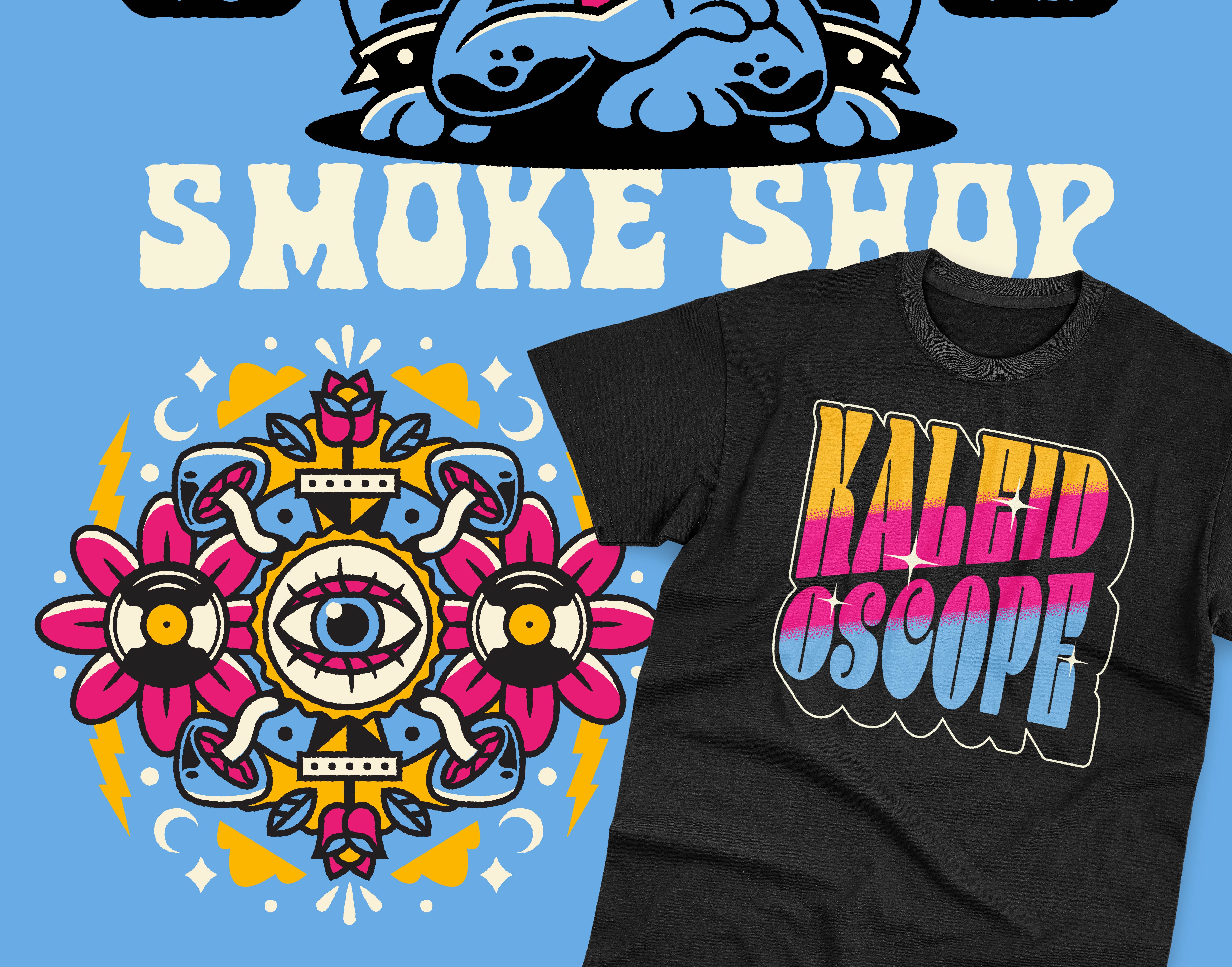
We built Kaleidoscope a visual identity as maximal and shape-shifting as the shop itself. A psychedelic world drawn in bold CMYK, hot pink, cyan, gold, and black, that channels five decades of counterculture without feeling like a costume: 70s bubble type, all-seeing eyes, mushrooms, flowers, lightning, and a tripped-out blue toad mascot cool enough to carry the whole brand on a hat. The wordmark leads it. A custom groovy display letterform with a peace sign tucked in one letter and a daisy in another, flexible enough to run loud on a matchbook and tight on a sticker. Around it we built a deep kit of illustration, badges, and lockups, one for every side of the business, from the ornate all-seeing-eye smoke shop seal to the "Piercing" and "Smoke Shop" and "Worth the Trip" marks, so a shop with a dozen offerings reads as one unmistakable brand. Then we put it on everything a place like this lives on: tees, hats, stickers, matchbooks, grinders, lighters, air fresheners, ashtrays, signage, and gift cards, all carrying the same loud, hand-drawn, slightly-psychedelic energy. The result gives a 50-year Springfield institution a visual identity as wild and beloved as the shop that earned it. Same Kaleidoscope. Finally looks like it feels inside.



Explore more work