Fight CRC Campaign
In the world of patient advocacy, few organizations stand out as boldly as Fight Colorectal Cancer (FIGHT CRC). Born from a vision to change the landscape of cancer treatment through advocacy, policy, and research, FIGHT CRC has been a beacon of hope since its founding in 2005. But how do you capture the essence of an organization that describes itself as "extremely loud, involved, and sometimes even feisty"? This was the challenge presented to us, and we were ready to jump in head first - the only way we know how.
Share this page
Insight
Cancer nonprofits tend to look the same: soft light, muted colors, a tone that treats the patient as someone to feel sorry for. Fight Colorectal Cancer is the opposite of that. Since 2005 they've been loud, involved, and openly feisty, taking the fight to Capitol Hill and refusing to whisper about a disease nobody likes to discuss. The problem was that their brand didn't match their fight. The challenge was to build an identity as relentless as the organization itself, one that carried real hope without softening into the sympathy-card sameness the whole category defaults to.
Solution
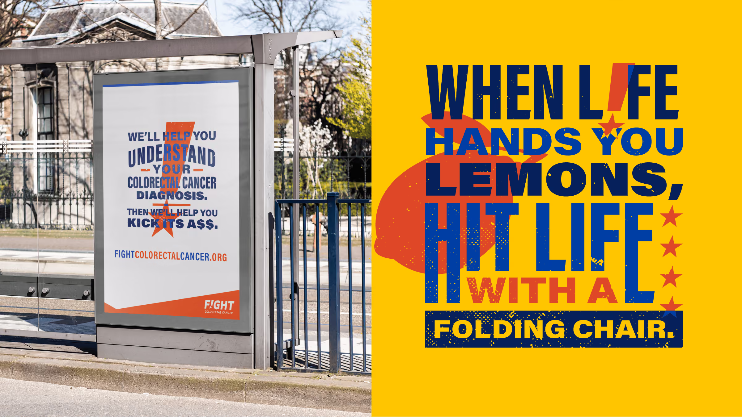
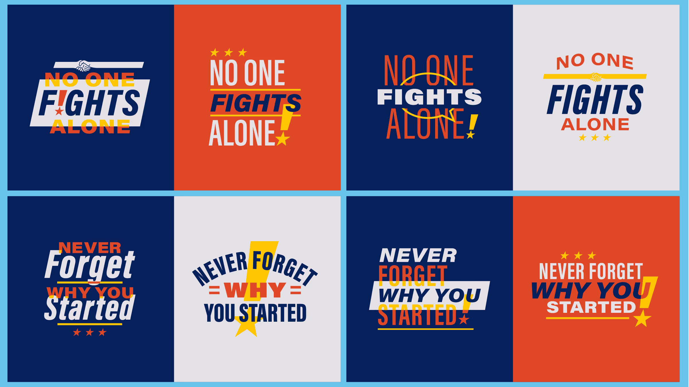
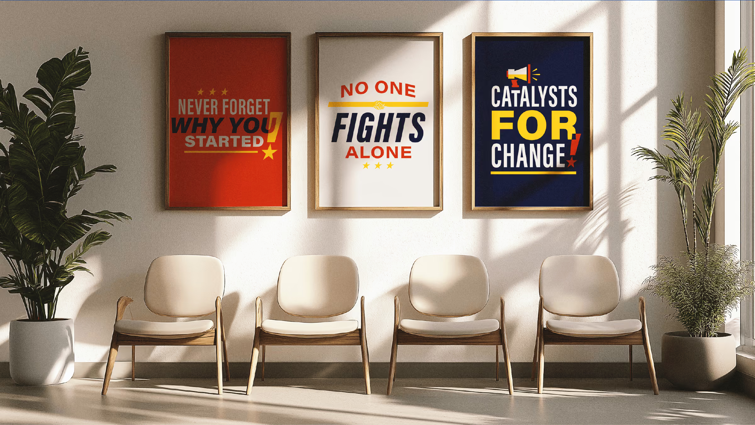
We built the campaign around one idea: relentless champions of hope. Not comfort, not pity. Fight. That concept became the spine of the voice and the visuals both. The copy talks the way Fight CRC actually fights, direct, determined, speaking straight to patients, advocates, and the policymakers they lobby, without a trace of hospital-brochure softness. Custom illustration and bold design carry the same energy, turning hope into something with teeth instead of a pastel abstraction. Then it ran everywhere the fight happens: print for medical offices and events, advertising to pull in new supporters, and merch that lets an advocate wear the cause out loud. The result gave a national advocacy organization a voice and a look as loud as its mission. From Capitol Hill to community events, Fight CRC finally shows up looking like the fight it's actually in.












Explore more work