Mother's Oktoberfest
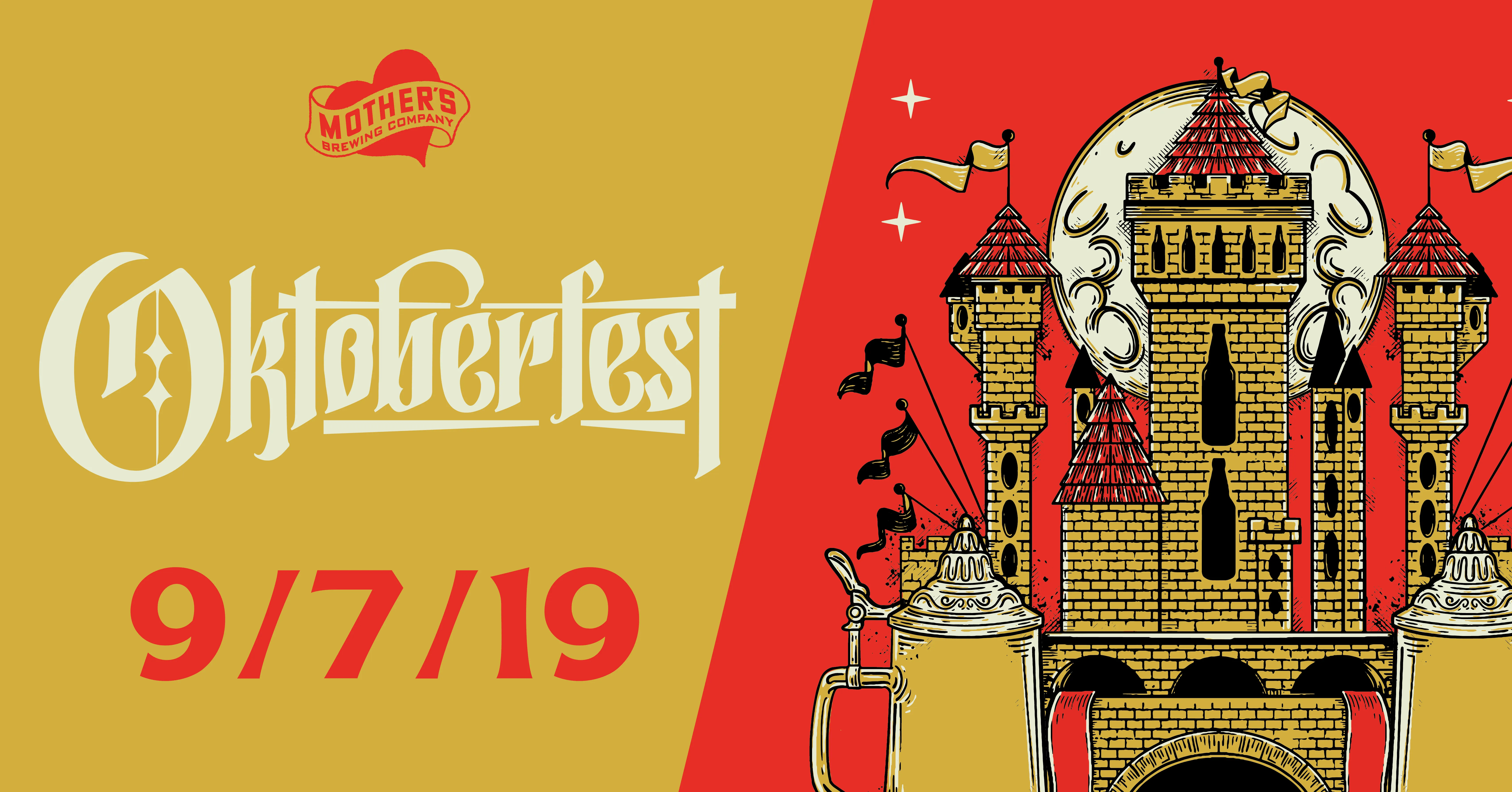
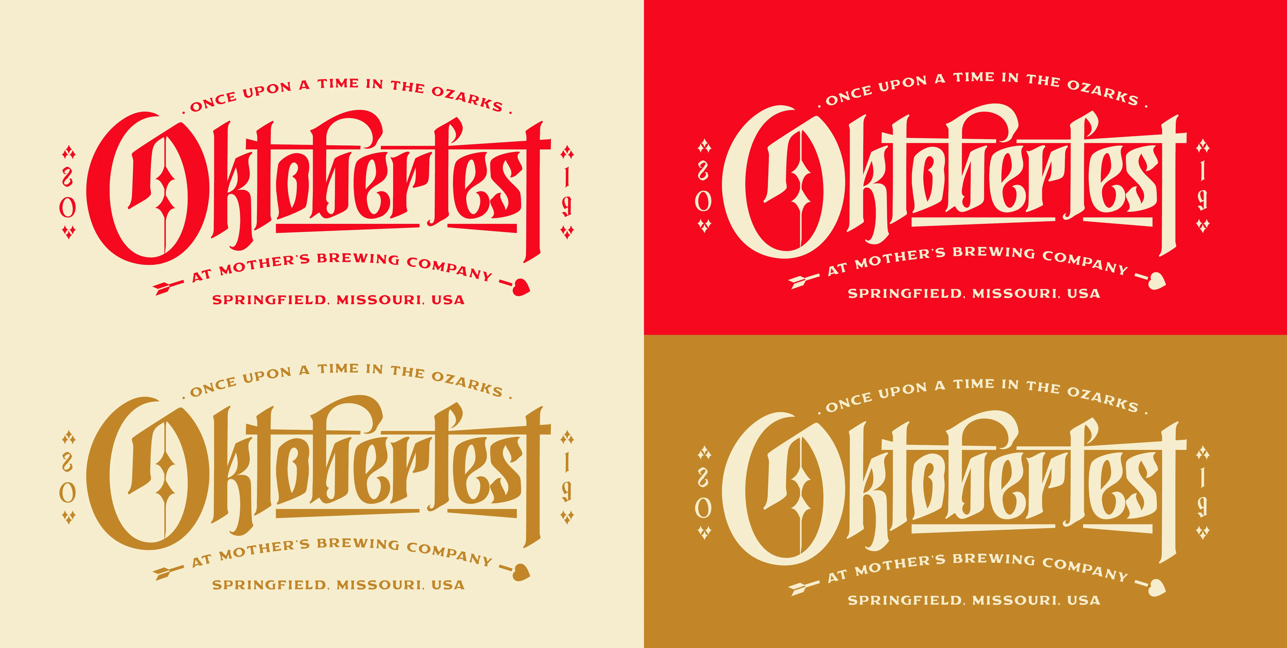
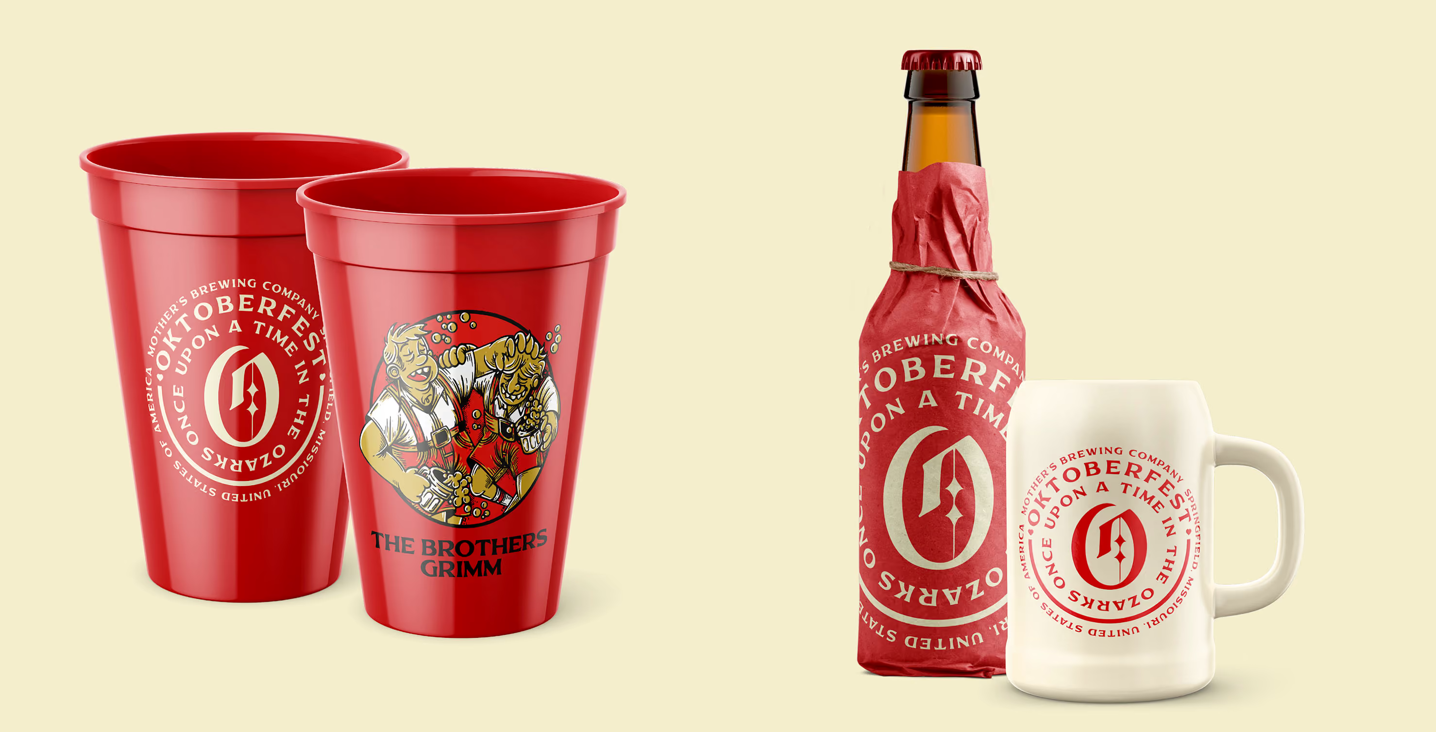
Aside from their packaging and brand management, Mother’s asks us every year to take over the design for multiple festivals throughout the year. Everyone has some sort of Oktoberfest - so how could we make this one different? Enter - Once Upon A Time In The Ozarks.
Services
Awards
2x Gold American Advertising Award
Share this page
Insight
Everybody has an Oktoberfest. Every brewery, every town, the same steins and lederhosen and oompah clip art, recycled year after year. Mother's brings us in every year to design their festivals, and the standing challenge is always the same: how do you make the most generic beer event on the calendar feel like it could only happen here? The answer wasn't to do Oktoberfest better. It was to make it somewhere else entirely.
Solution
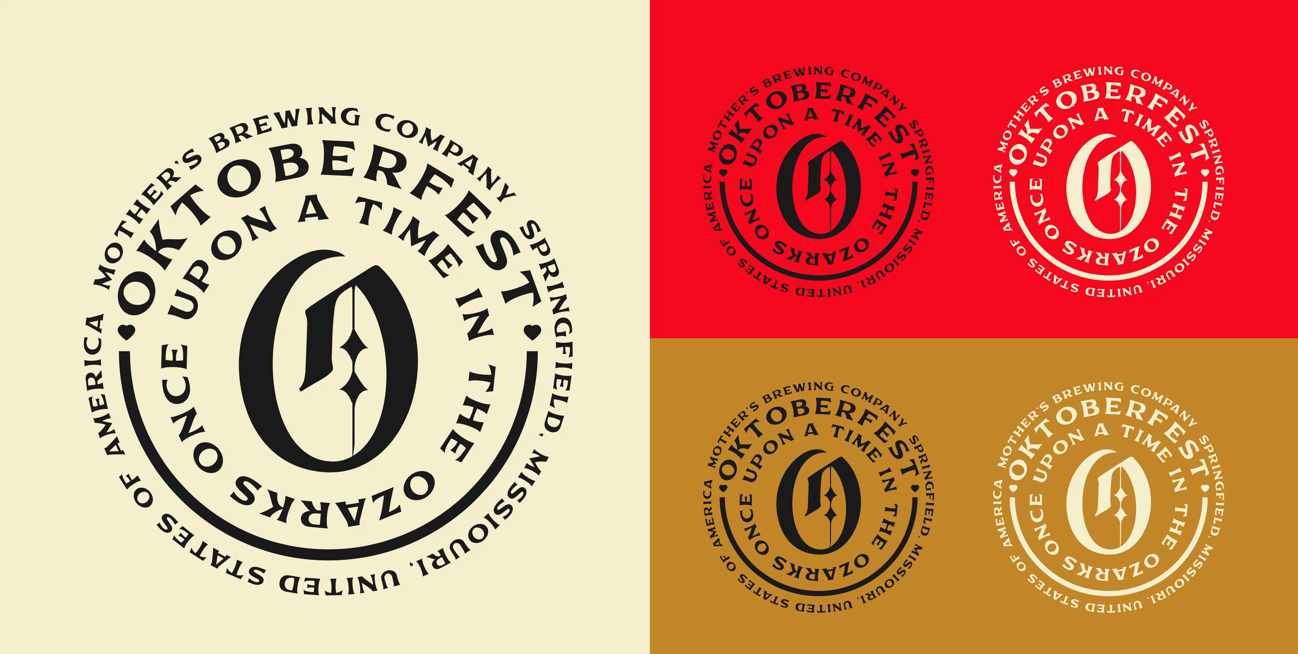
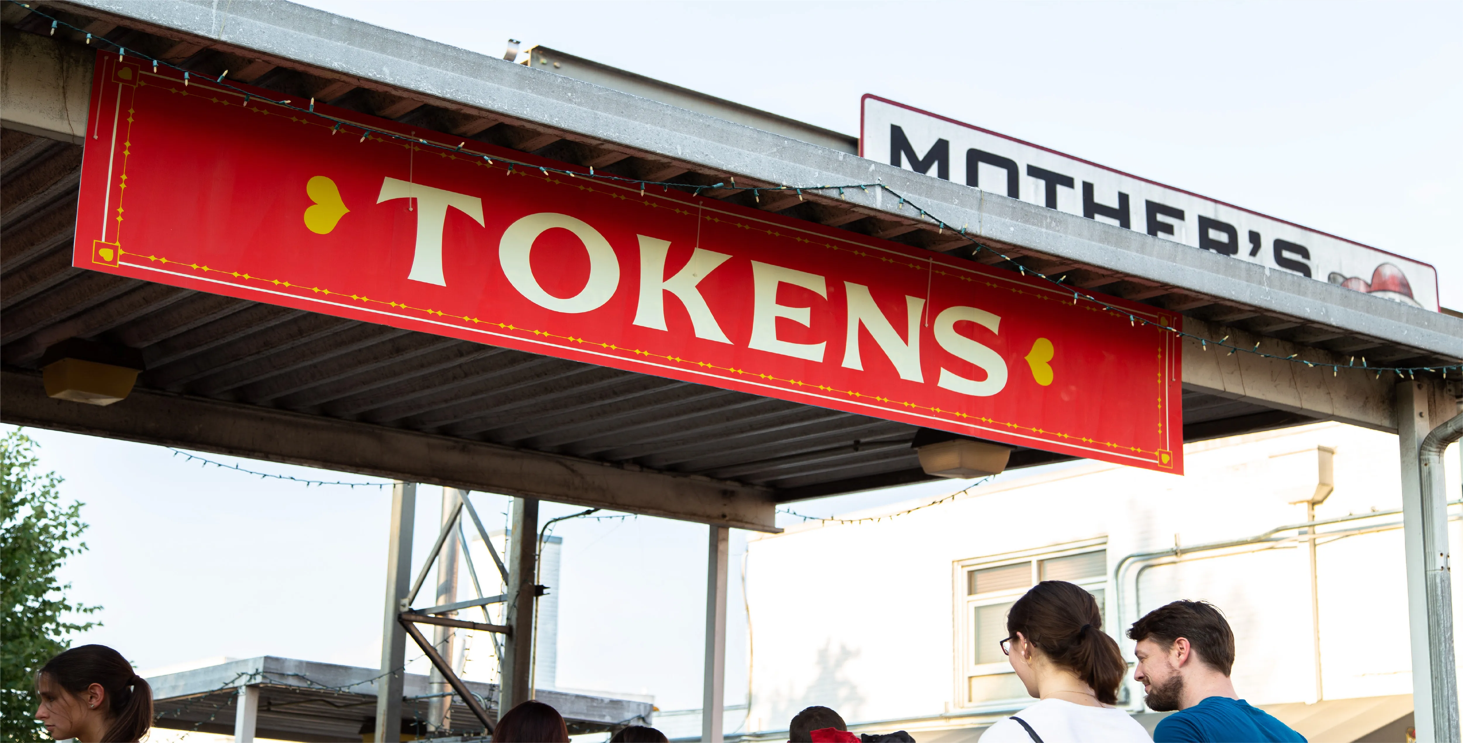
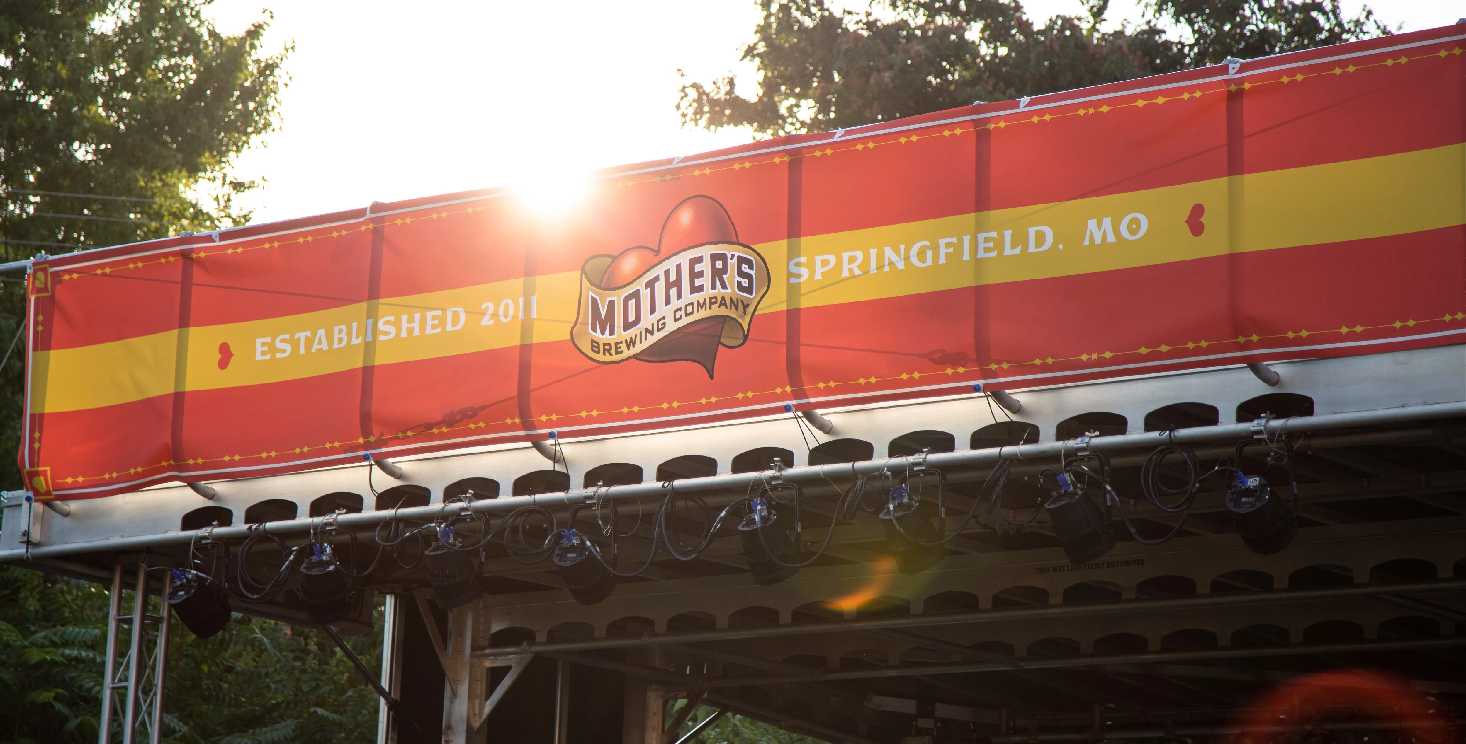
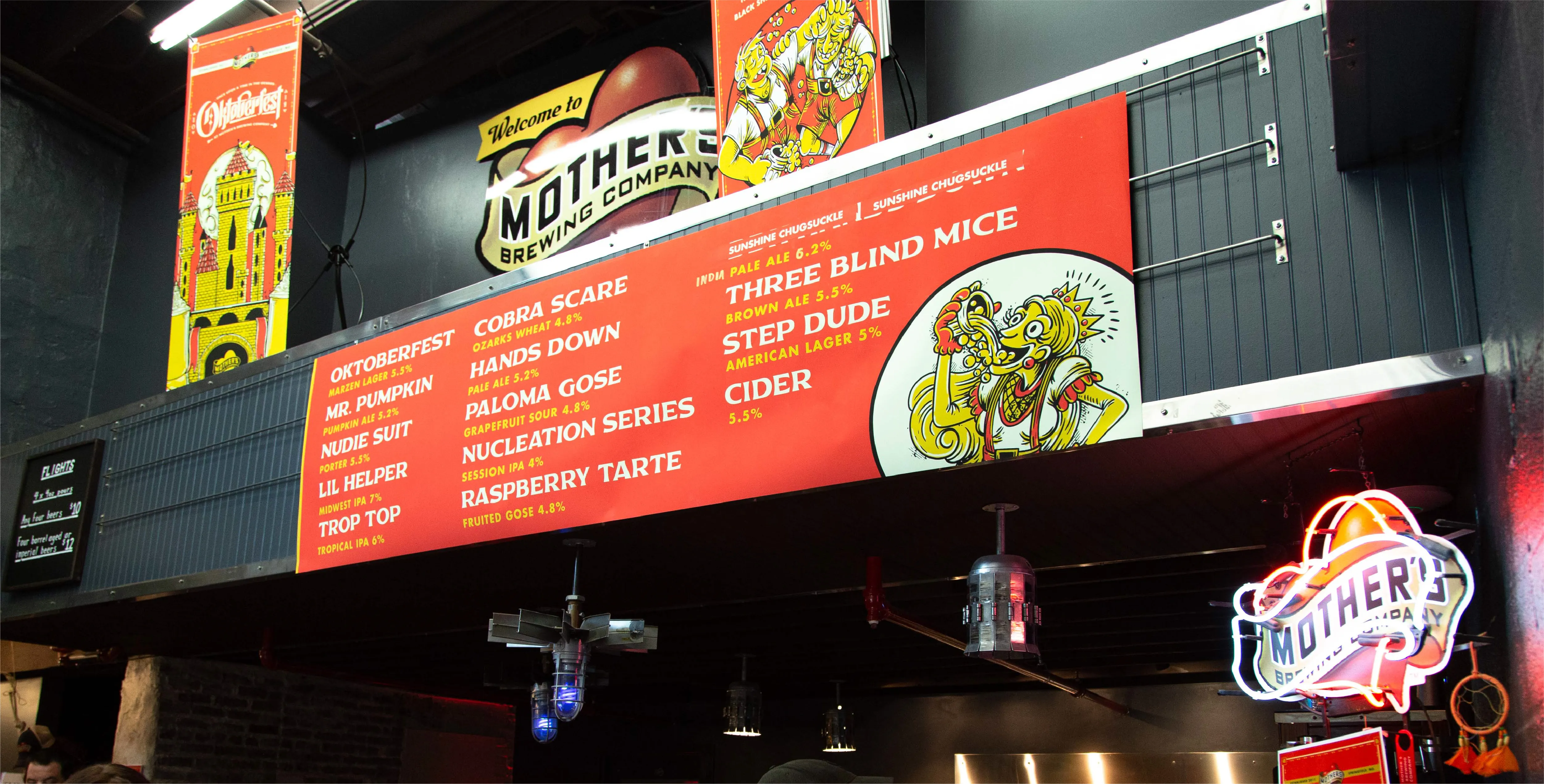
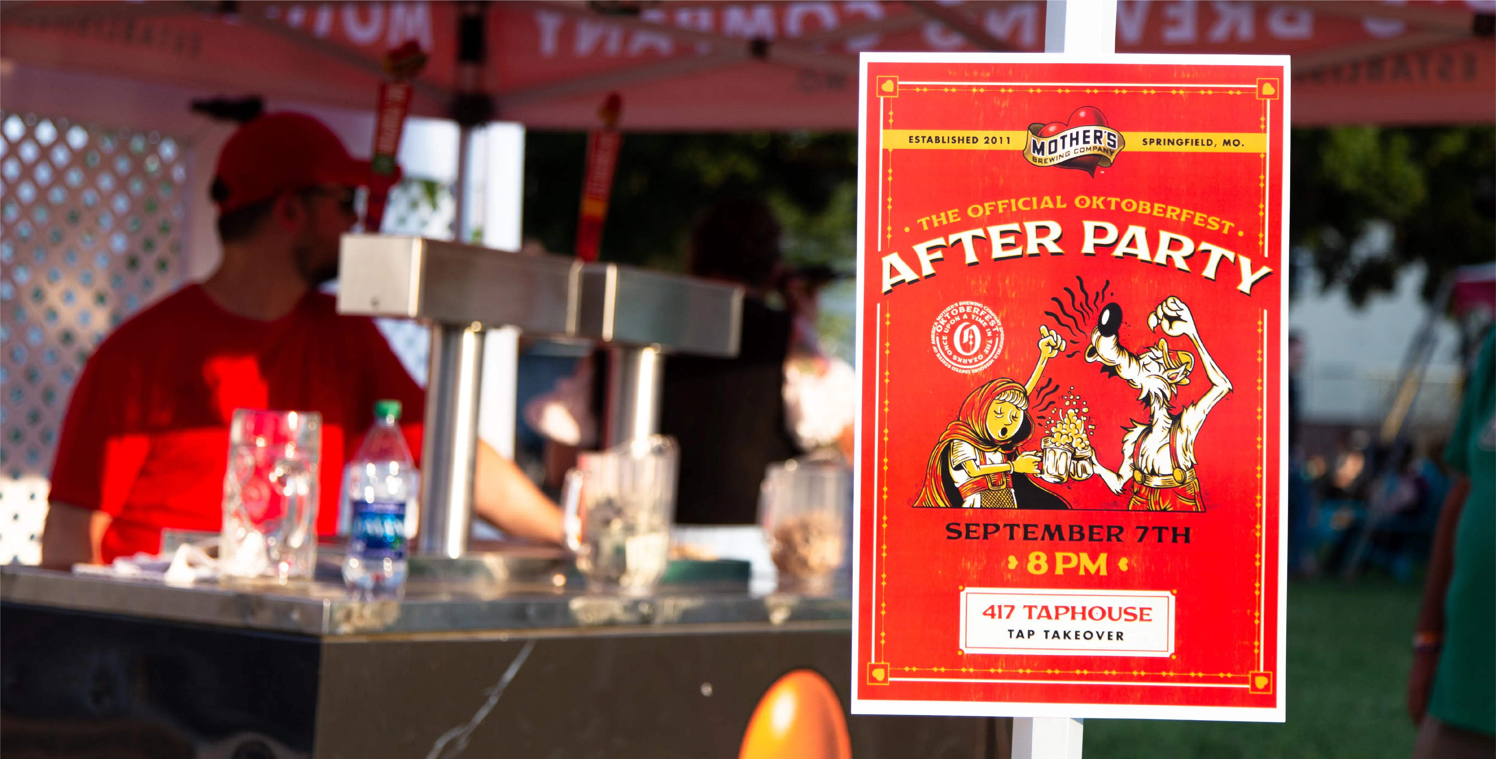
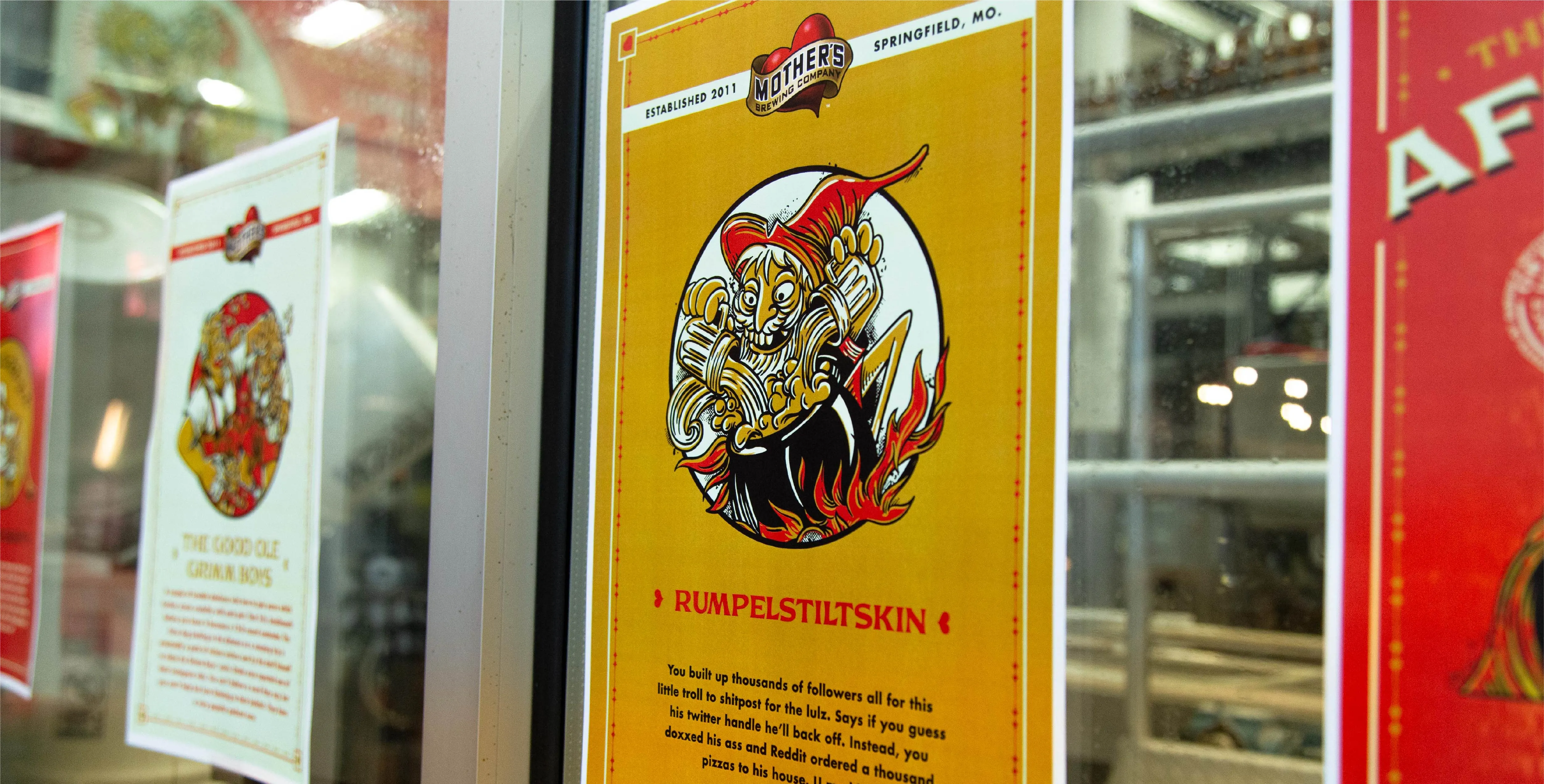
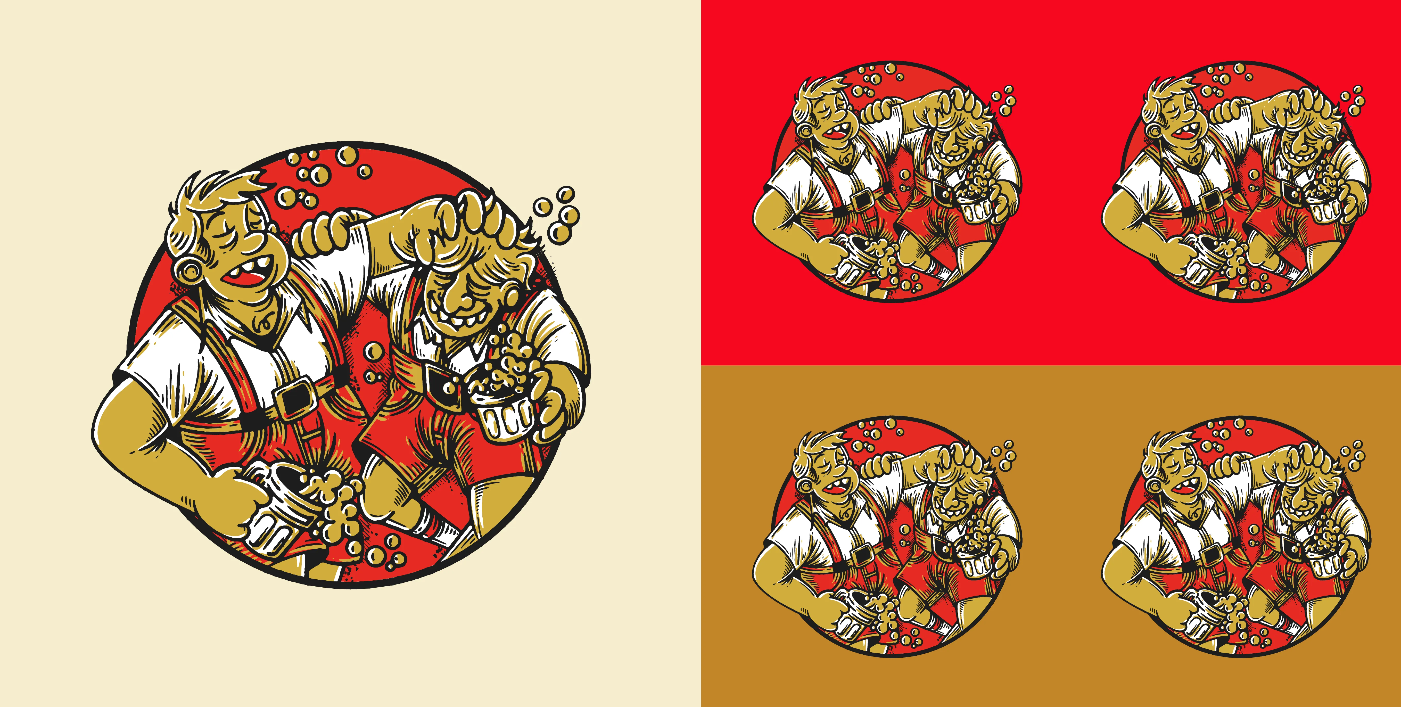
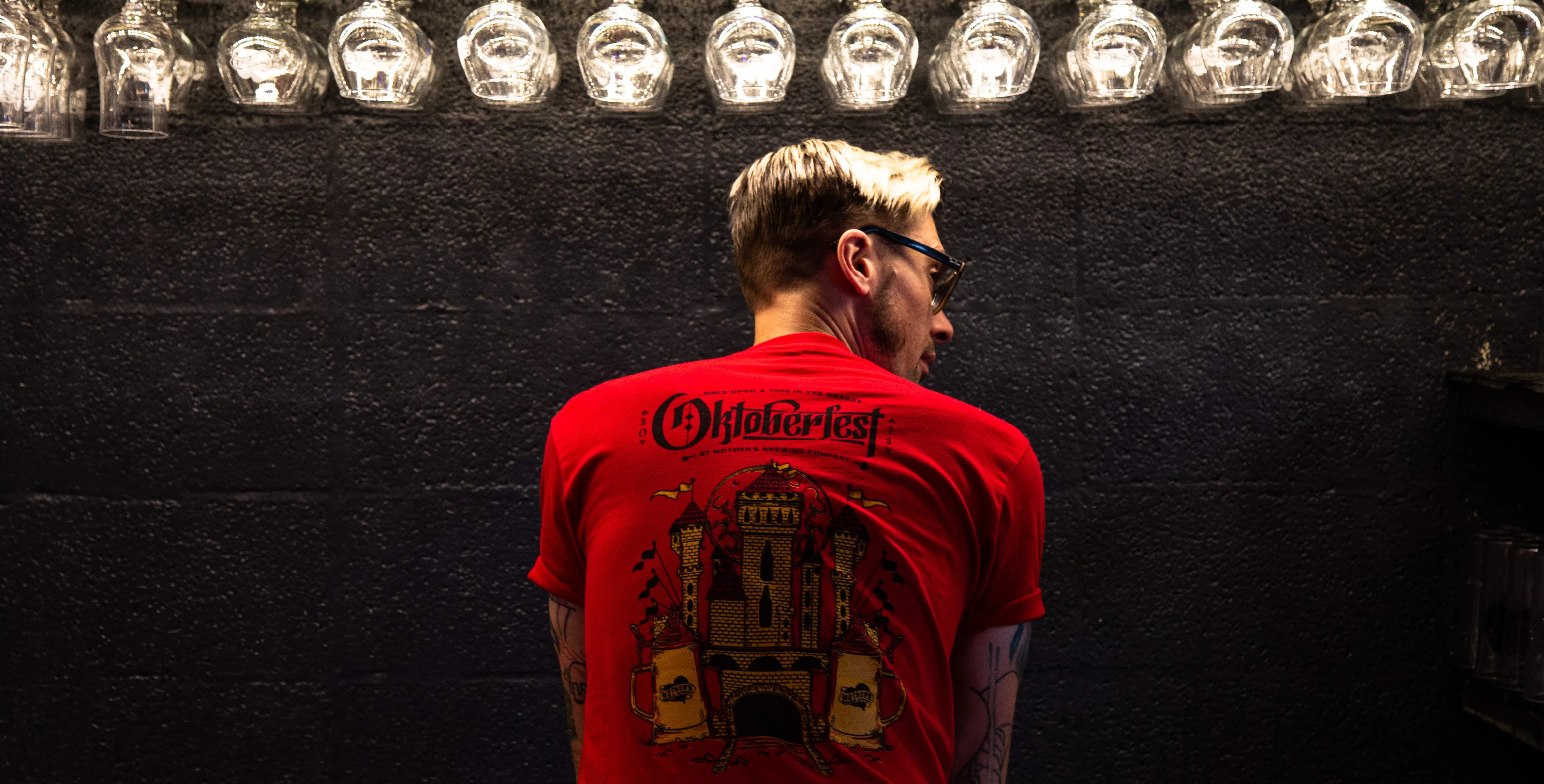
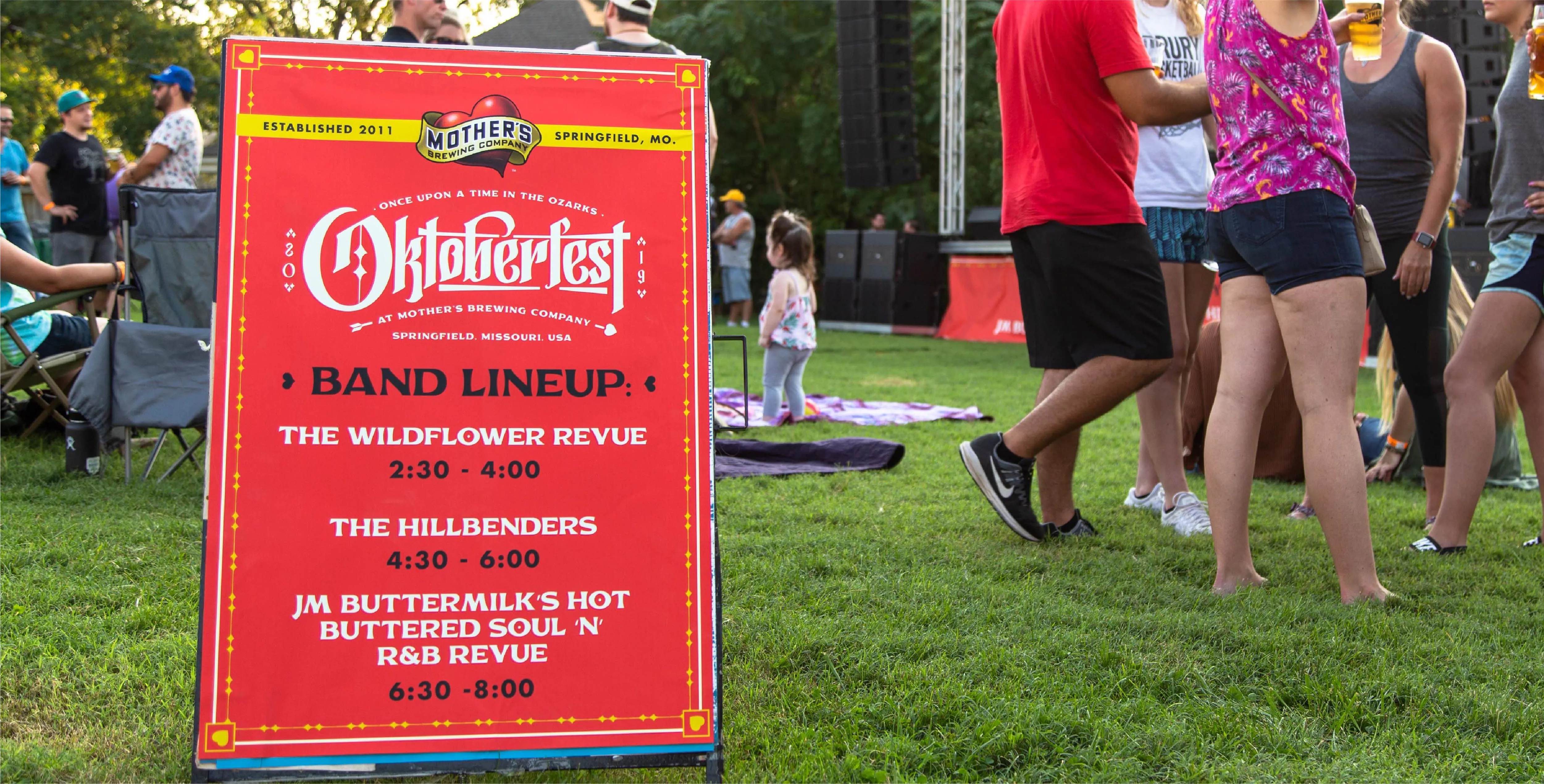
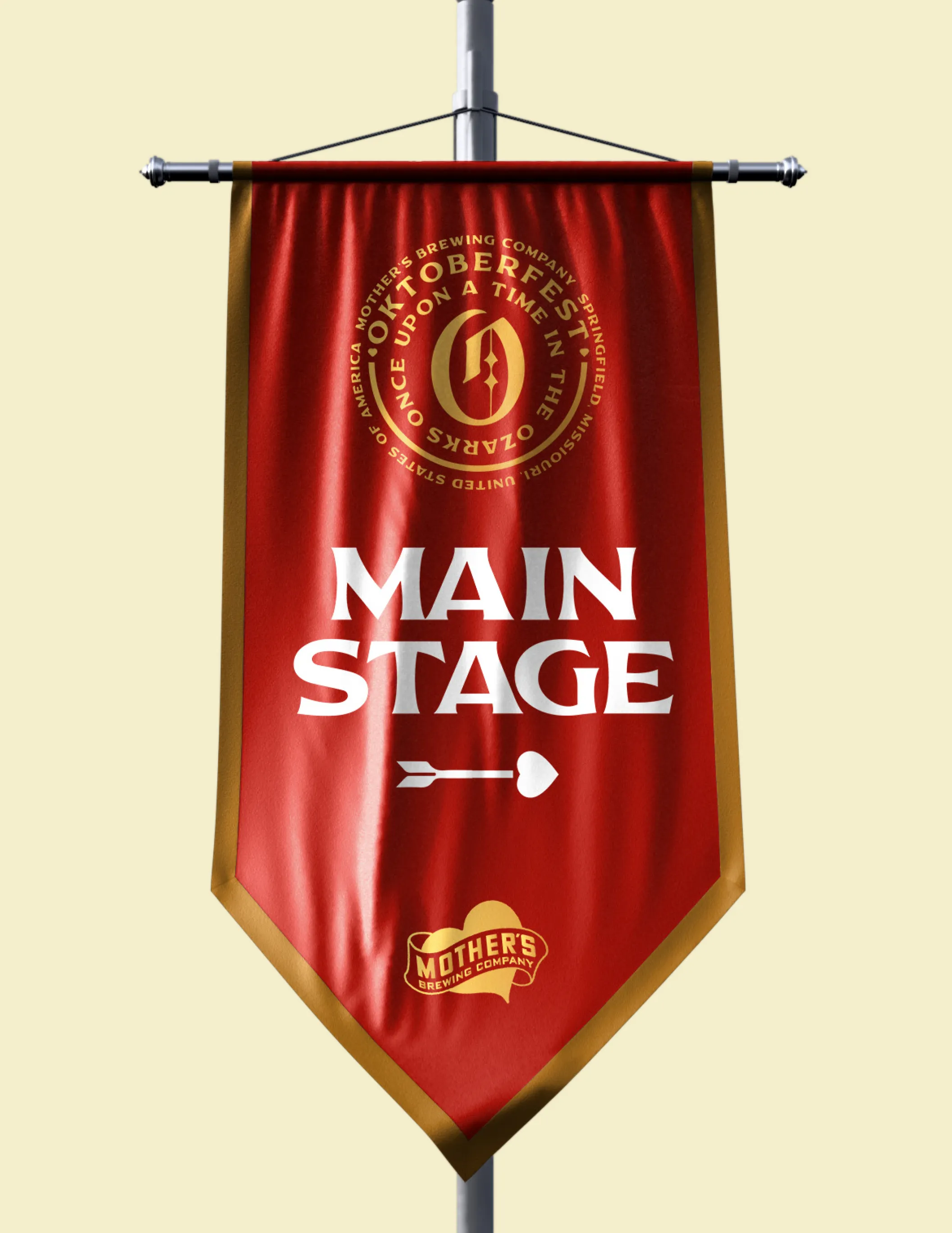
We built the event around one idea: Once Upon A Time In The Ozarks. Classic German fairy tales, the Brothers Grimm, Cinderella, Rumpelstiltskin, pulled out of the old country and dropped into the Ozarks for a weekend of music and cold beer. That concept turned a generic festival into a whole illustrated world. Custom character illustration reimagined the fairy-tale cast as Oktoberfest guests, giving the event a story instead of a theme and a look nobody else could copy, because nobody else has the Ozarks. The system carried across everything the festival touches, from promo to packaging to the grounds. The result took the most copy-paste event on the calendar and made it unmistakably Mother's, and unmistakably here. It went on to win a regional ADDY.
Explore more work