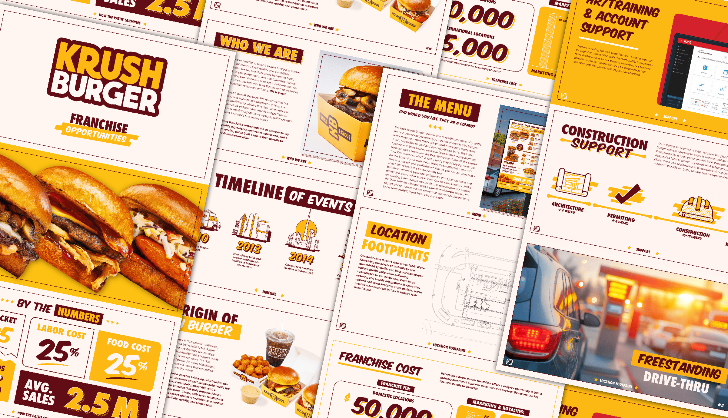
Krush Burger
Krush Burger built its legacy on something simple: tiny burgers with huge flavor. Since 2009, they’ve been slinging slider-style burgers that punch way above their weight class — a fast-food original that became a cult favorite. But after a couple of decades in the game, the brand had started to lose its edge. The food was still killer, but the branding? It wasn’t keeping up.
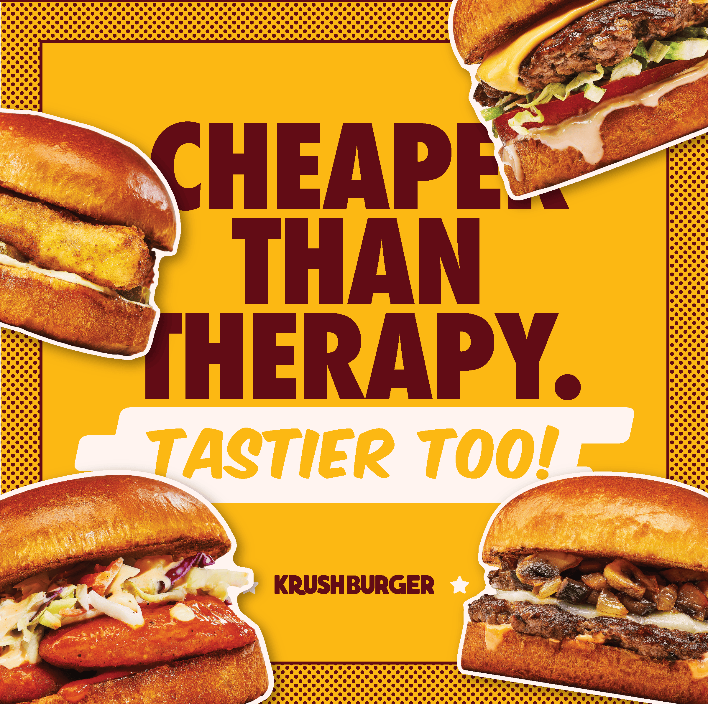
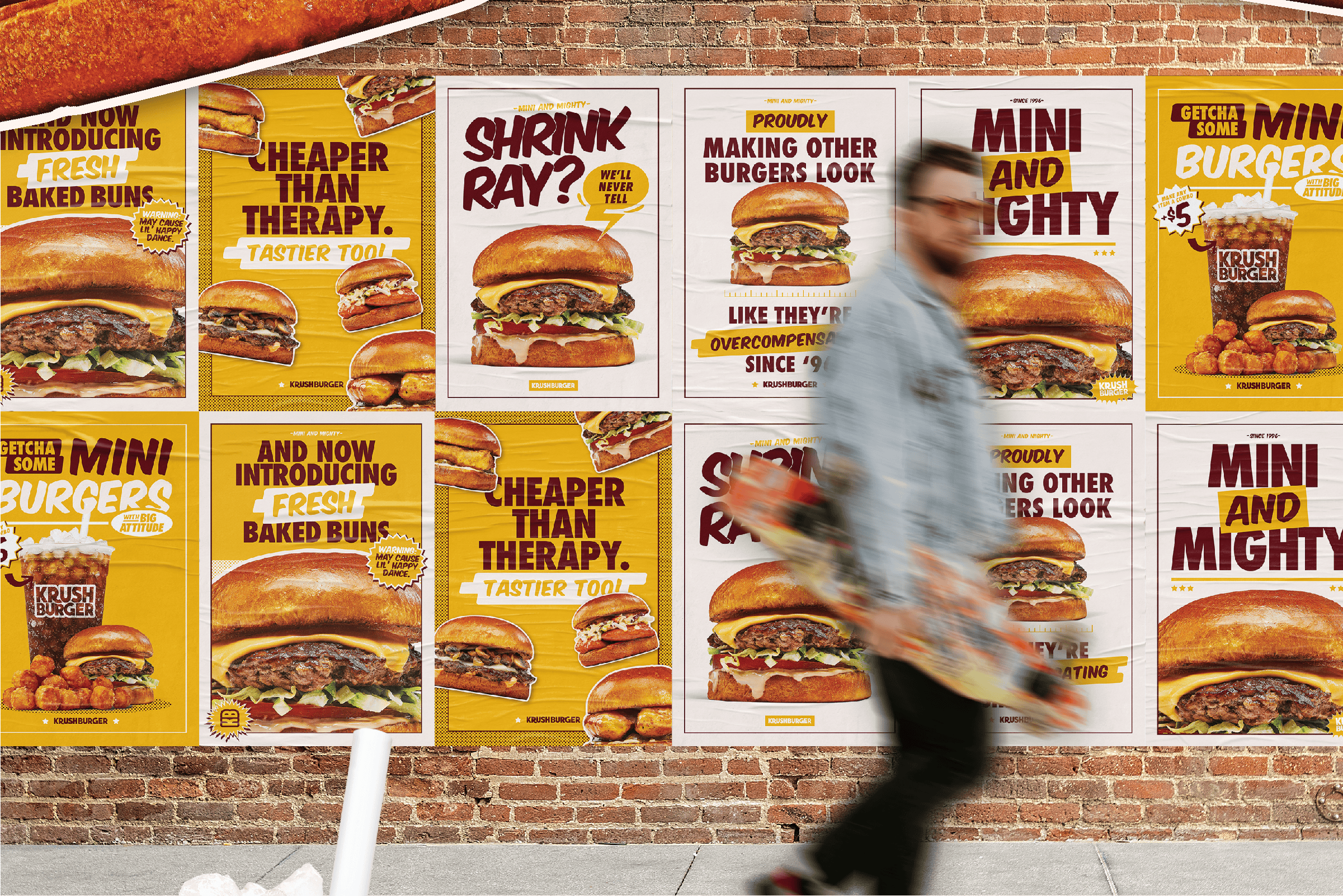
That’s where we came in. We stepped up to serve a restaurant rebrand that hit as hard as Krush’s spicy mayo. The challenge was clear: create a brand identity that felt as bold, compact, and craveable as the burgers themselves — something you could spot from across the street or scroll past and instantly crave.
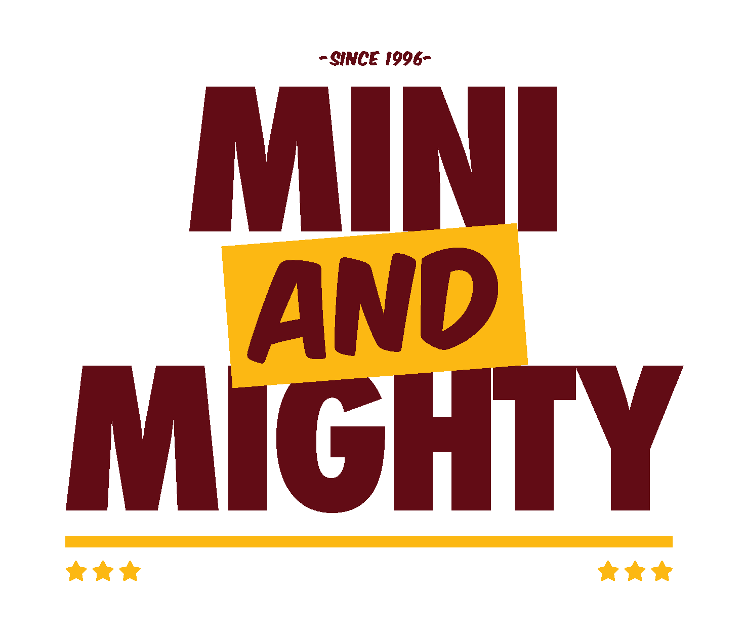
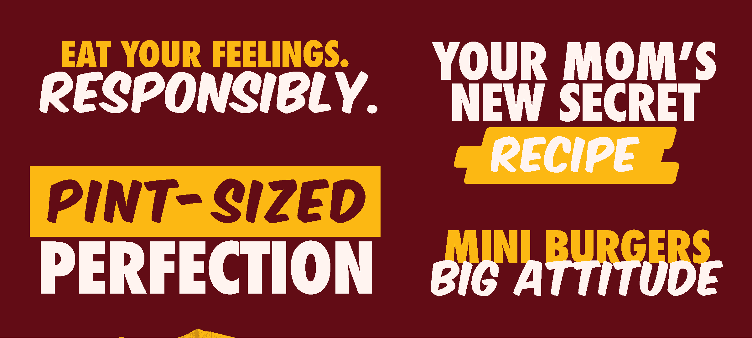
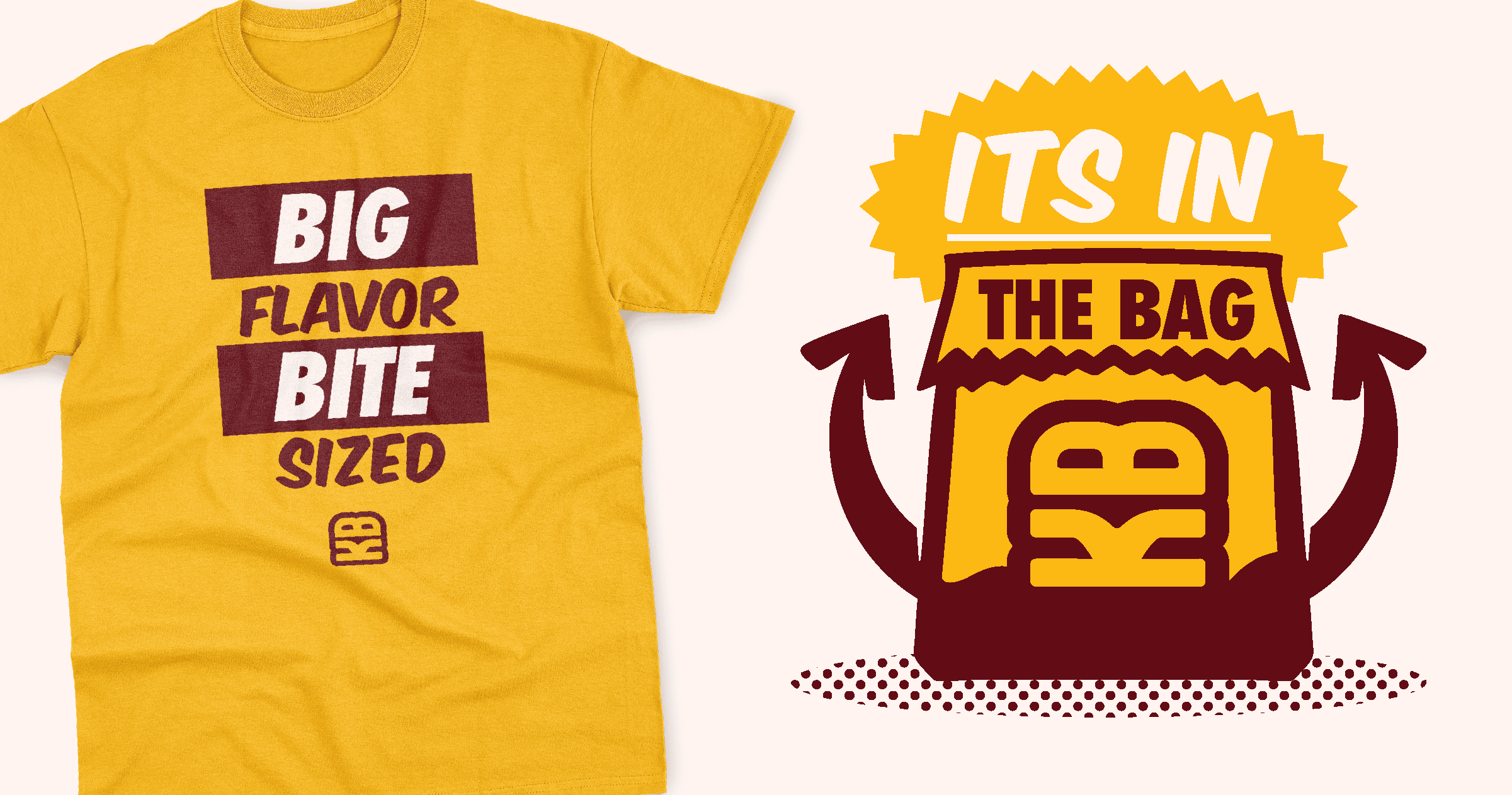
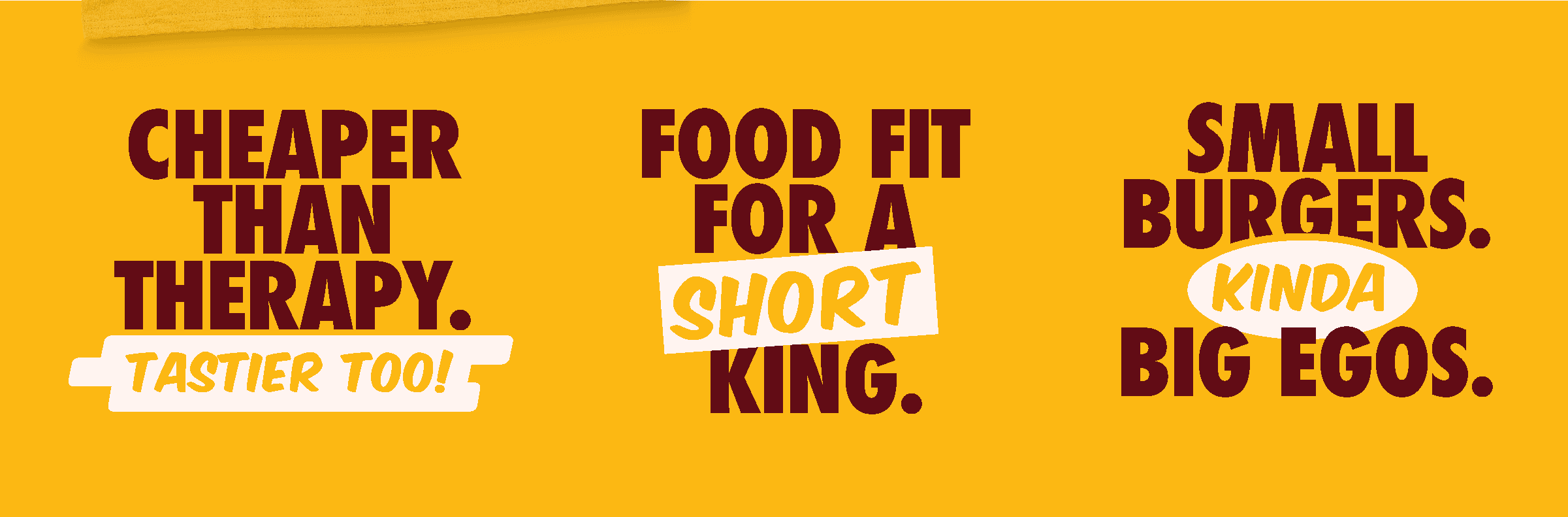
This wasn’t just a new logo or a color swap. It was a full brand overhaul — voice, visuals, attitude, and all. We turned Krush Burger into a brand that talks the way it tastes: loud, confident, and dripping with personality.
Mini burgers? Cool.
But in a world of big chains yelling louder every year, Krush needed a new voice — one that could compete without losing its irreverent charm.
The old branding didn’t match the food’s energy. We saw an opportunity to craft something sharper: a fast food identity system with a side of swagger.
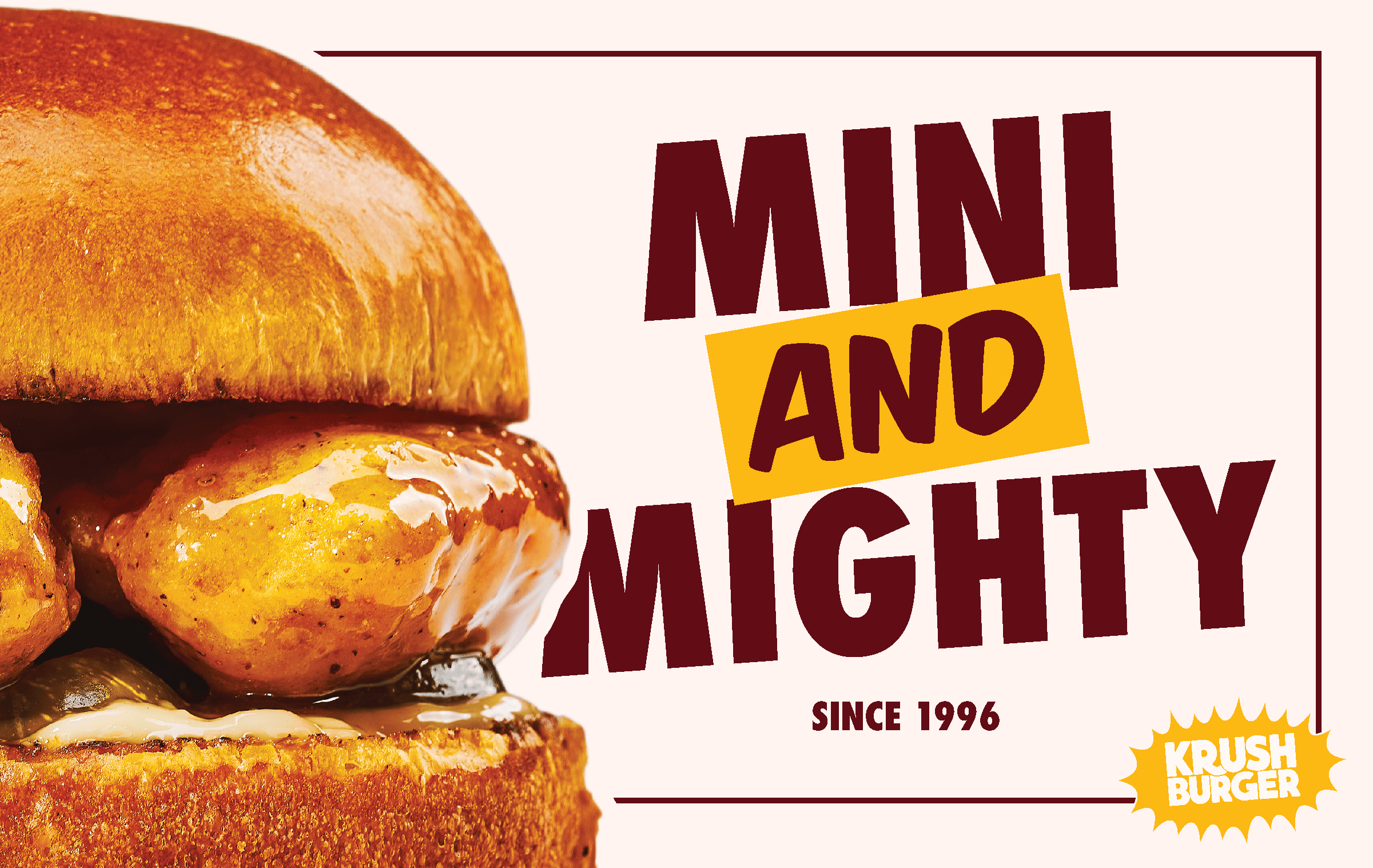

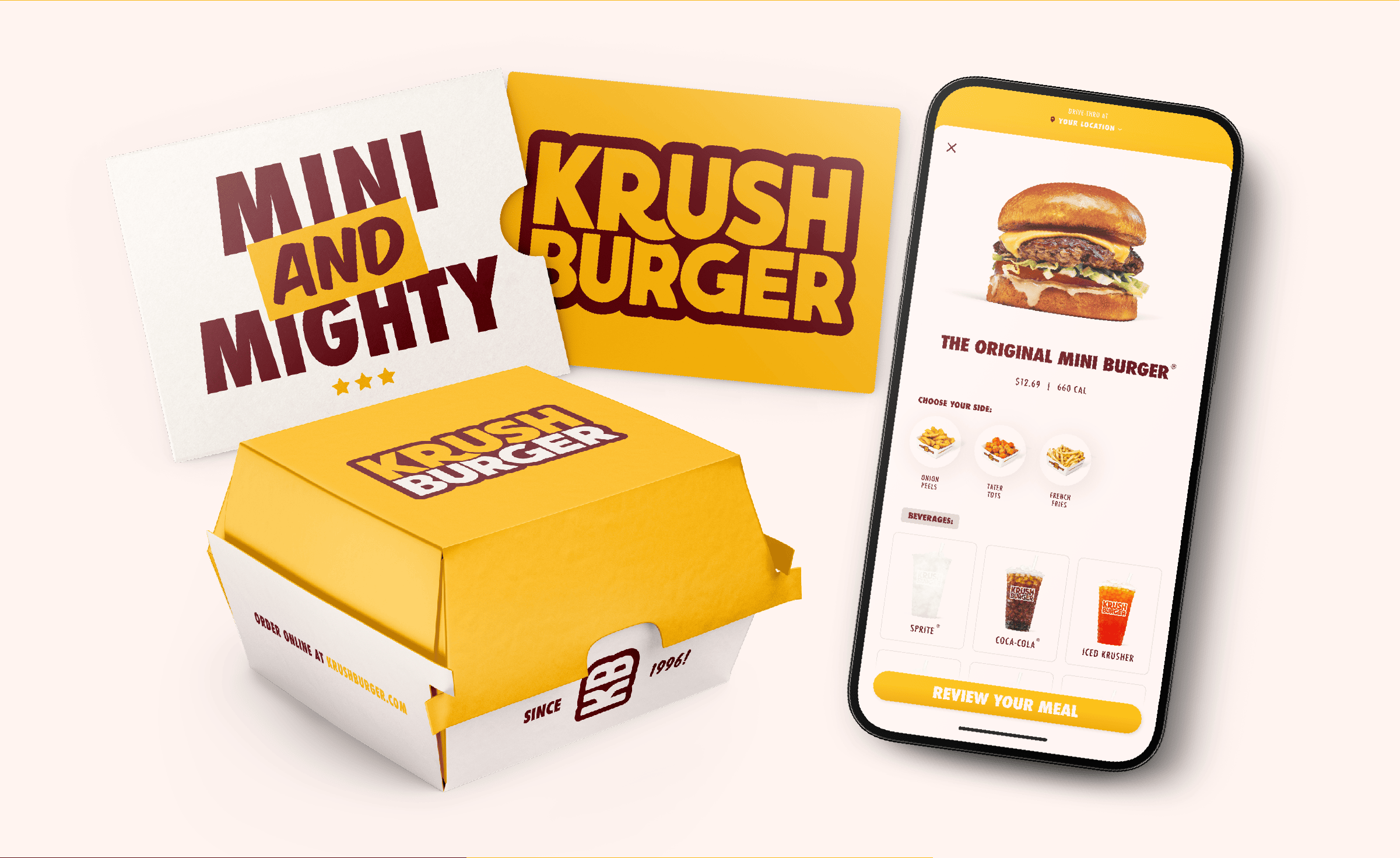

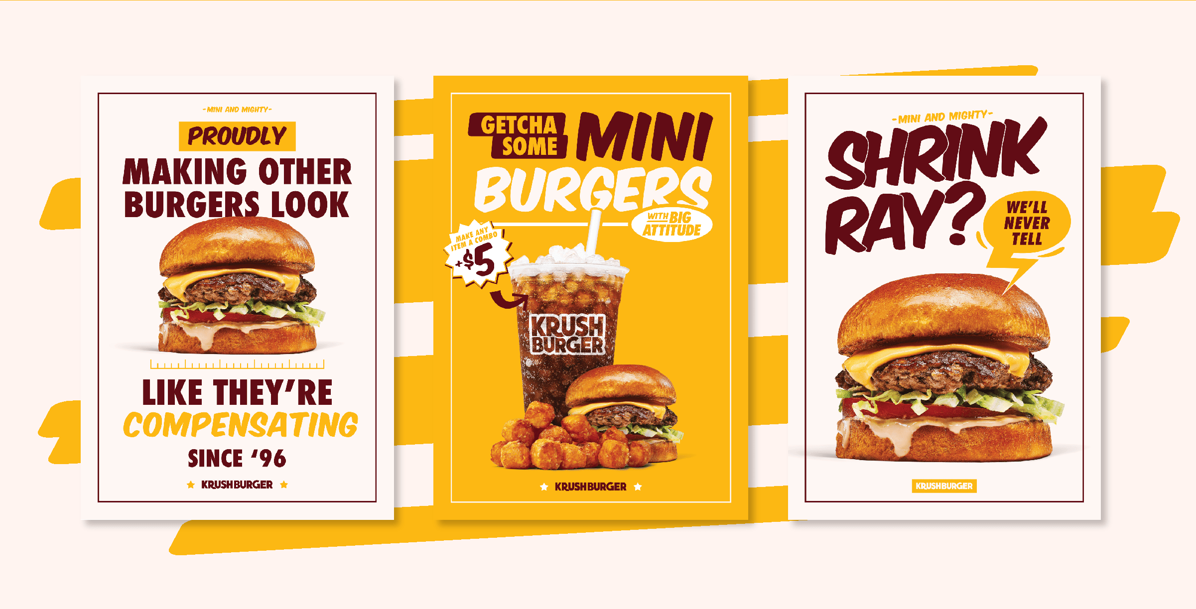
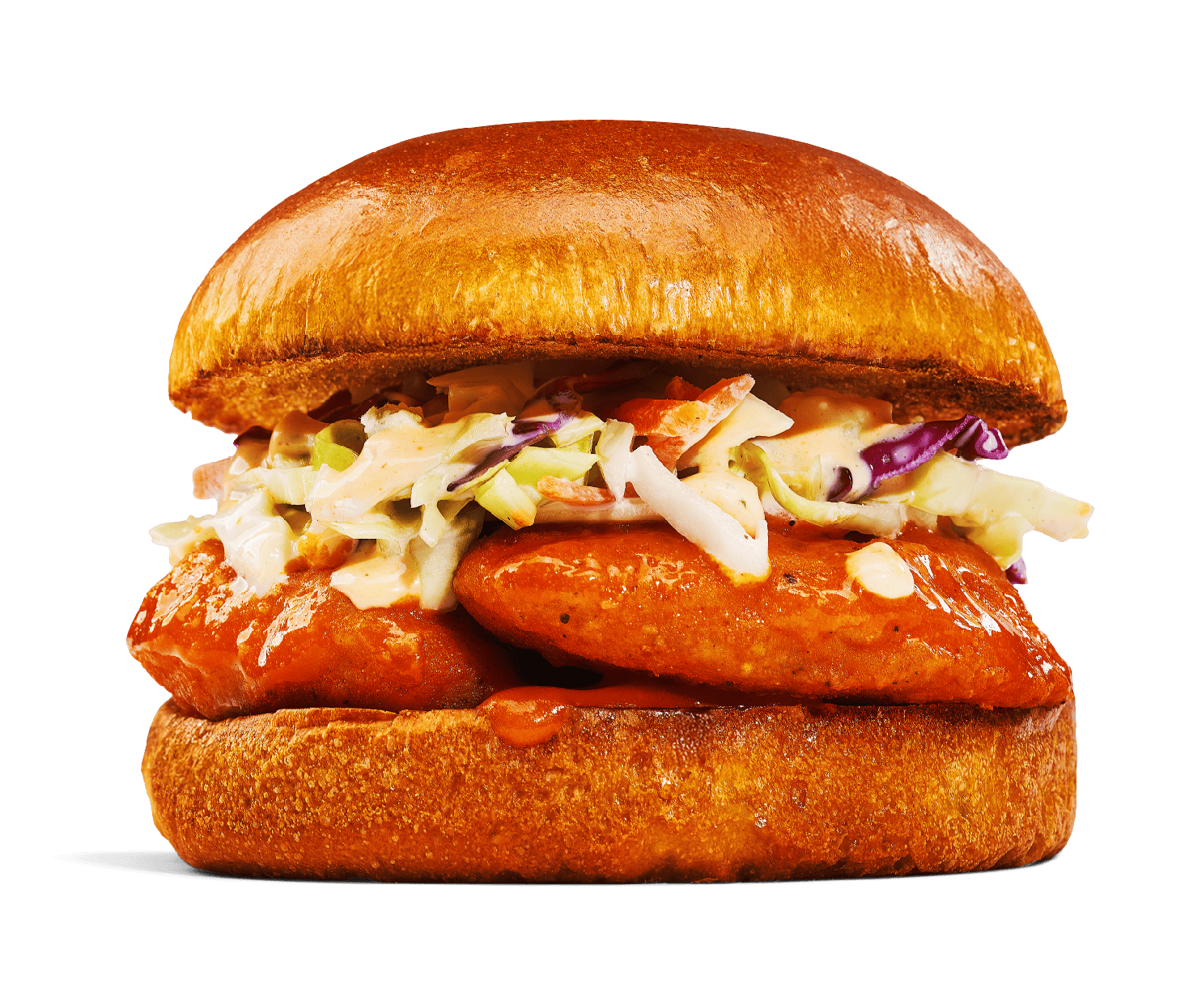
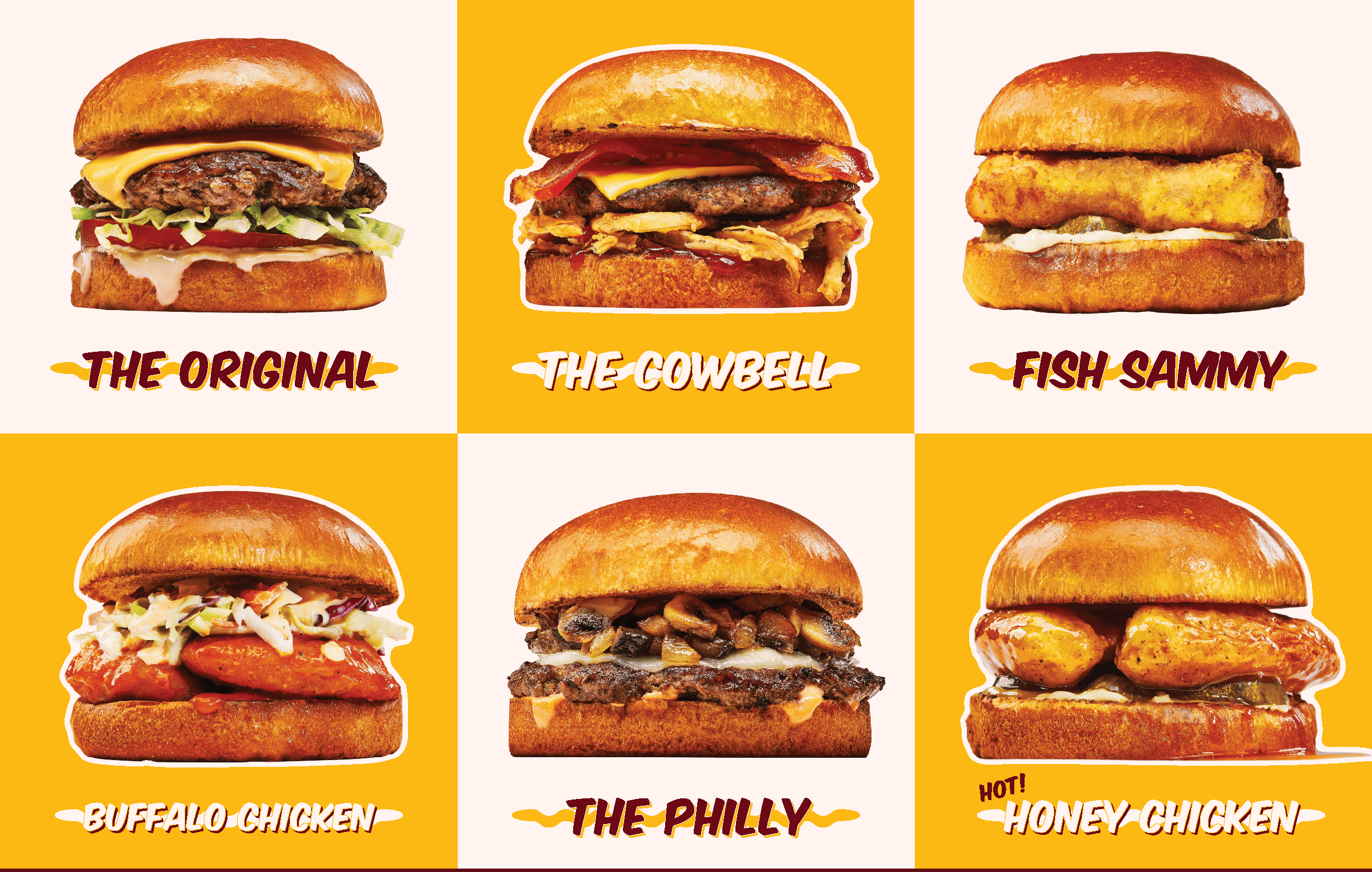
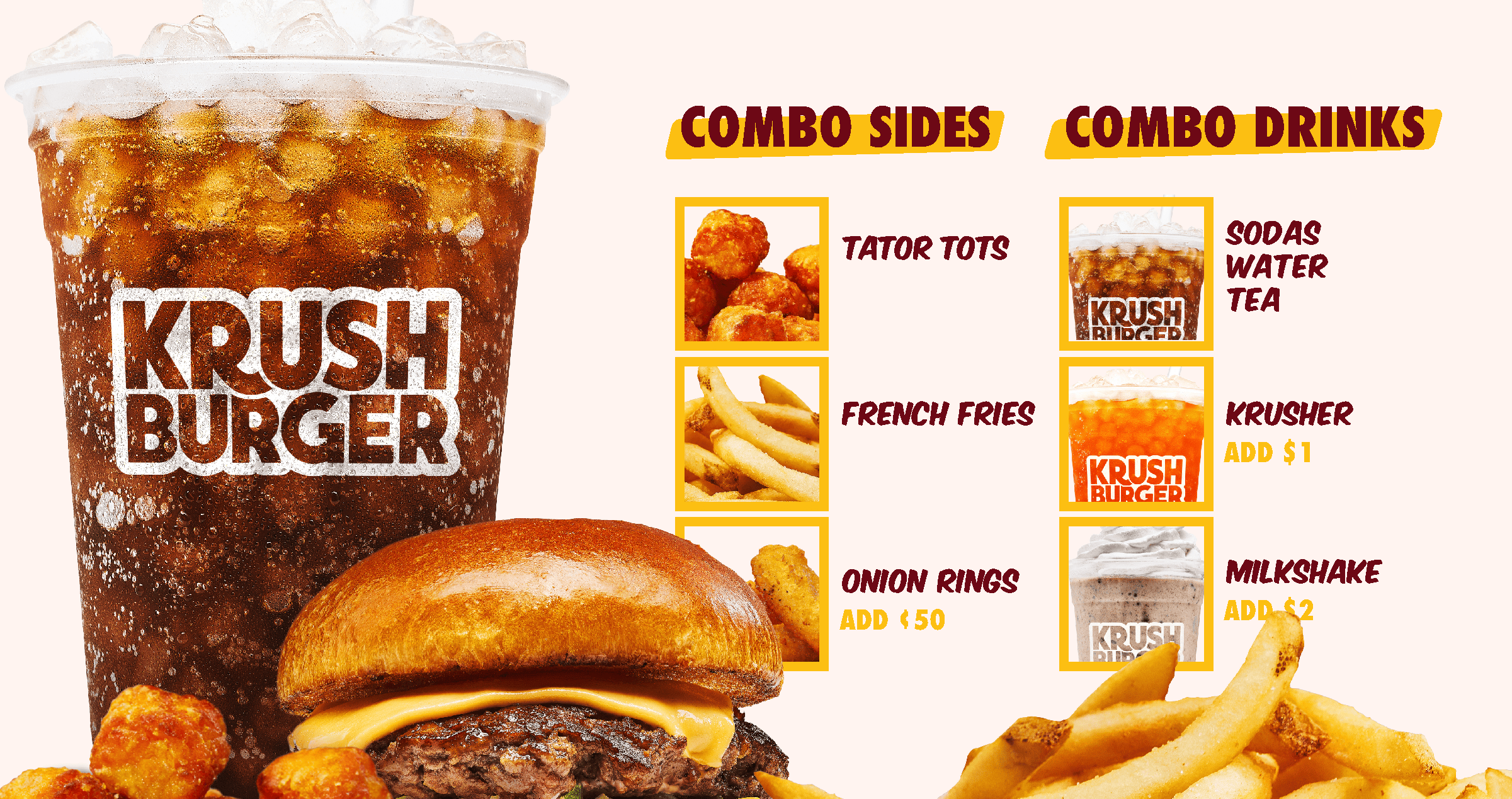
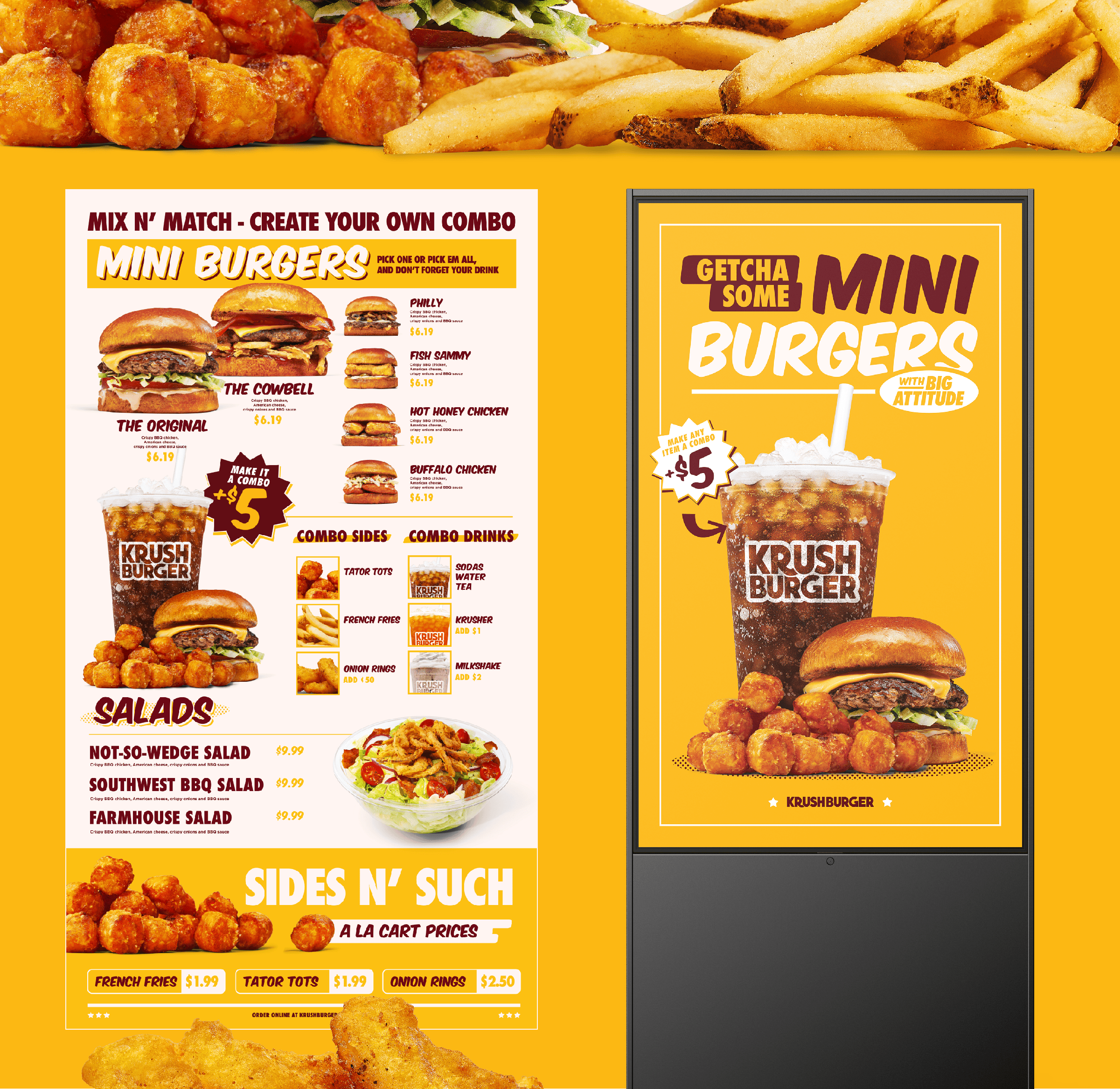
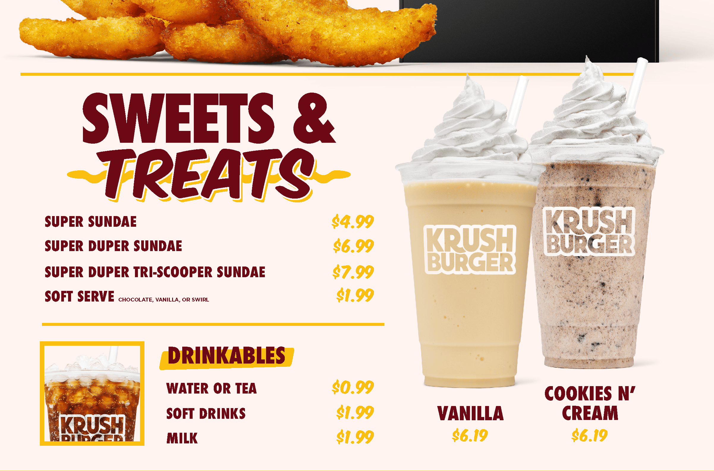
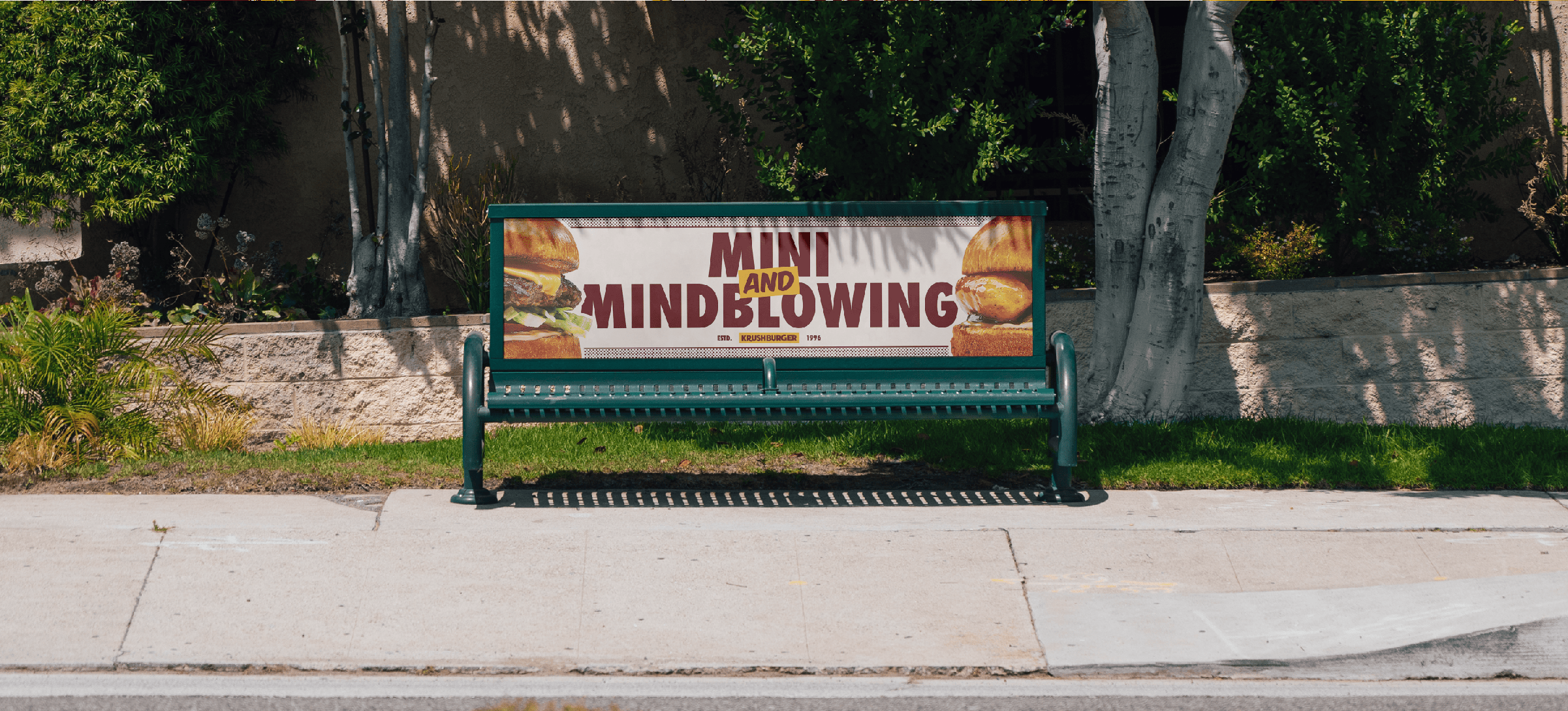
Every rebrand deserves visuals that make people’s stomachs growl, so we handled the food photography in-house with Punchbowl, our sister photography studio— capturing Krush Burger’s new attitude bite by bite. Each shot was built to feel big, glossy, and unapologetically craveable — dripping sauces, shiny buns, and perfect grill marks under dramatic lighting. We wanted the photos to do what great branding should: sell the experience before the first bite. The result is a suite of mouthwatering imagery used across digital, packaging, and ad campaigns that cement Krush Burger as a fast food icon with premium flavor.