Do Be Kind Dispensary
What if a dispensary felt less like a headshop and more like your neighbor’s front porch?
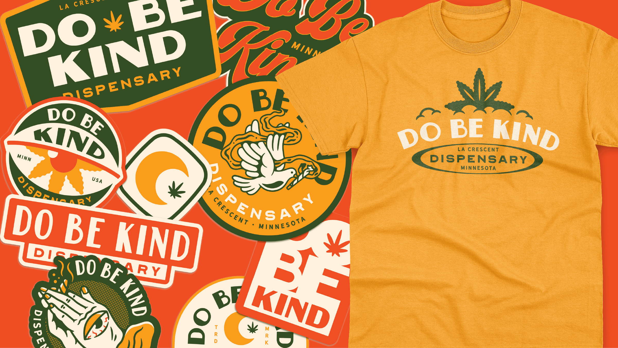
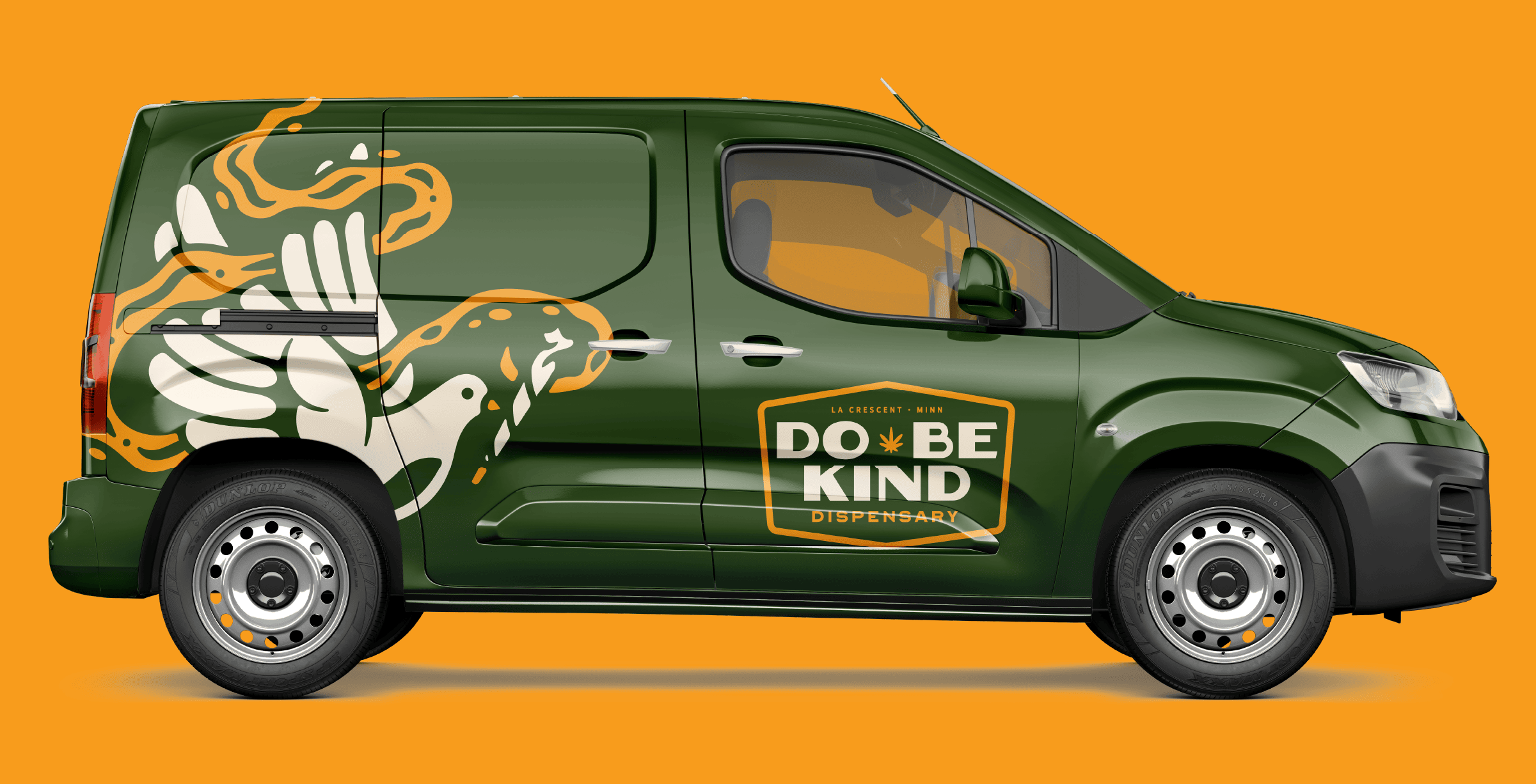
Fried Design Company partnered with Do Be Kind, a boutique cannabis dispensary based in La Crescent, Minnesota, to craft a full-service brand identity that fused Midwestern charm, approachability, and playful sophistication. From naming conventions and logo systems to illustration, tone of voice, and merchandising, this project is a blueprint for how to elevate cannabis branding beyond the expected. We began by grounding the brand in Midwestern values: kindness, loyalty, and comfort. Rather than lean on the familiar stoner archetype or luxury elitism, we positioned Do Be Kind as the friendly neighborhood expert—equal parts welcoming and knowledgeable.
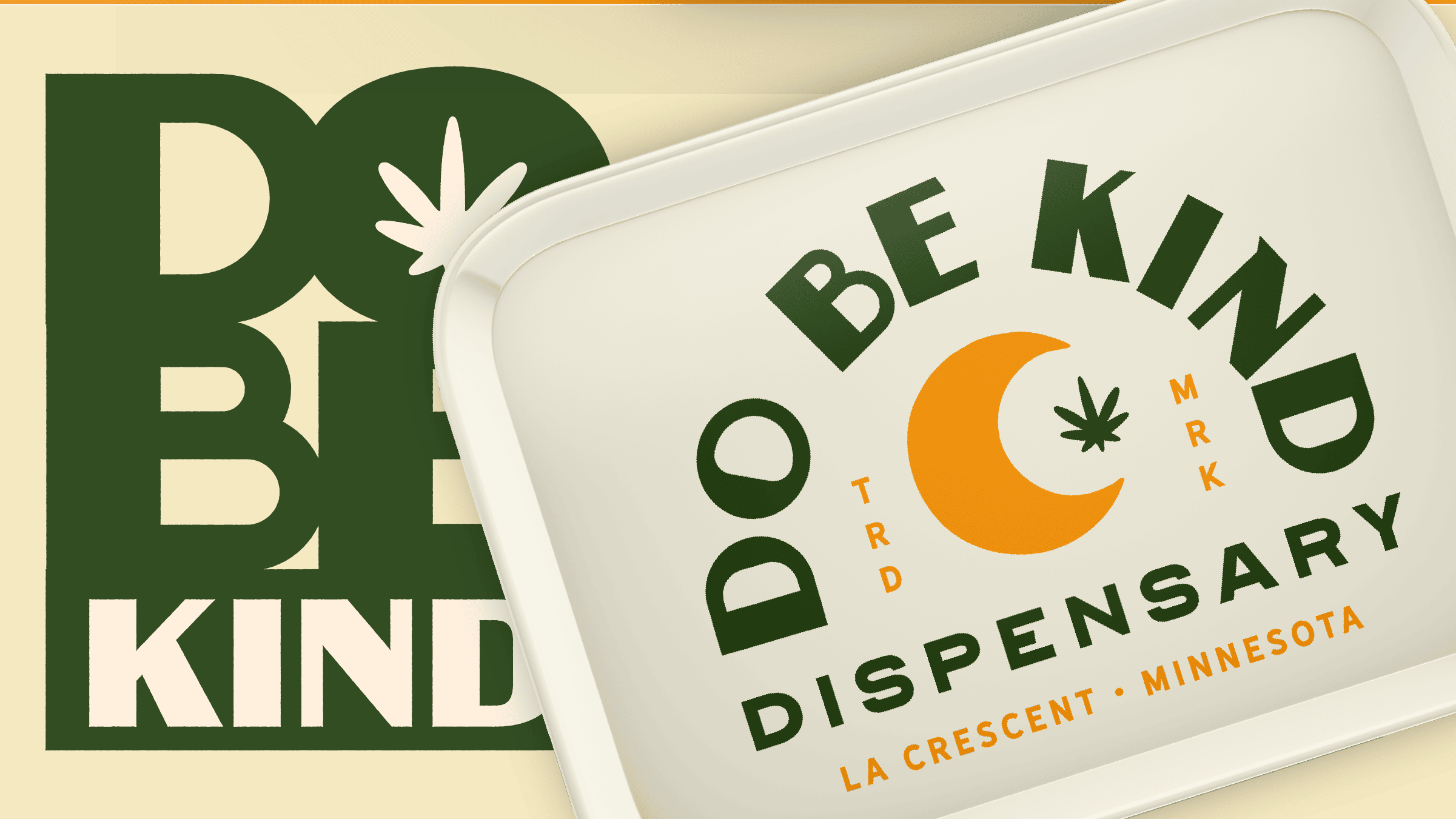
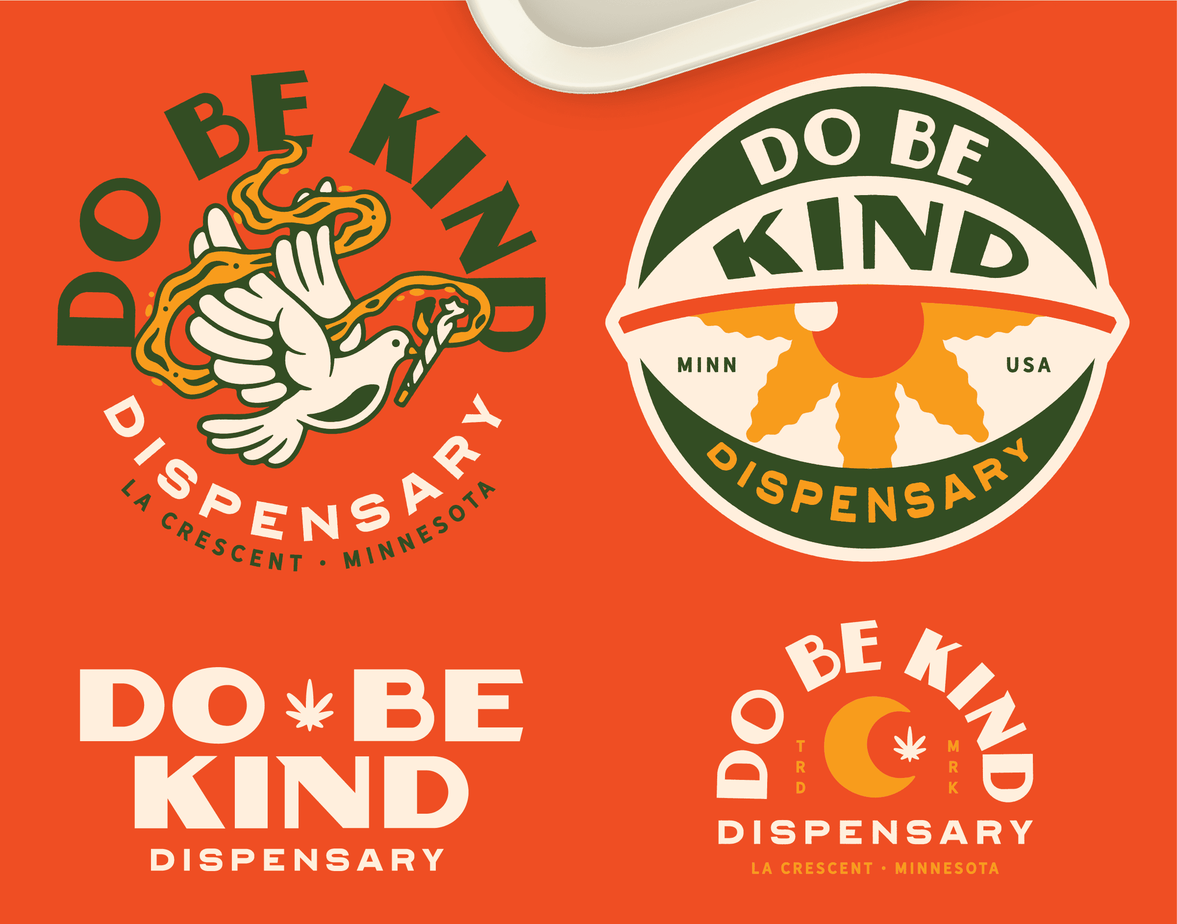
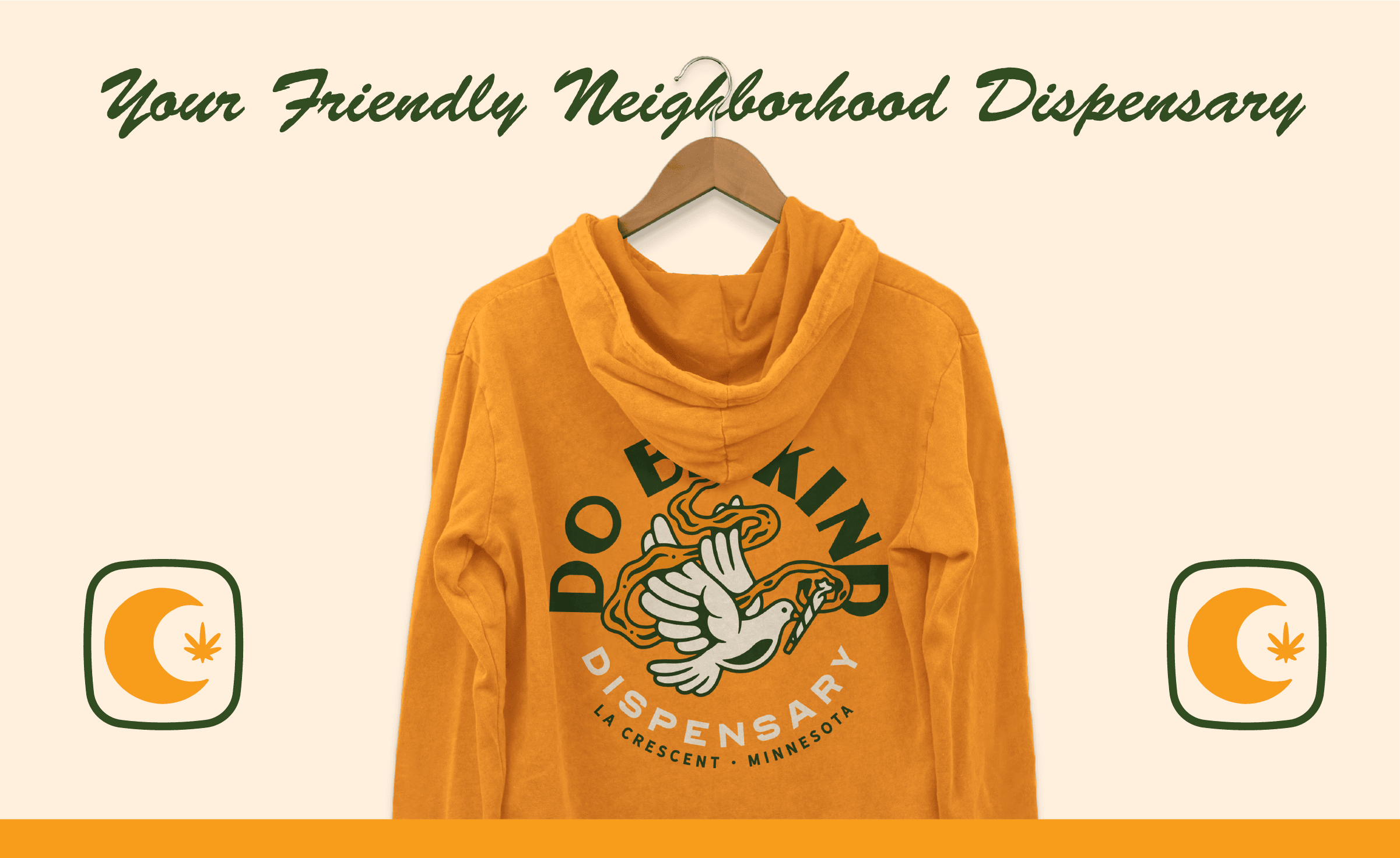
The logo suite was designed with flexibility and personality in mind. The primary mark—a shield-shaped badge—echoes trust and familiarity. A subtle cannabis leaf and custom typography nod to the industry while retaining a timeless, small-town quality. We created a suite of custom illustration badges and character marks—from a glasses-wearing bulldog named Gizmo, to surreal, hand-drawn elements like praying hands with an eye and flying doves wrapped in smoke. These became hero elements across merch, bags, and in-store signage.