Team taco
There’s no I in Team y’all. The folks from Team Taco get it. As a group, they are fun-loving, hard-working culinary geniuses. Individually, they are just real good people. For their logo, we wanted to pay a slight tribute to vintage sports teams script logos, but with a modern feel to it.
Services
Awards
Gold American Advertising Award
Judges Choice American Advertising Award
Share this page
Insight
Team Taco is four people running a taco operation that punches way above its size, a big personality crammed into a little space. The name was the gift: it already said "team," which pointed straight at a world nobody in the taco category was using. Most taco branding reaches for the same cactus-and-serape clip art. Team Taco had a built-in angle hiding in its own name, if the brand was willing to fully commit to it.
Solution
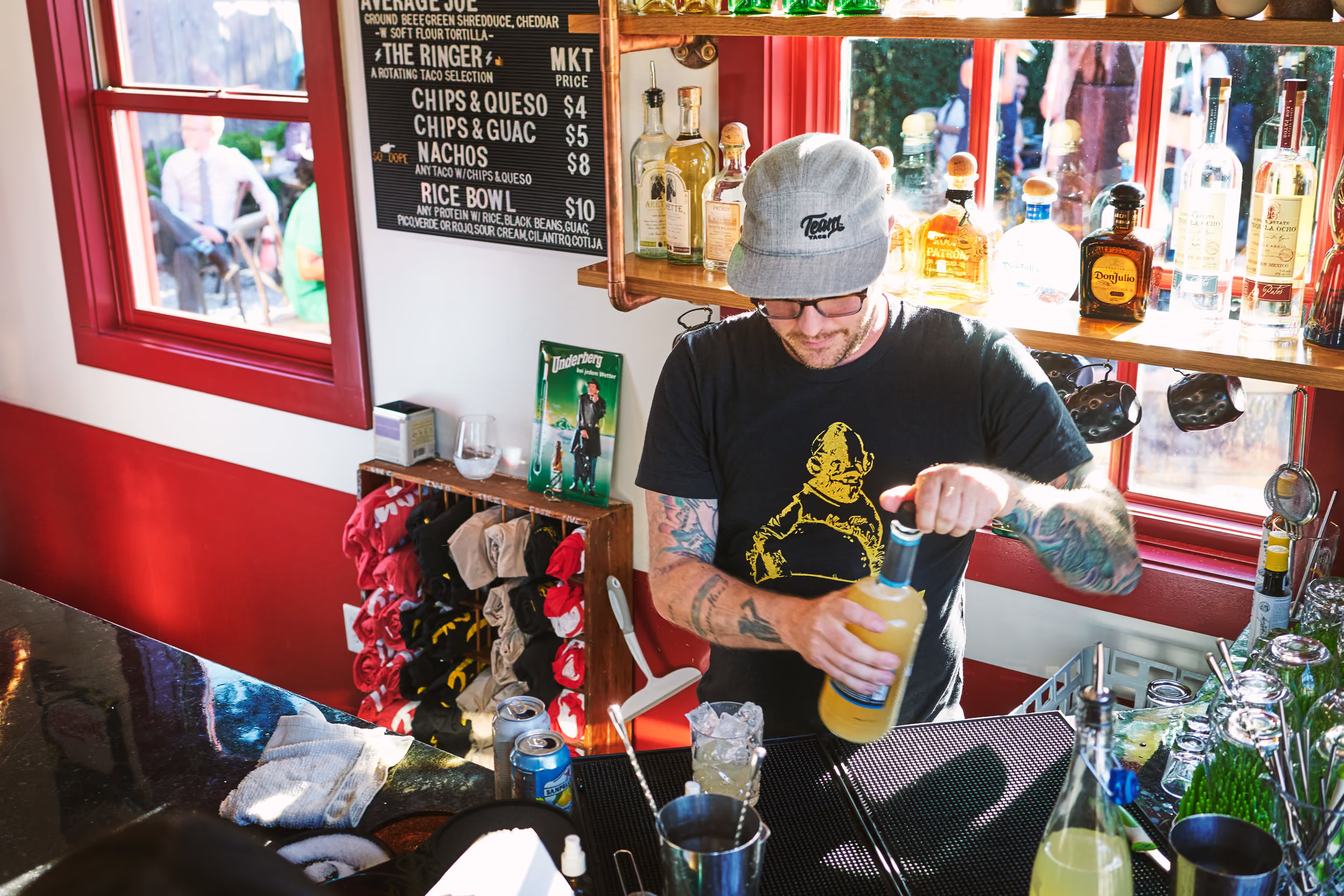
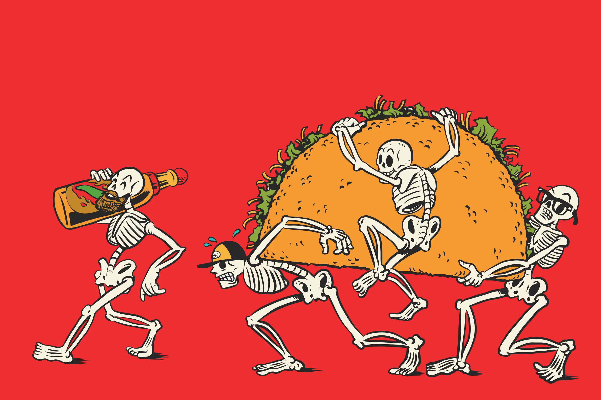
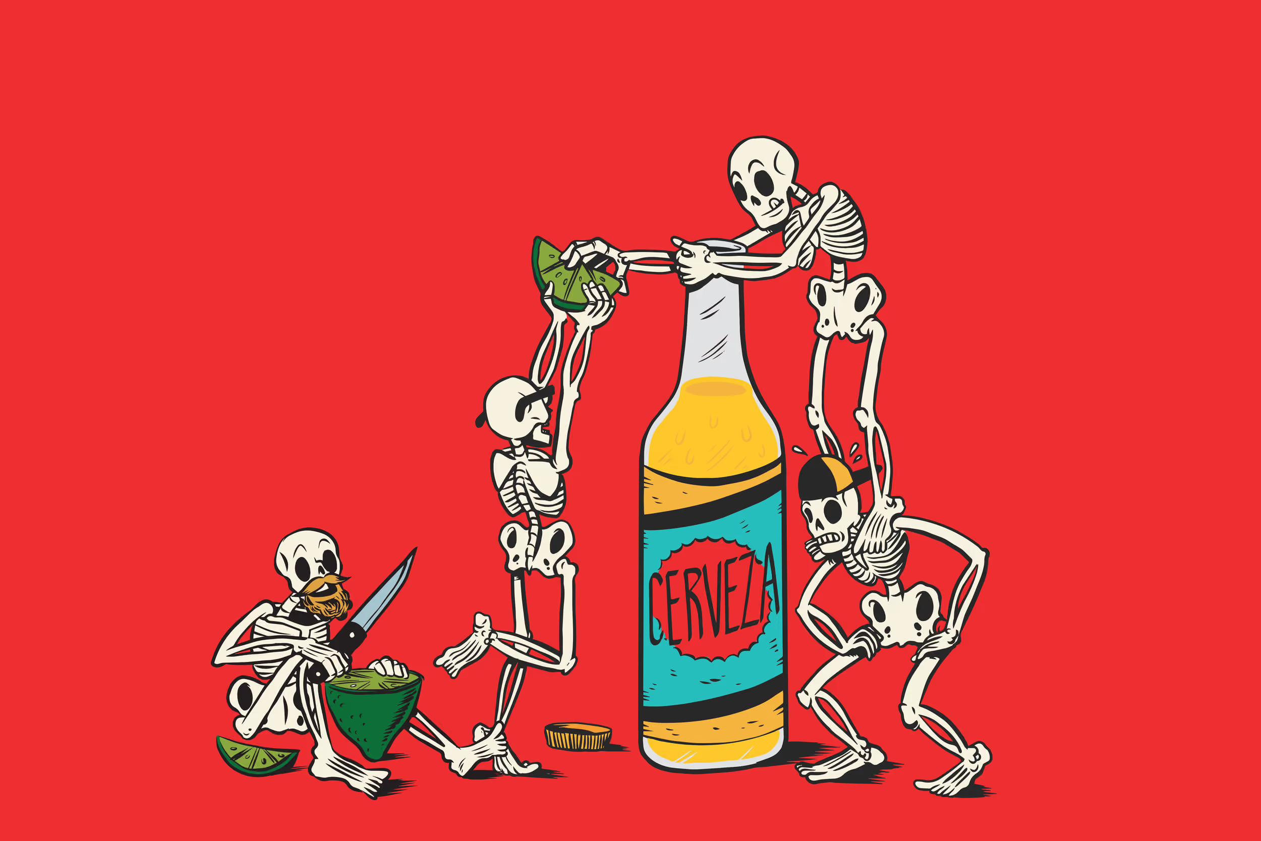
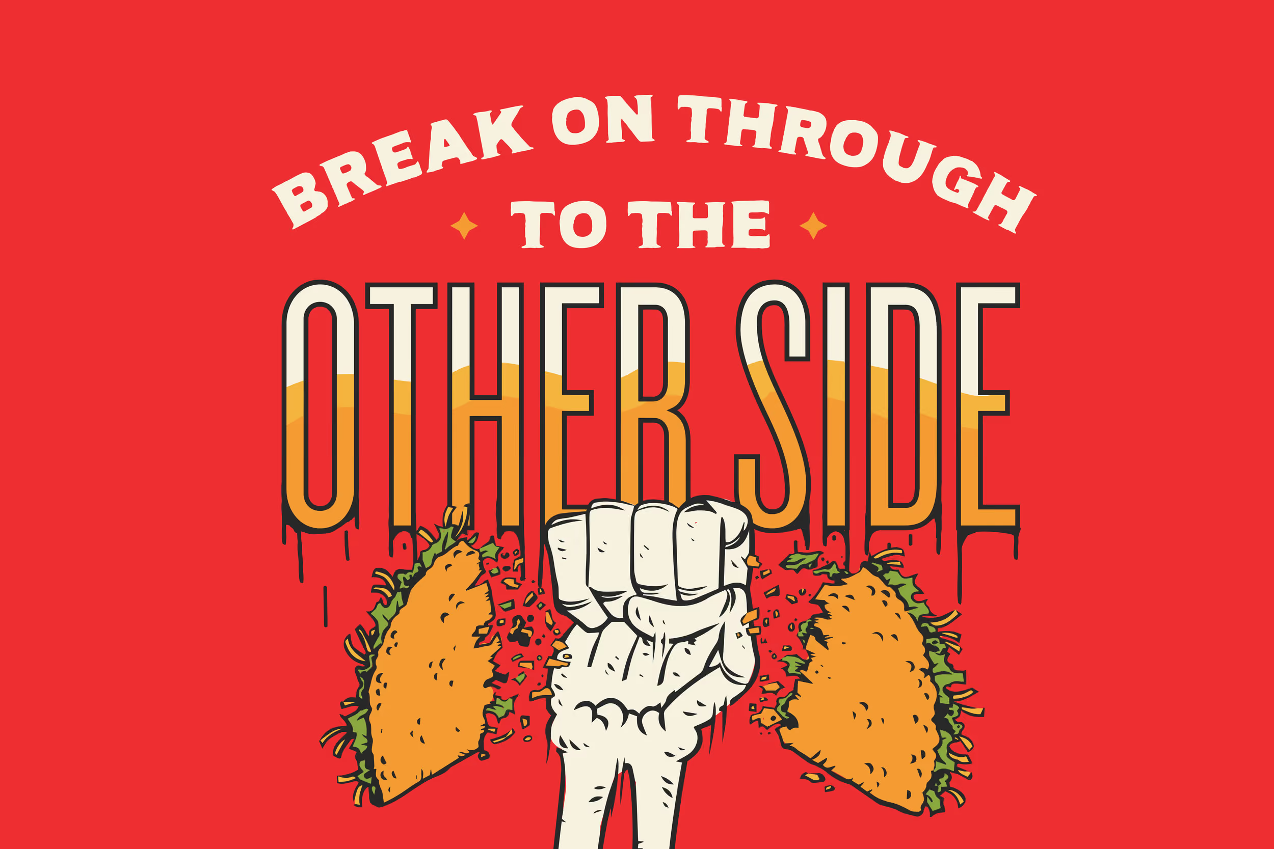
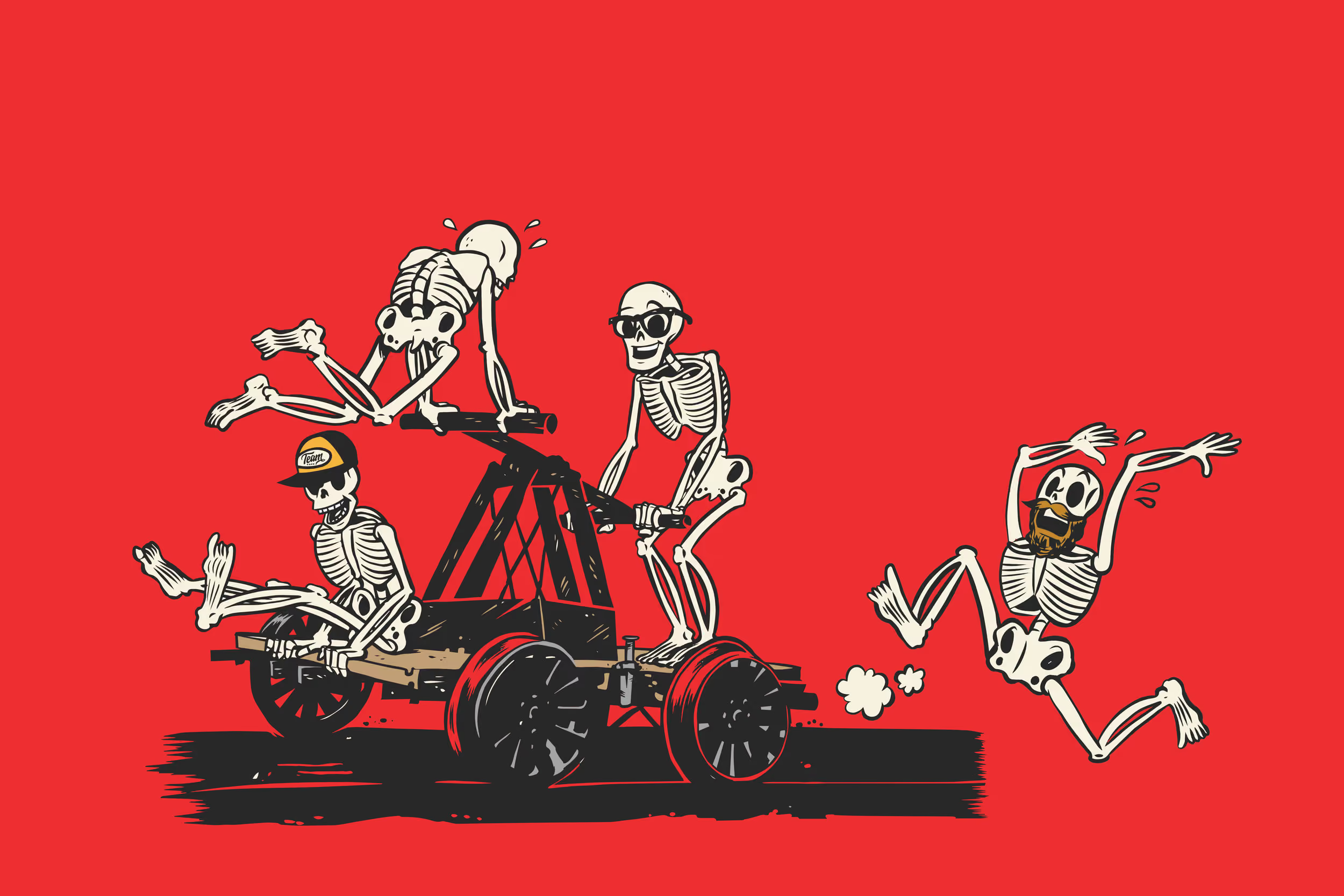
We ran with the name and built Team Taco like a sports franchise. A vintage-inspired script logo, the kind you'd see stitched on an old baseball jersey, gave a tiny taco spot the swagger of an established club, with a modern edge so it didn't read as costume. Then we gave the team a team. The Skeleton Crew, four mascot characters paying homage to the four founders who run the place thin and make it look easy, became the personality across menus, signage, and merch. We even wrapped their pop-up trailer in the crew so everyone knows the party's arrived when it pulls up. Every touchpoint got the same considered treatment, so a four-person shop felt like a brand with a whole roster behind it. The result took a small taco joint and gave it the identity of a team worth rooting for.

Explore more work