Cherry Picker
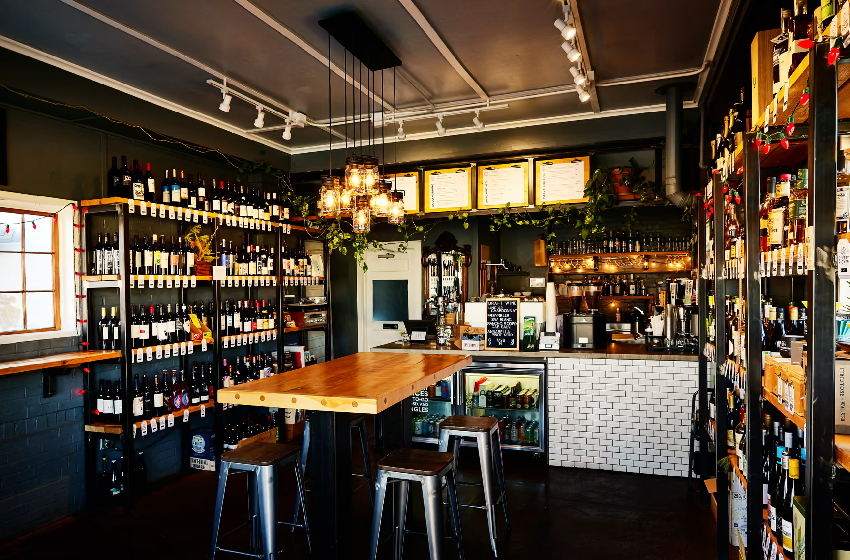
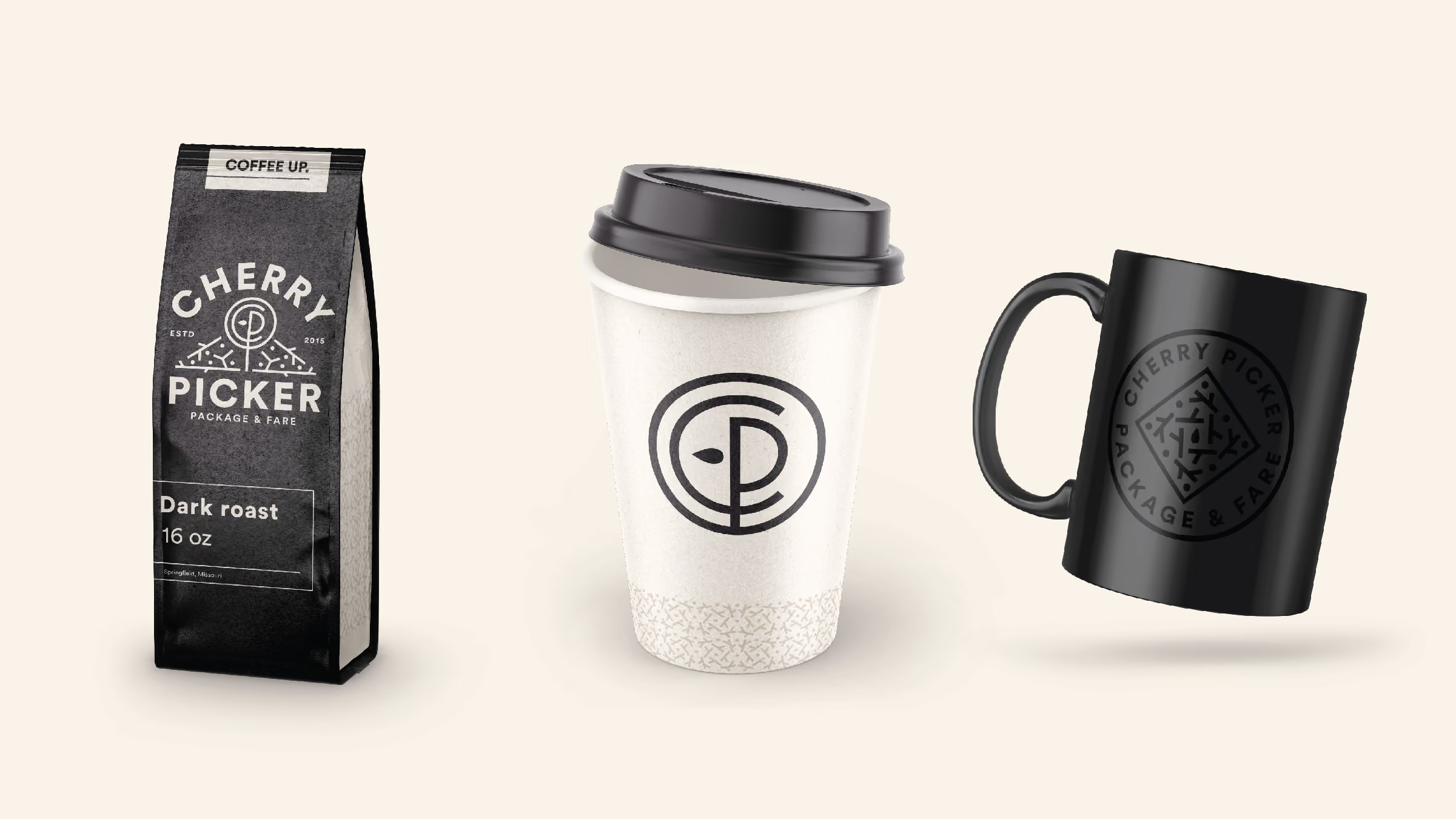
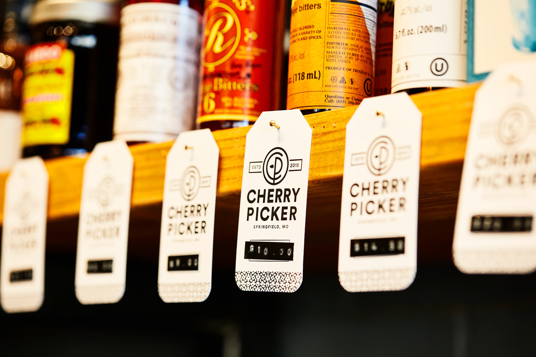
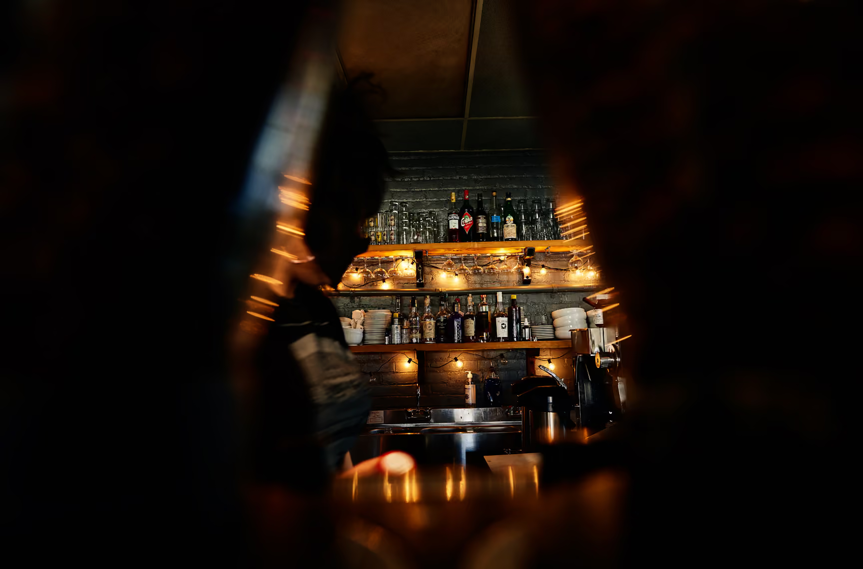
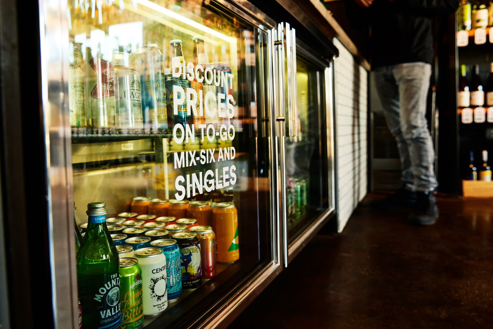
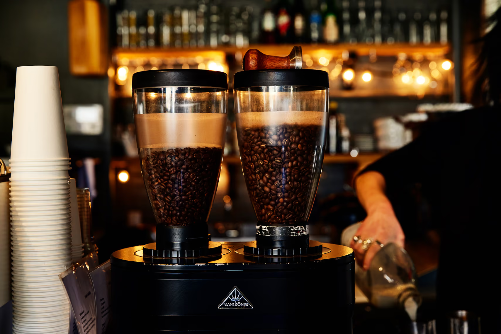
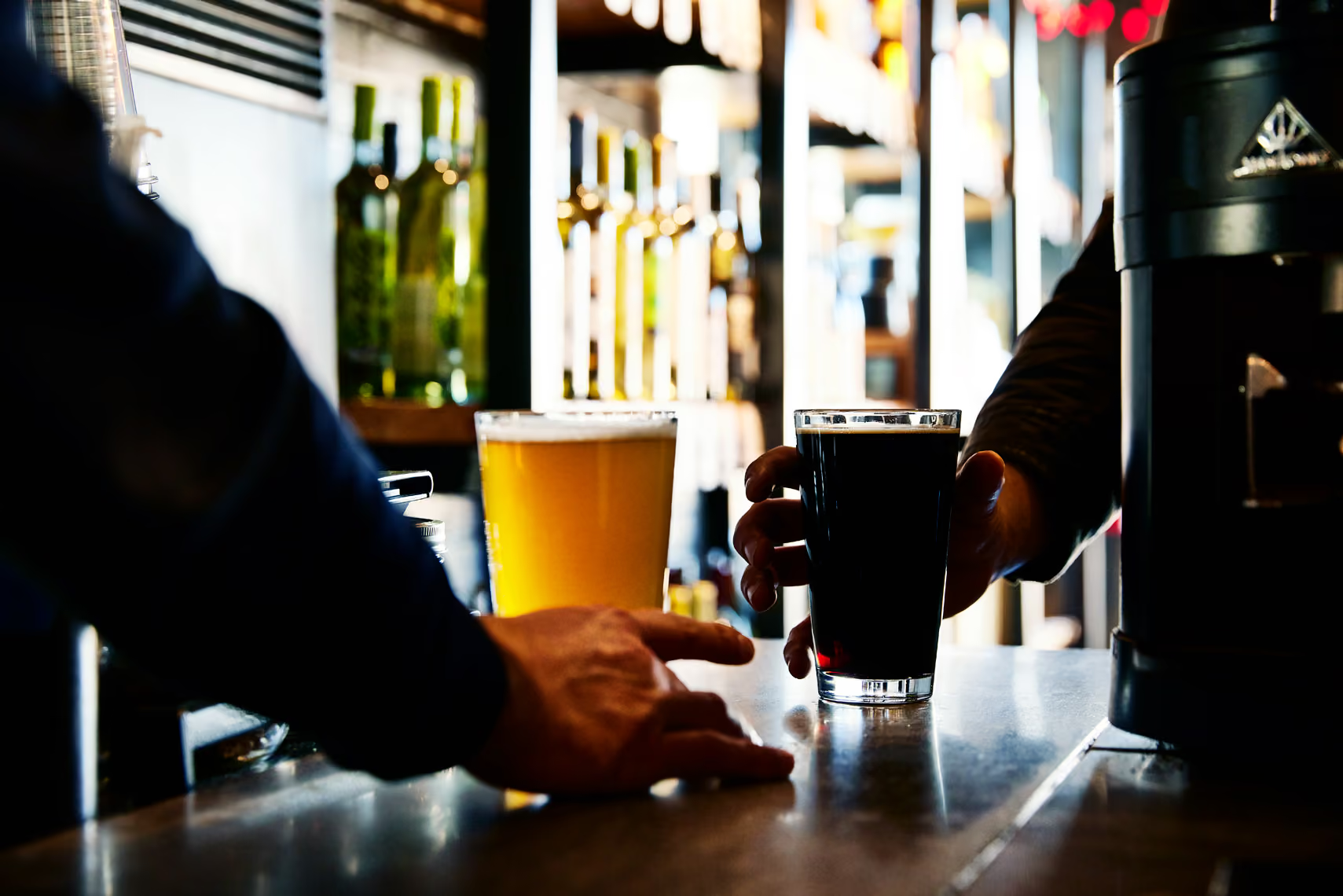
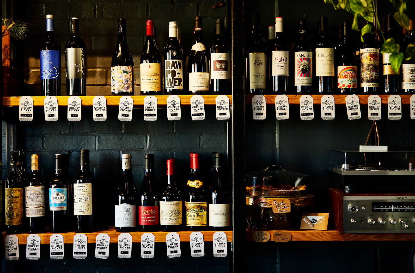
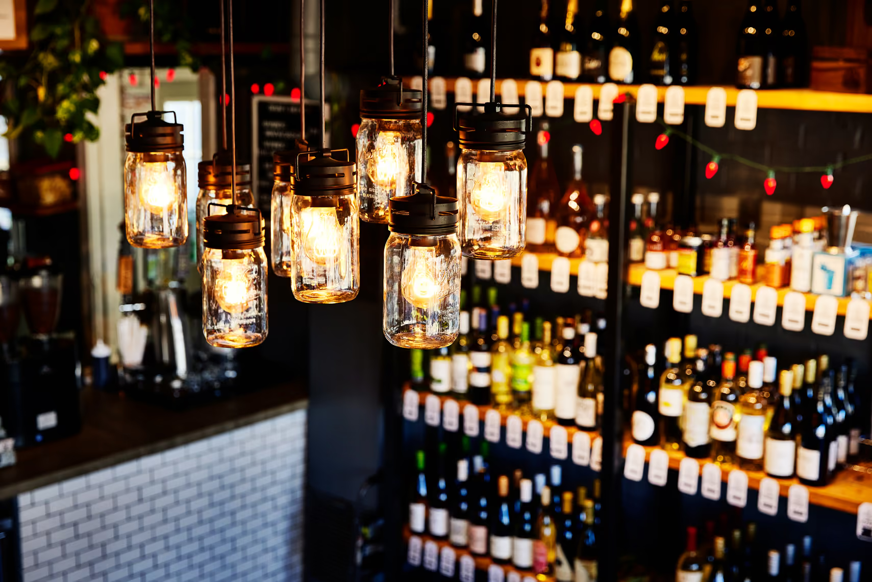
Cherry Picker is a central Springfield, MO. staple. Part coffee shop, part bar, part liquor store, all local gem. The owners came to us to breathe a little fresh air into the place - help bring the brand into the future and maybe even build something for future locations.
Services
Share this page
Insight
Cherry Picker is a lot of things at once, part coffee shop, part bar, part liquor store, and a central Springfield favorite that people already loved. That combination makes it a hard rebrand. The brand had to tie three different businesses into one identity, do it without alienating the regulars who made the place a local darling, and somehow help a tiny footprint punch above its size, with an eye toward future locations. Freshening up a beloved spot is delicate work: change too much and you lose the equity, change too little and nothing moves.
Solution
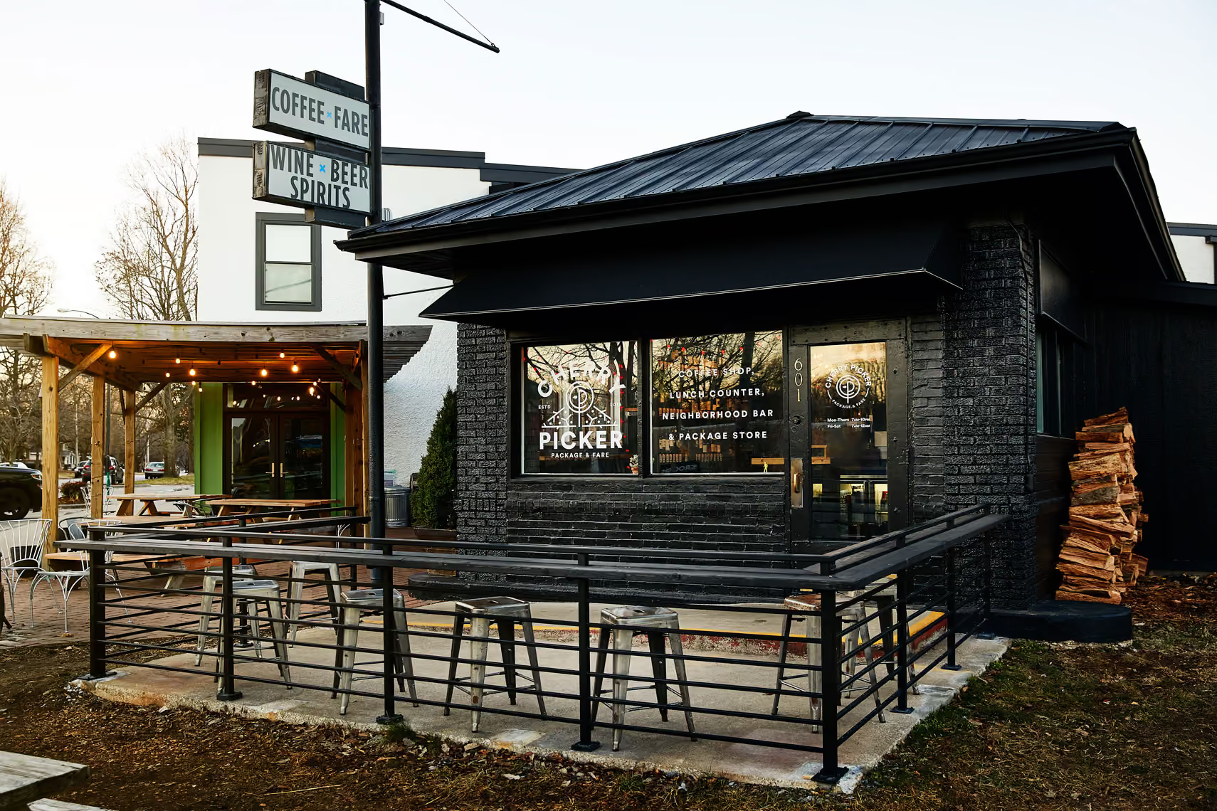
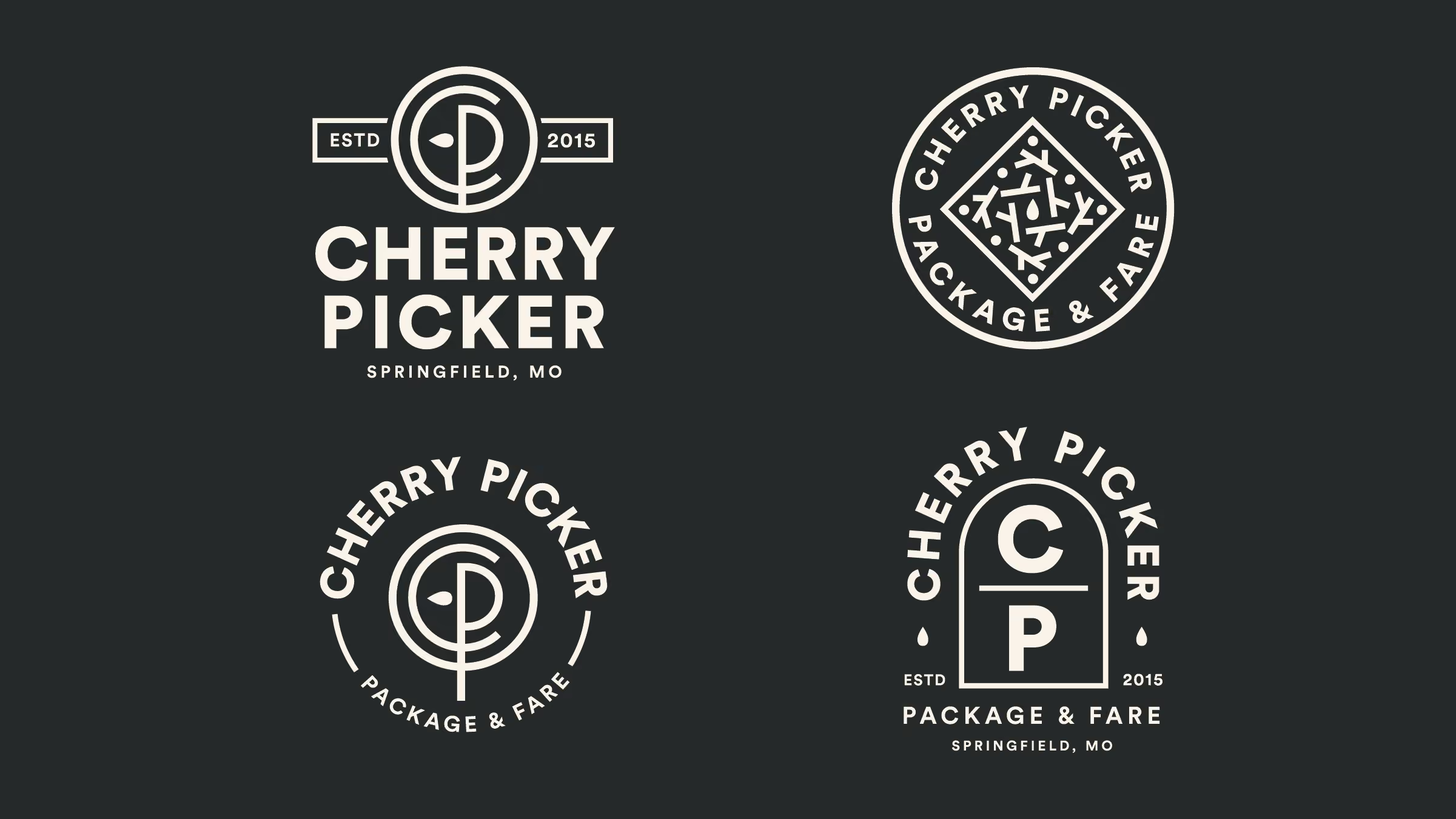
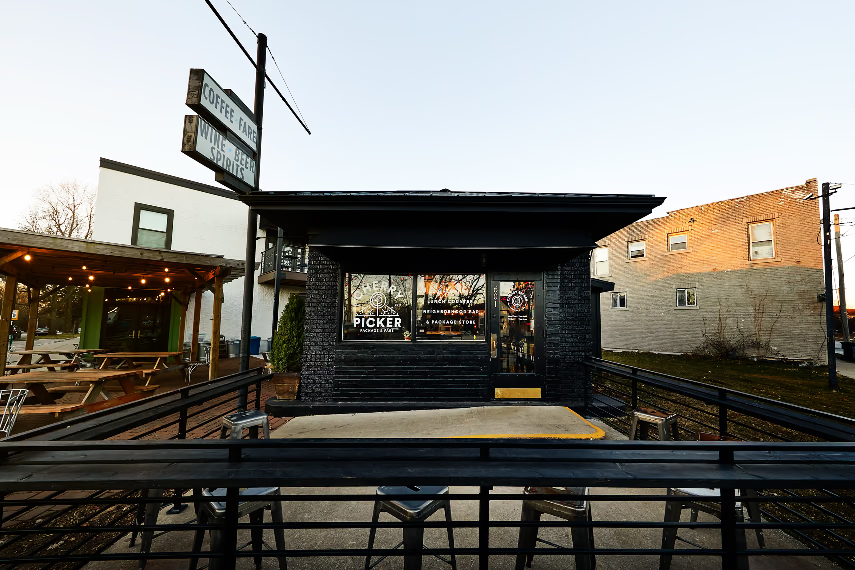
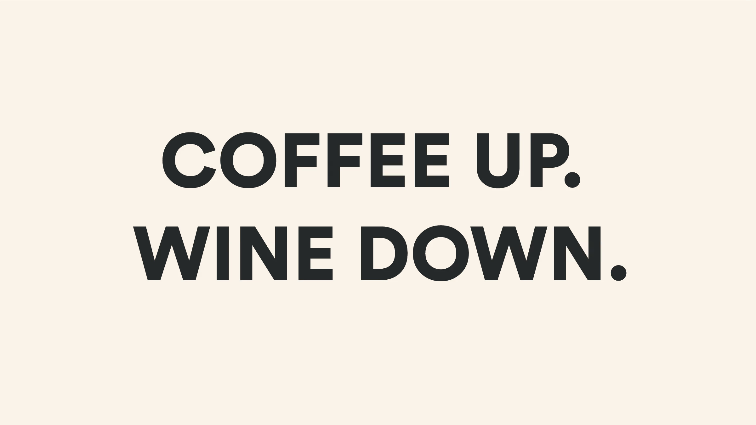
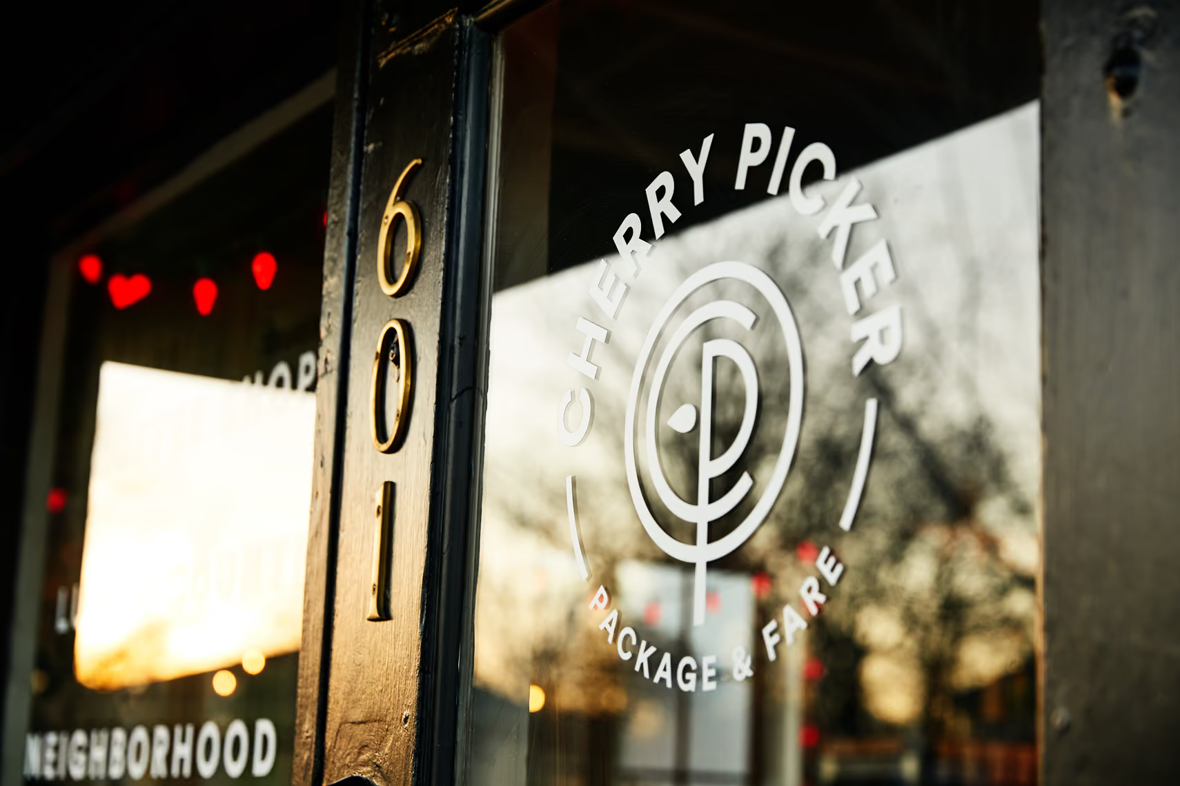
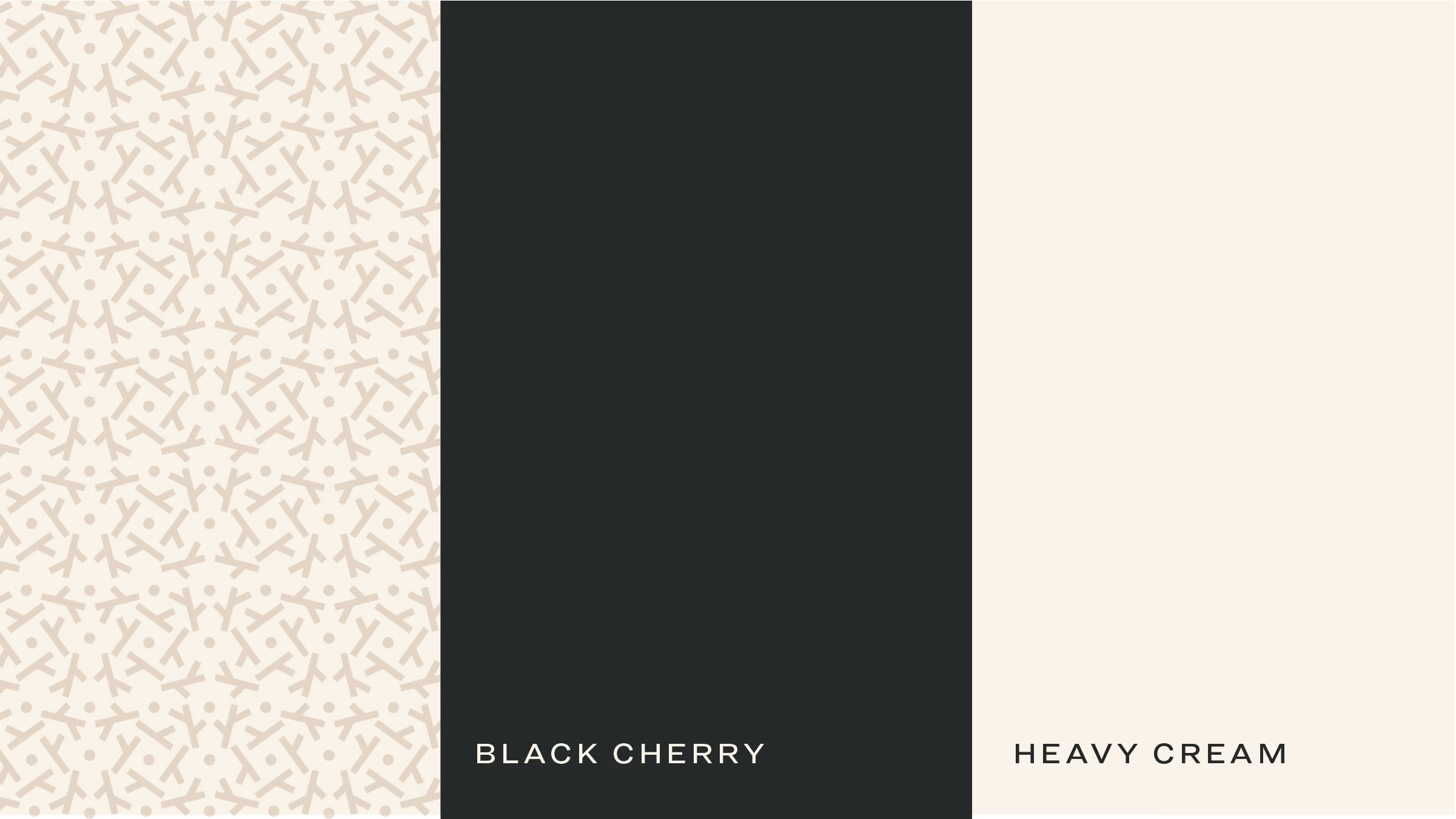
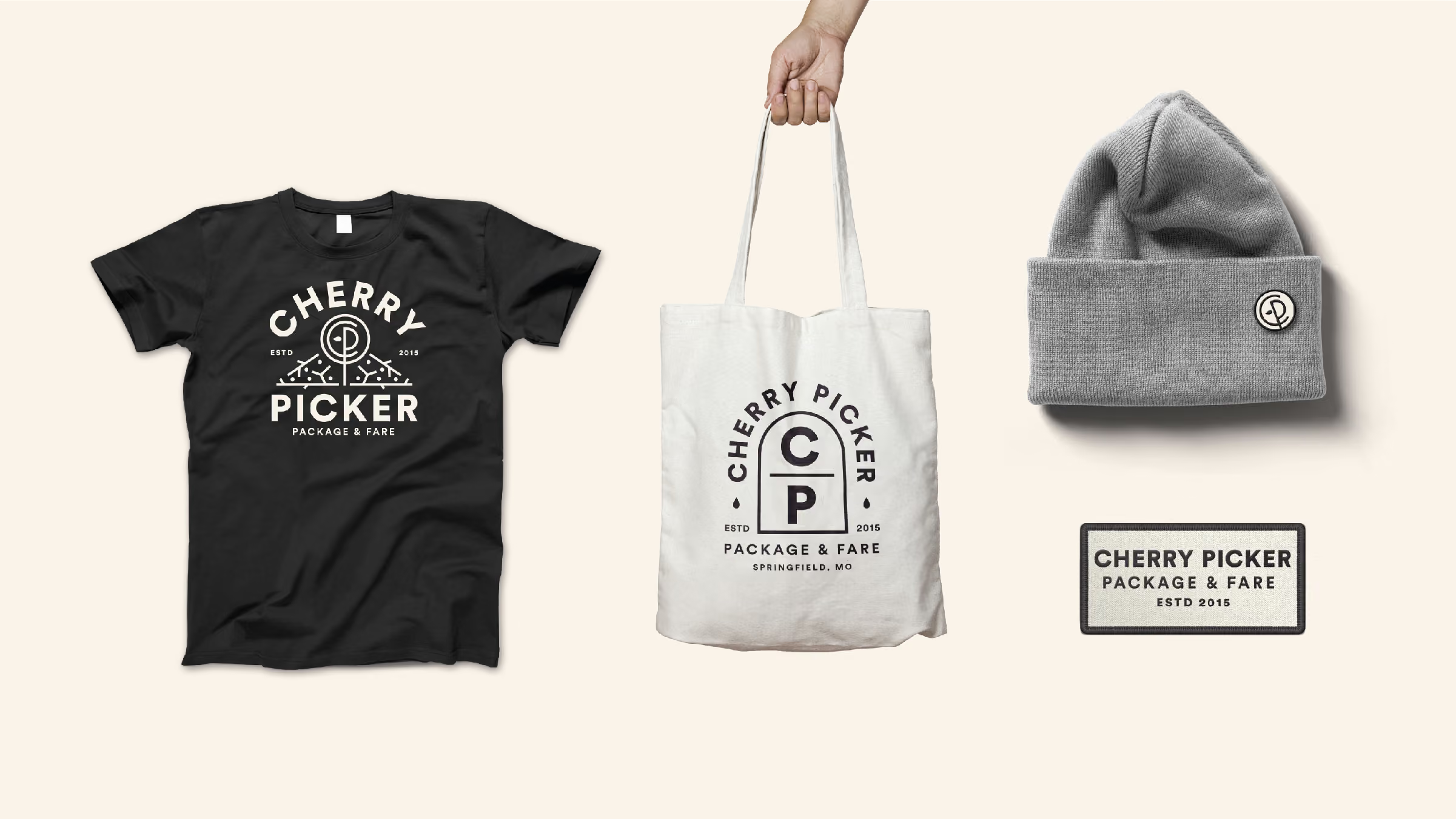
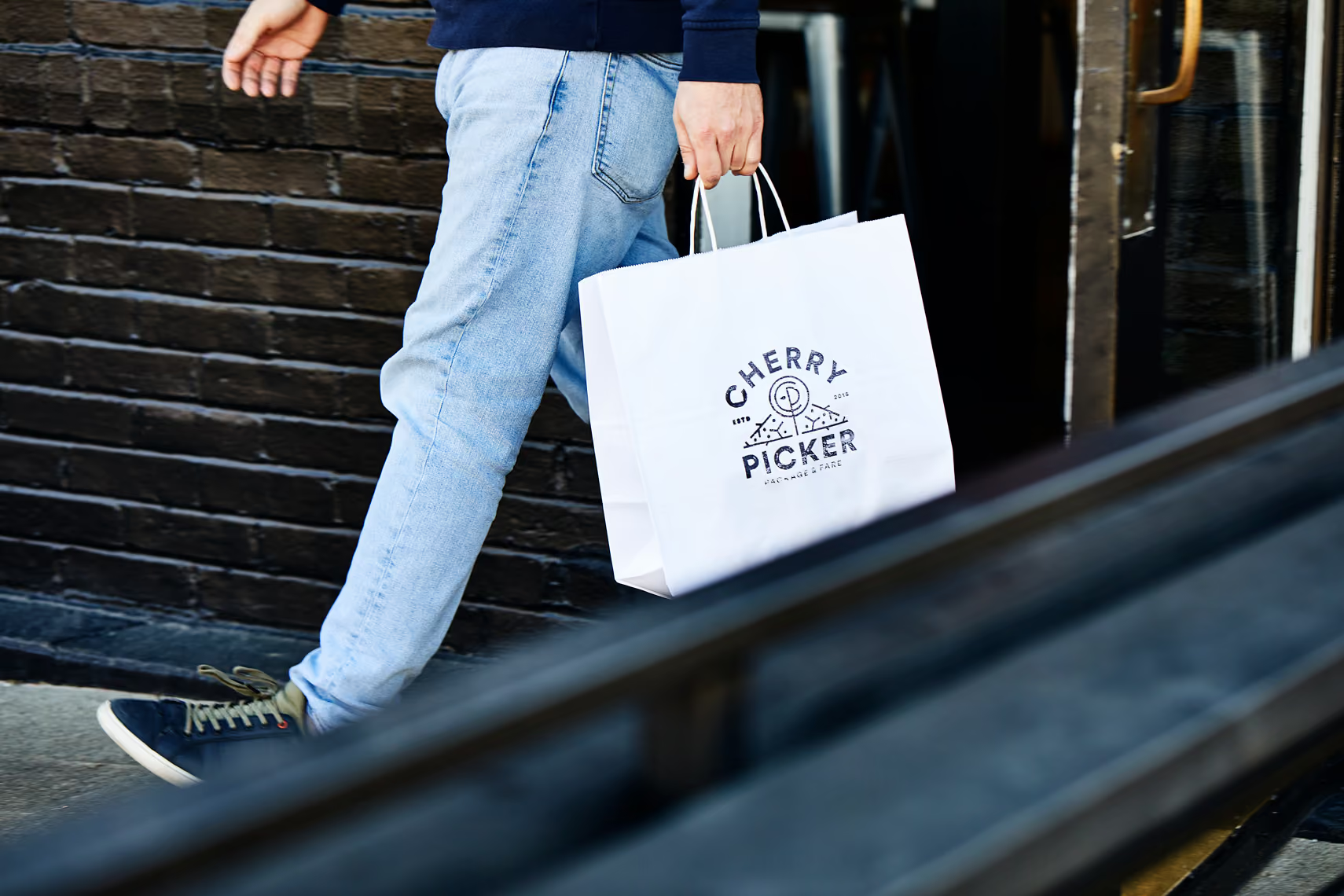
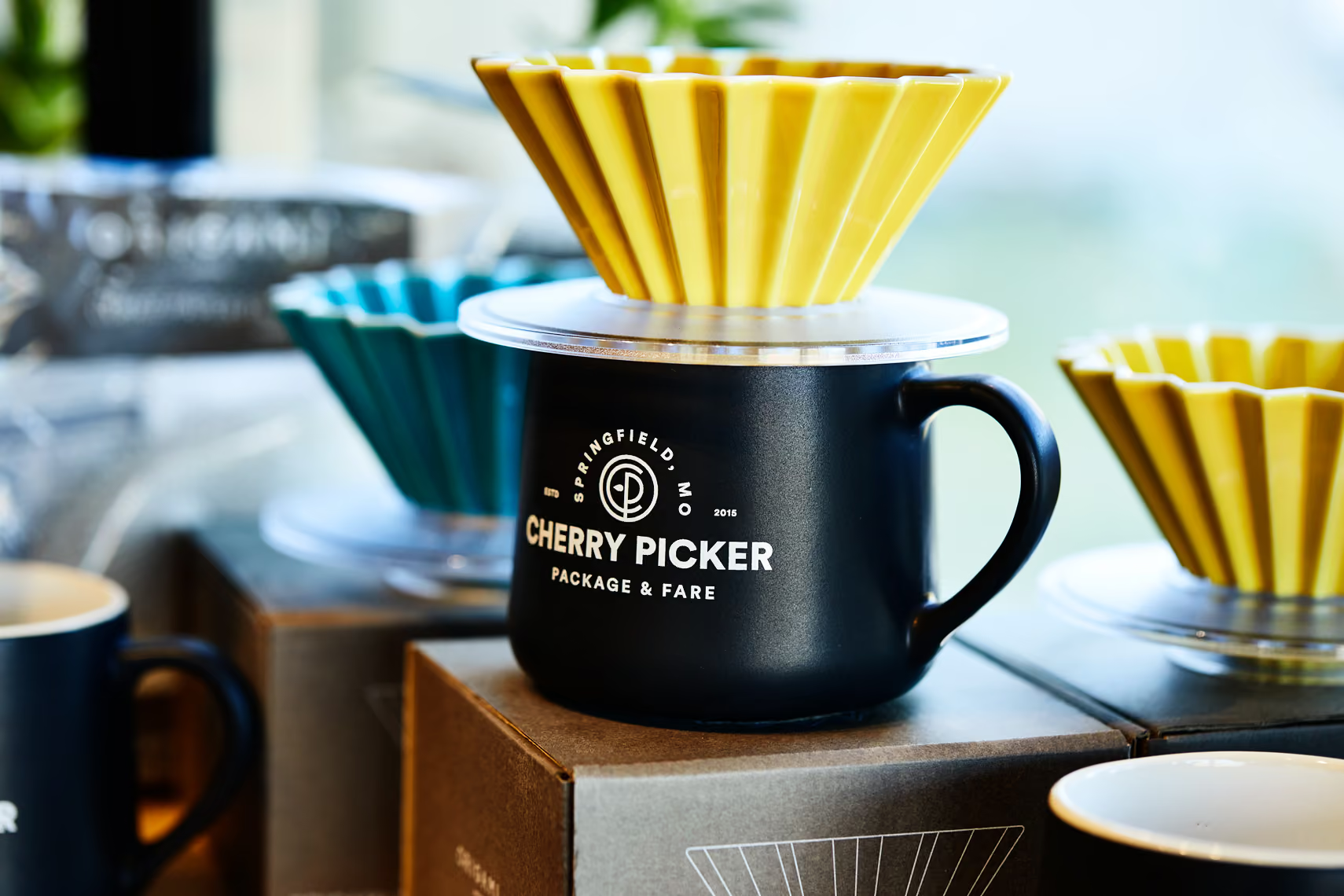
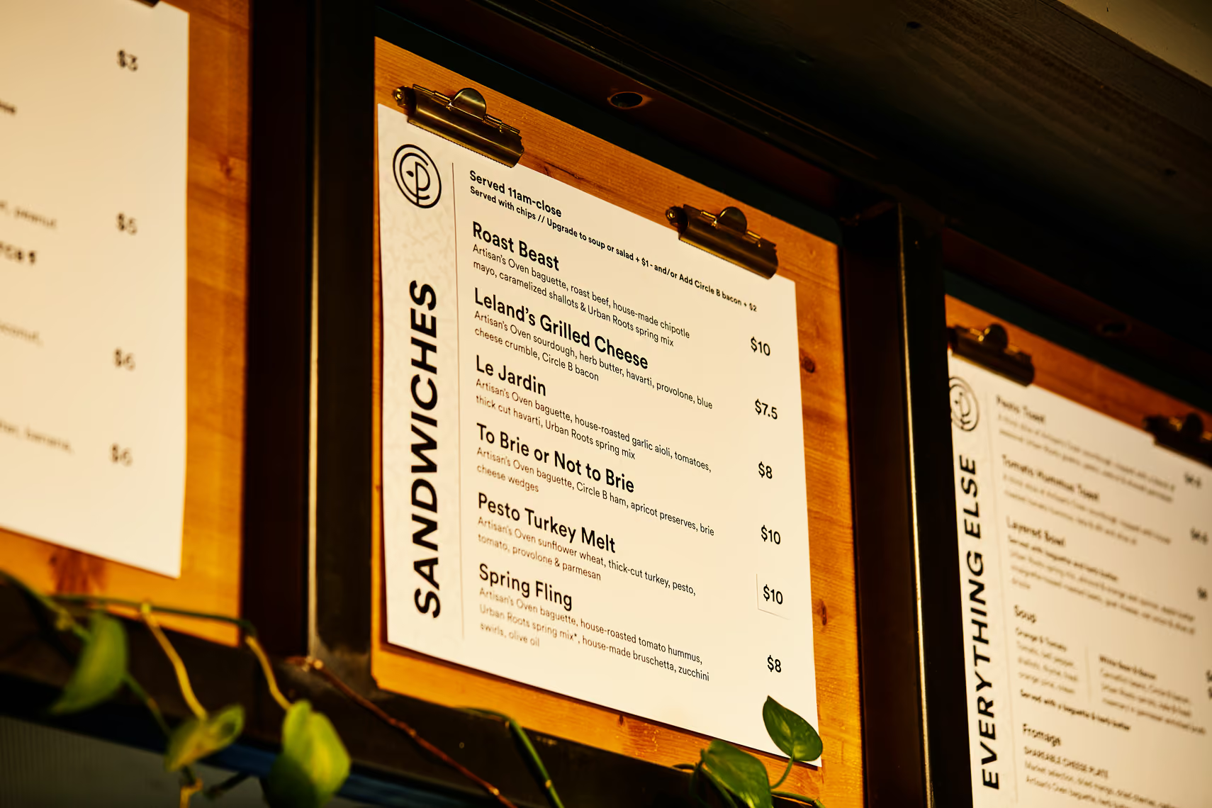
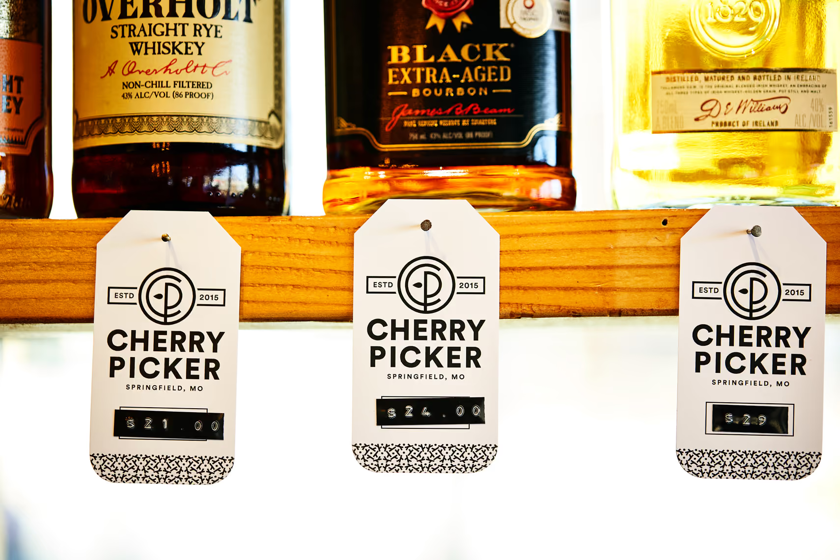
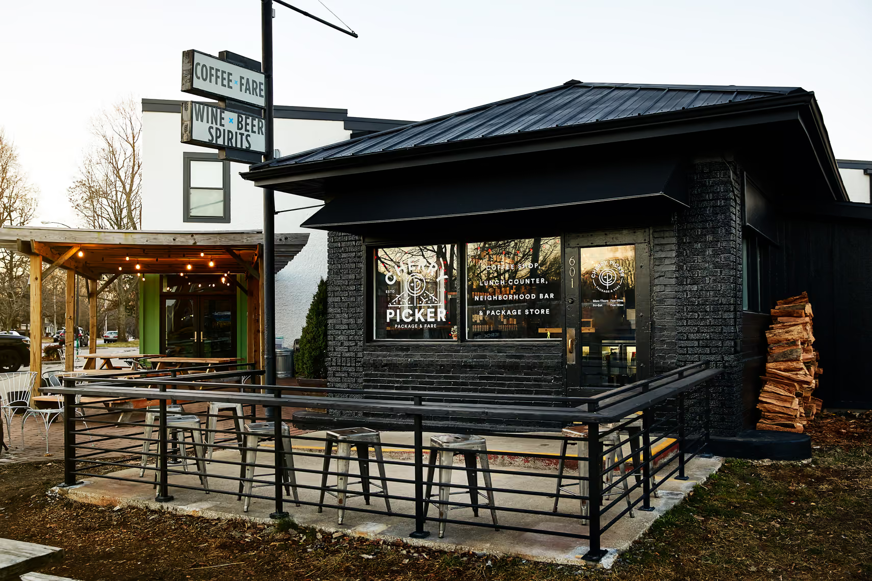
We took the best of the equity Cherry Picker already had and sharpened it into a cohesive brand, a new logo, taglines, and graphics that let a coffee-bar-liquor hybrid feel like one confident place instead of three. The boldest move was physical. We painted the old red-and-green building matte black, turning a small storefront into something you can't drive past without noticing. It's the whole strategy in one gesture: take a tiny spot and make a huge impression. The system was built to travel too, structured so it could carry into future locations without falling apart. The result modernized a local staple, kept everything regulars loved about it, and gave a small corner shop the presence of a real brand.
Explore more work