Wink
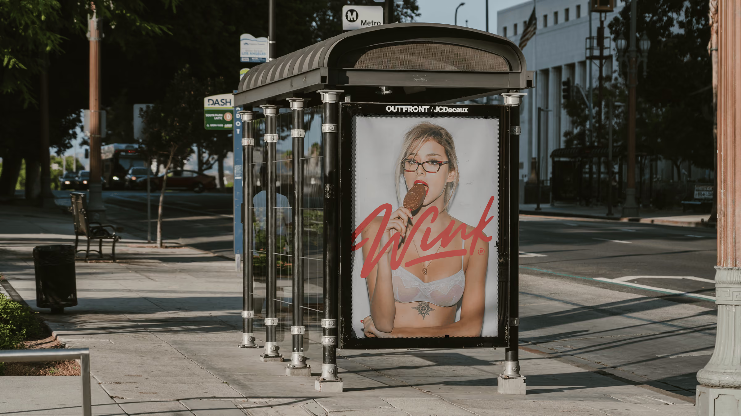
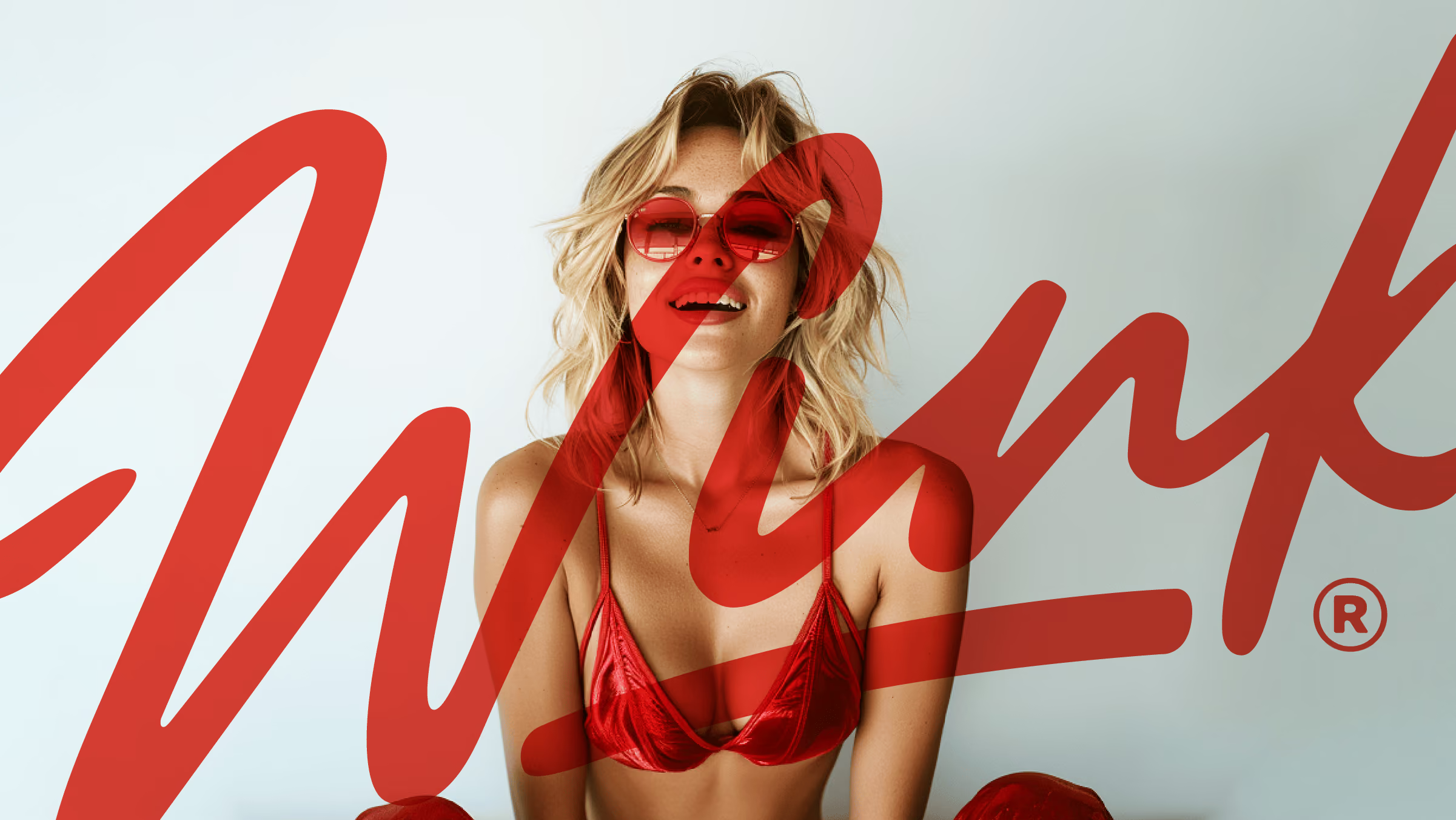
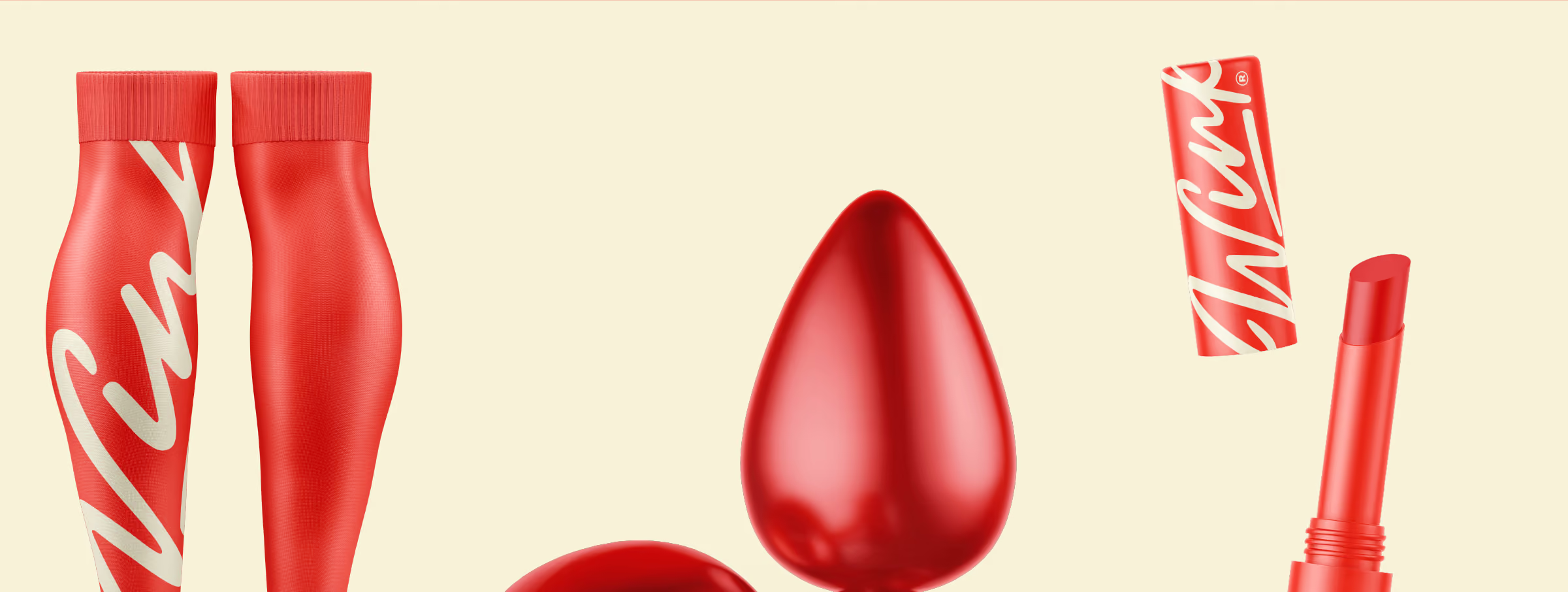
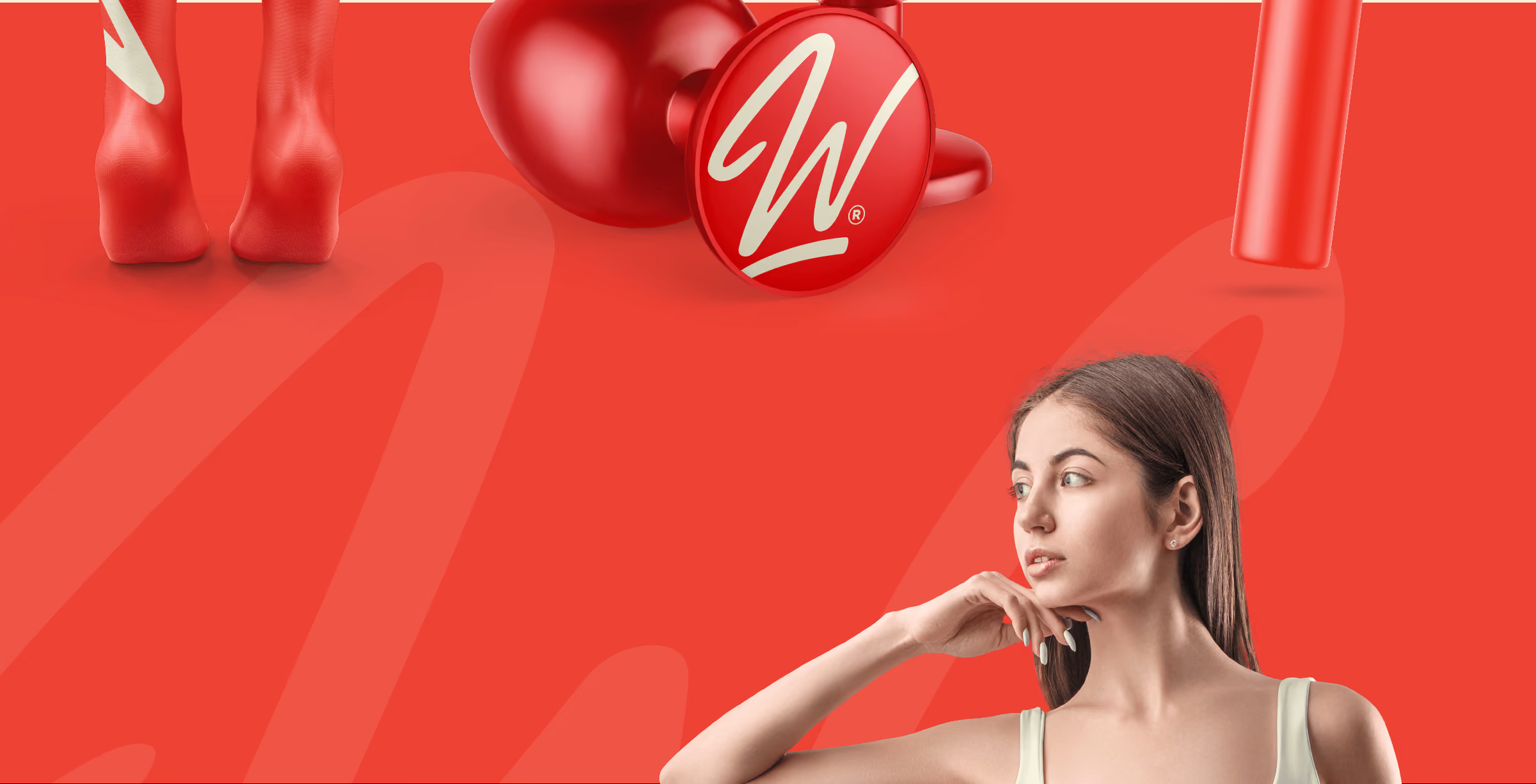
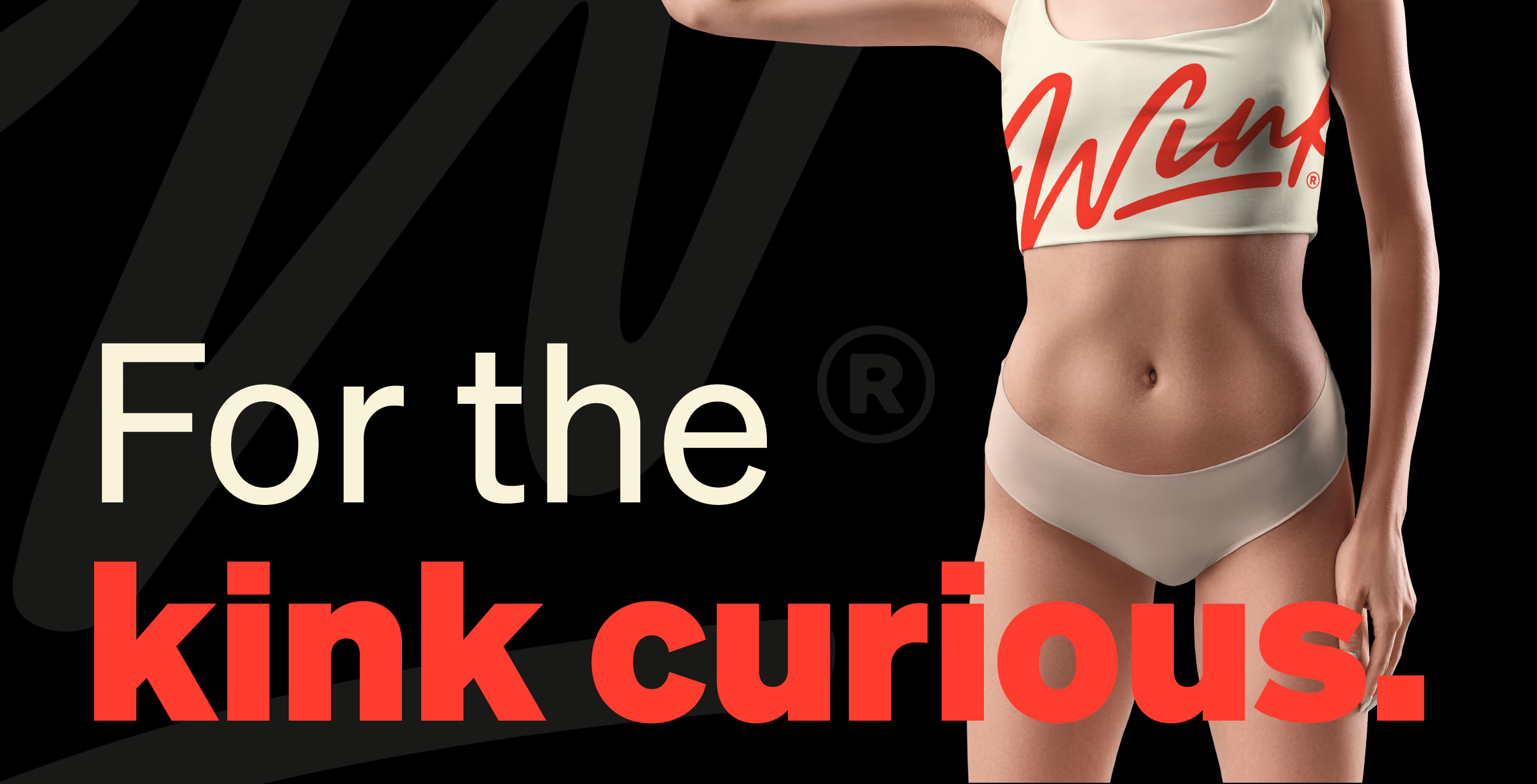
In a saturated market of content platforms, Wink faced the challenge of standing out and attracting both creators and consumers in the adult entertainment space. Our solution was to develop a brand strategy as bold and unapologetic as Wink's creators. We embraced a cheeky approach, creating a visual identity that winked at the audience with playful illustrations and a color palette that screamed "fun" rather than "seedy." Empowering creators was at the forefront of our strategy, positioning Wink as the platform where individuals could truly express themselves. We used taglines like "Come As You Are" and "Made To Be Watched" to drive this message home.
Share this page
Insight
The adult content space has a branding problem it rarely tries to fix: almost all of it looks seedy, and most of it treats creators as product rather than people. Wink was entering a crowded market and needed to win two audiences at once, creators deciding where to build their business and users deciding where to spend their time. The opening nobody had taken was to look like fun instead of shame, and to put the creator, not the content, at the center. The challenge was building something bold and unapologetic that still read as safe, welcoming, and genuinely on the creator's side.
Solution
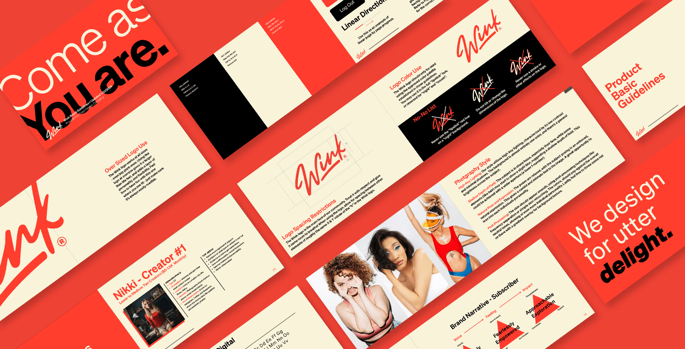
We built Wink around a simple, disarming idea: come as you are. Playful, not seedy. A platform that felt like a wink instead of a back alley. The visual identity leans into cheeky, illustration-forward design and a palette that reads fun rather than sketchy, deliberately breaking from everything else in the category. The voice matched it, taglines like "Come As You Are" and "Made To Be Watched" that were confident and lighthearted without tipping into crude. Because tone is everything in a space like this, we built voice guidelines that kept every message playful and safe at once, so the brand could be cheeky without ever being creepy. The whole system positioned Wink as a community where creators run the show, not just another platform hosting content. The result carved out real space in a saturated market: a brand that made both sides feel welcome, and turned a crowded, seedy category into somewhere that actually looked like fun.




Explore more work