El Tamale Drip
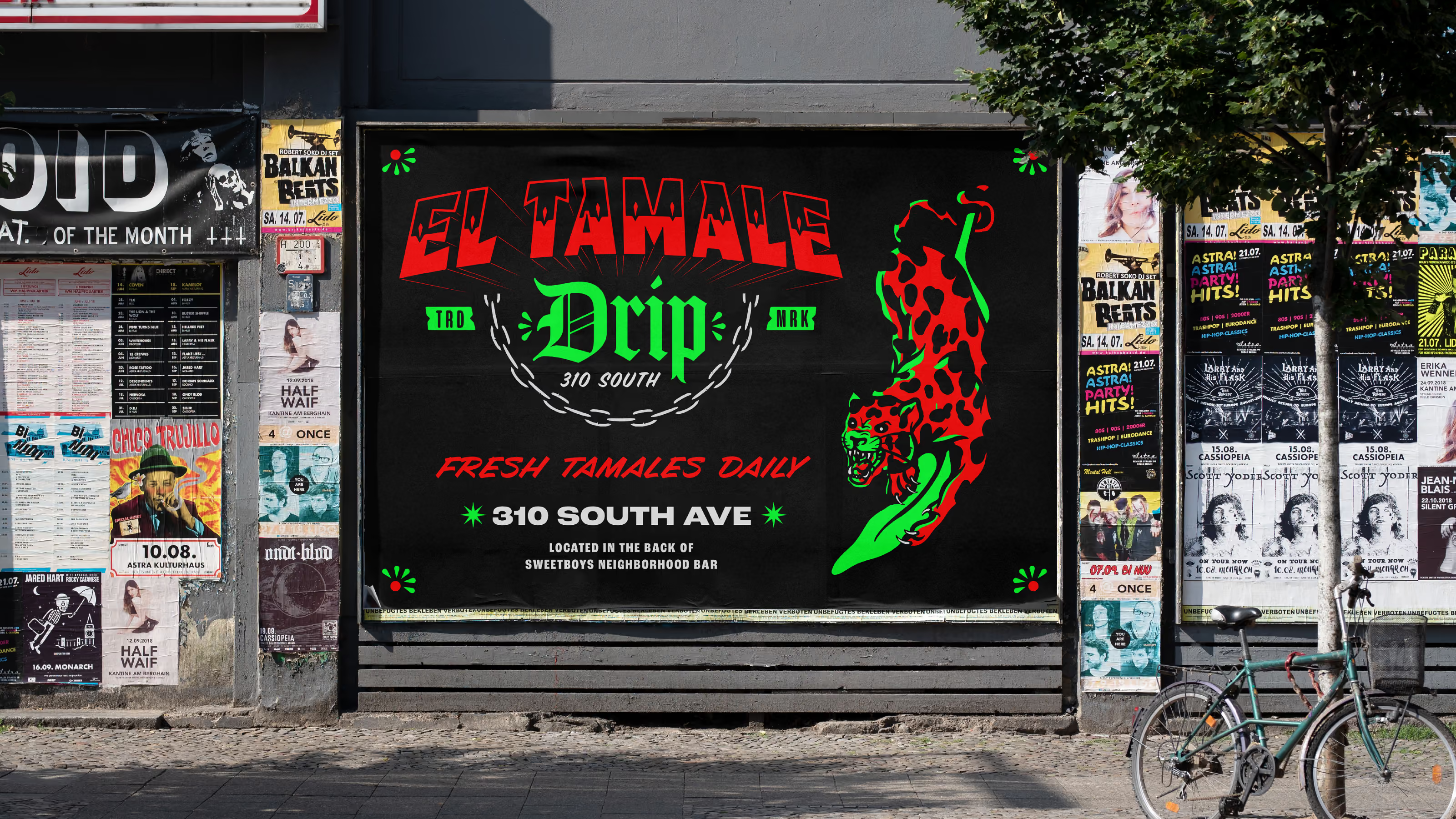
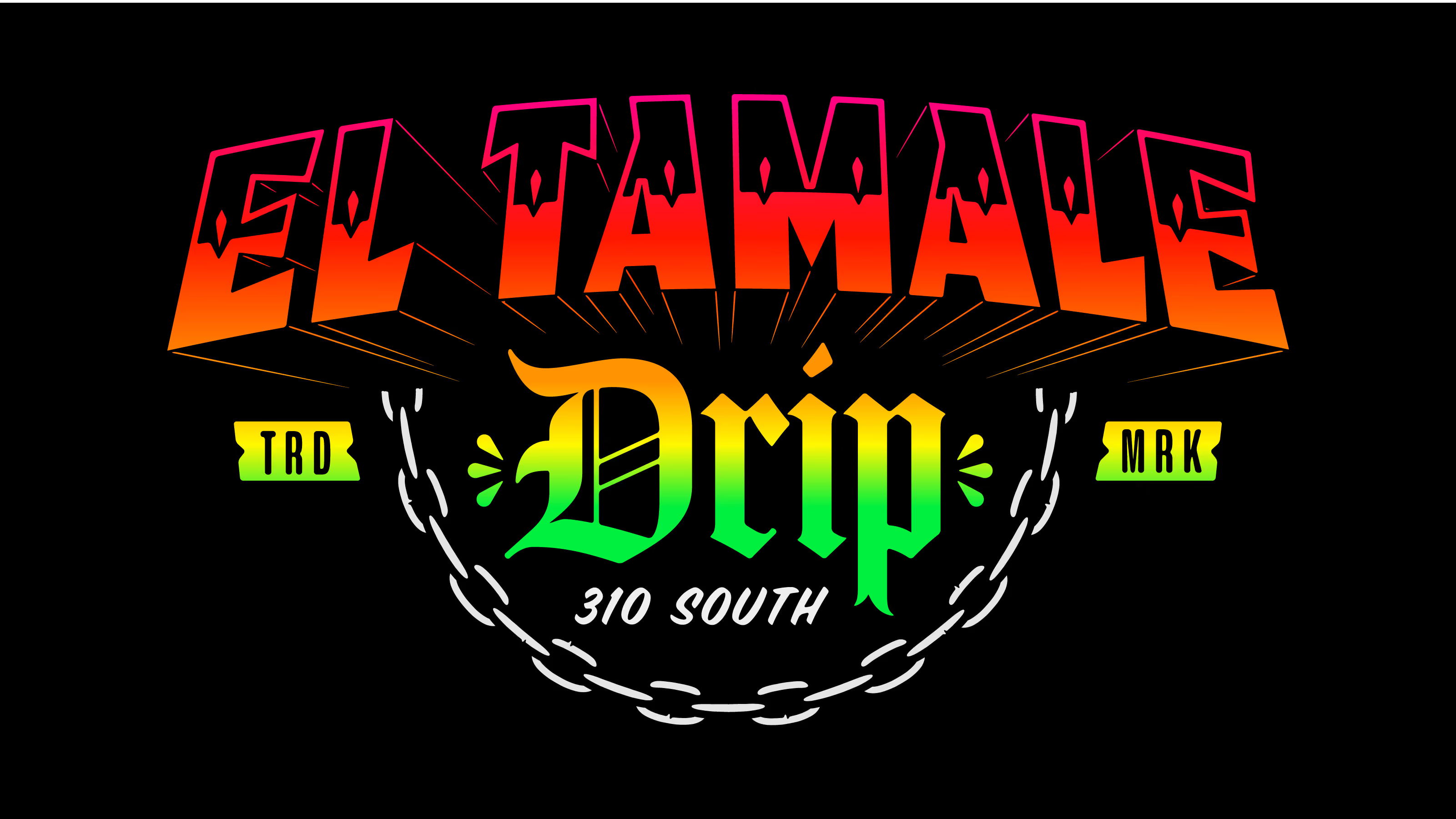
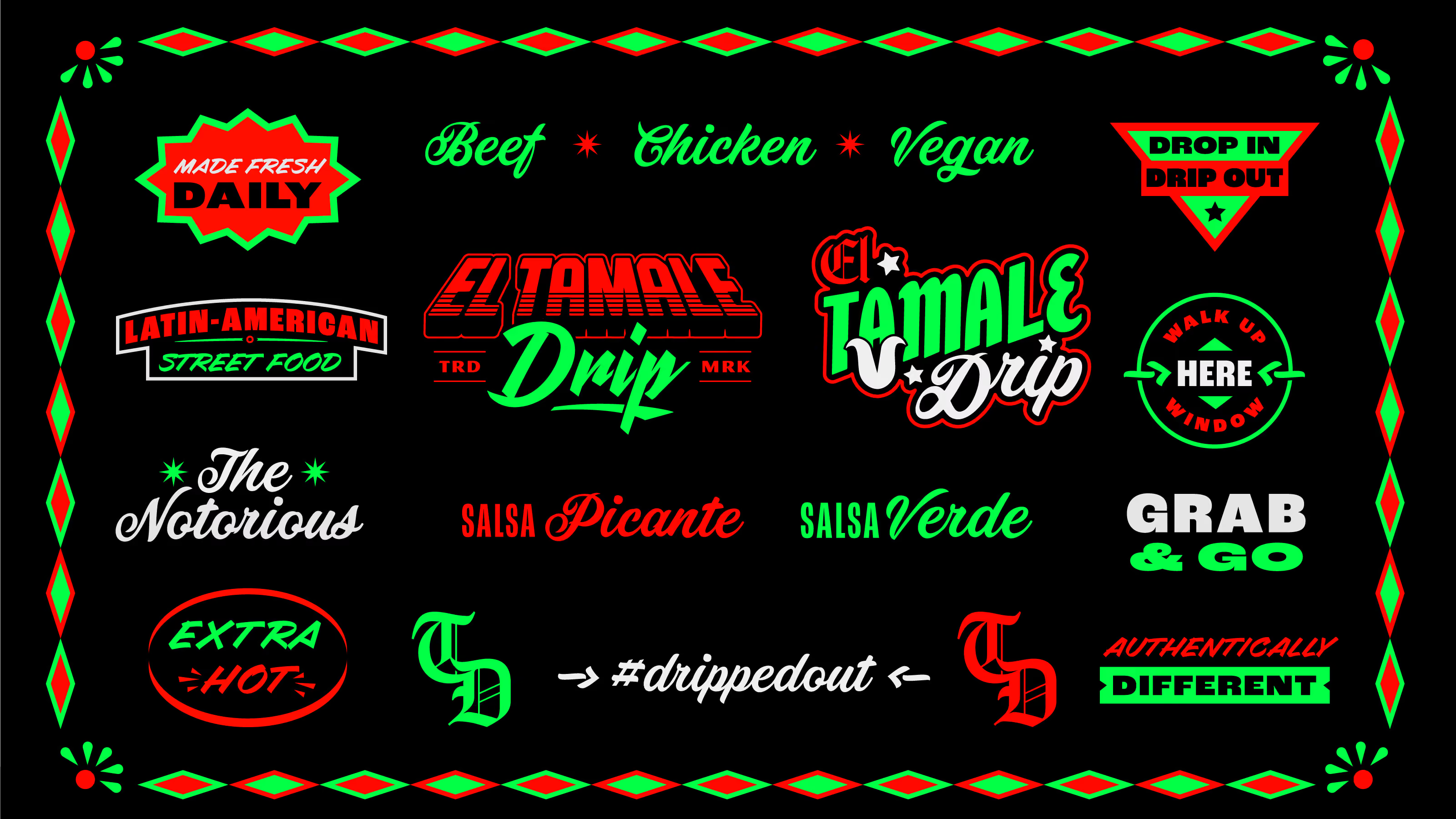
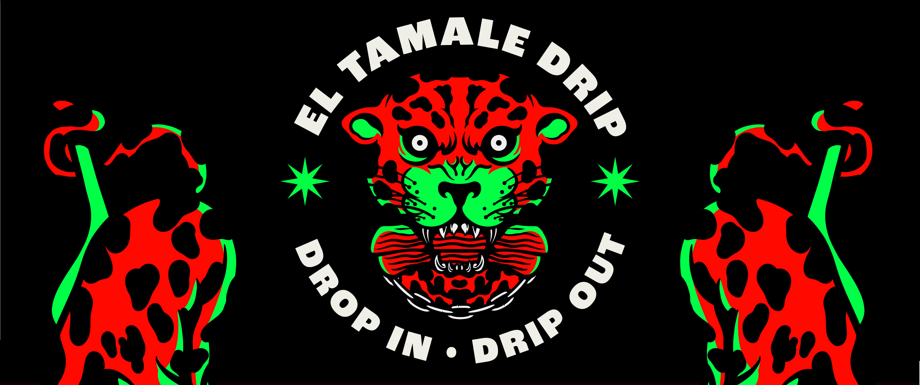
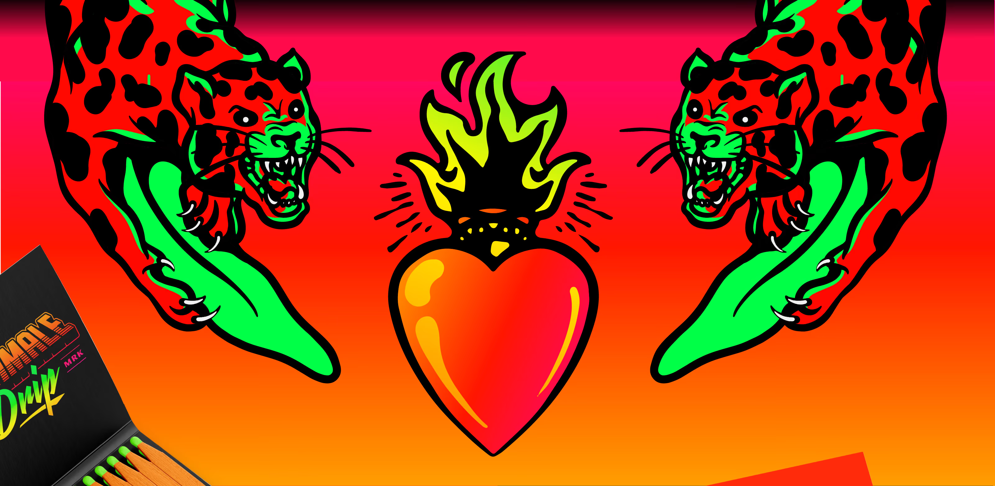
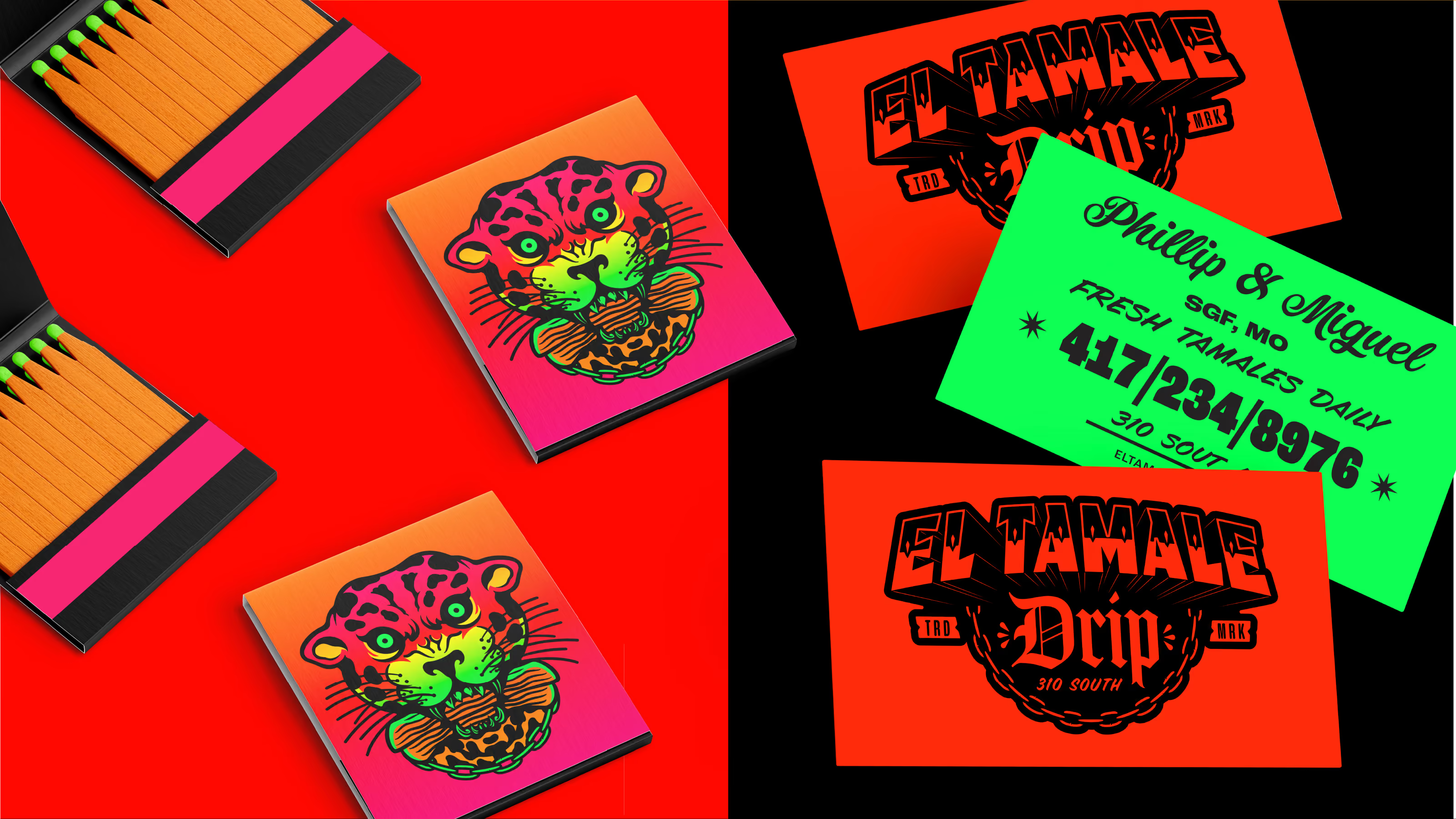
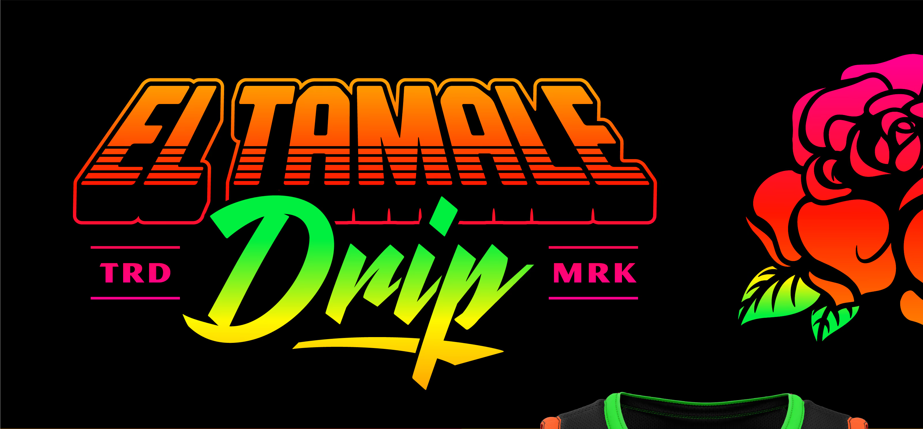
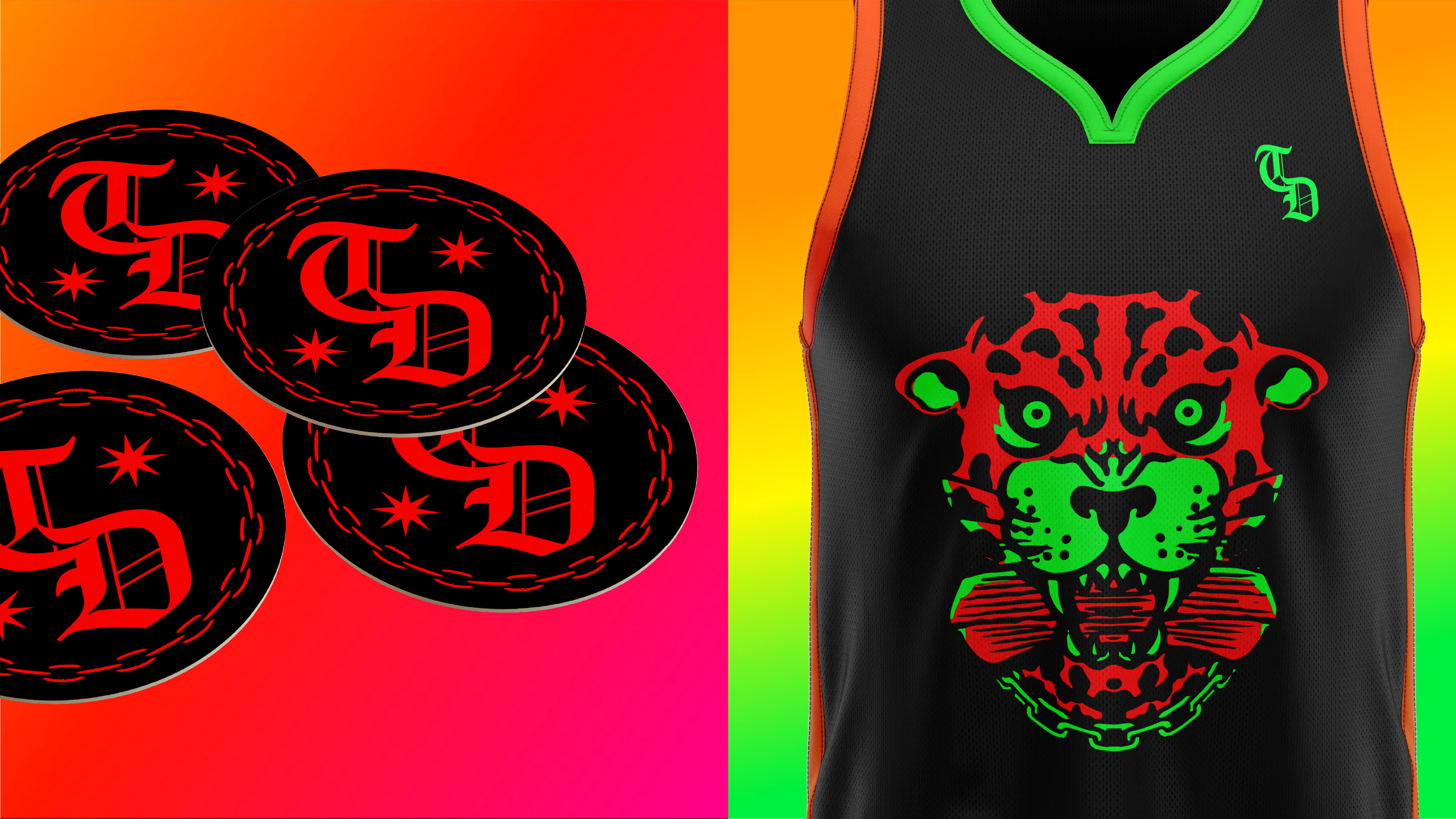
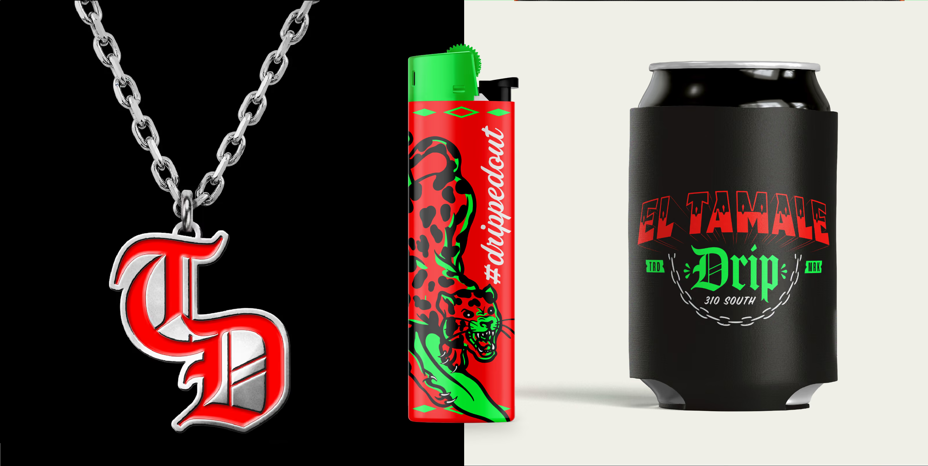
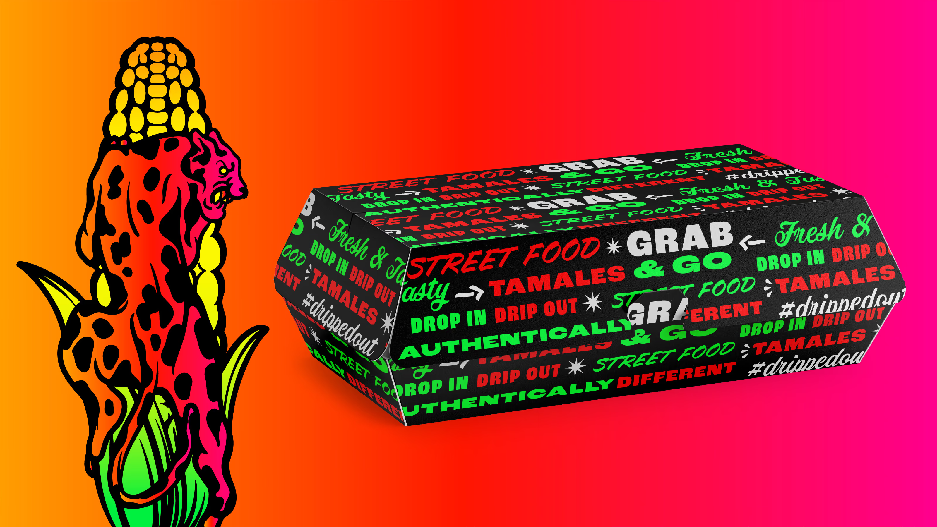
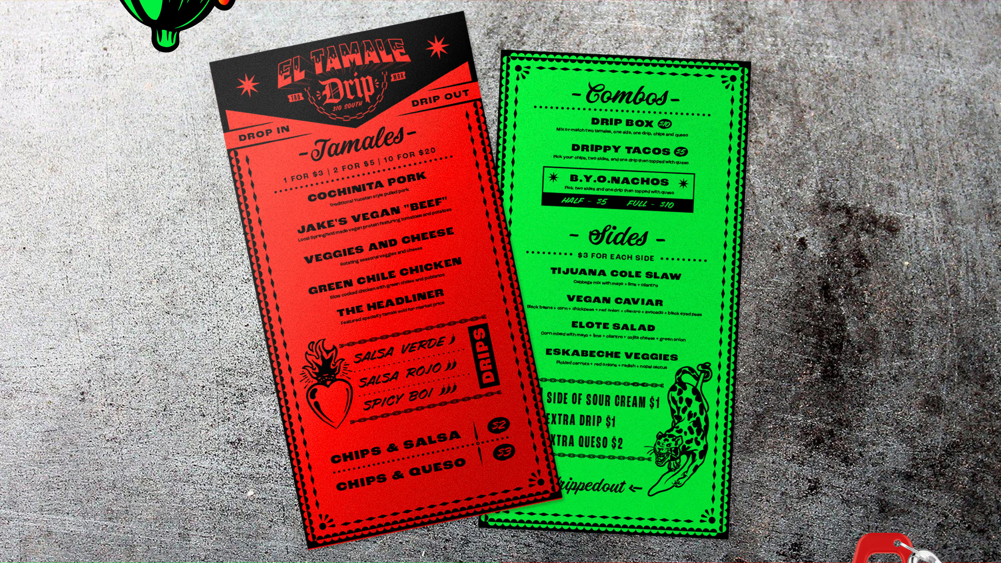
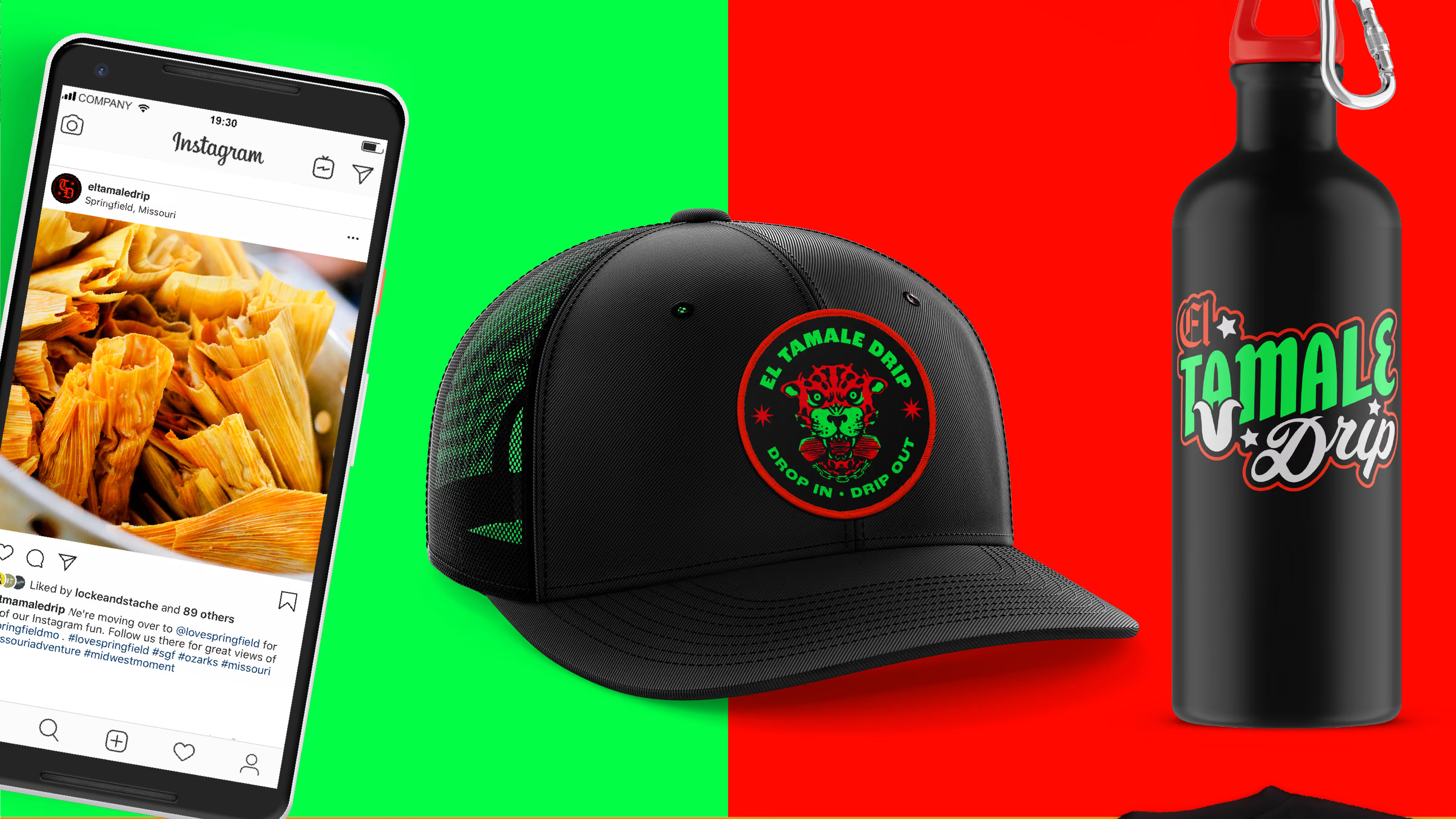
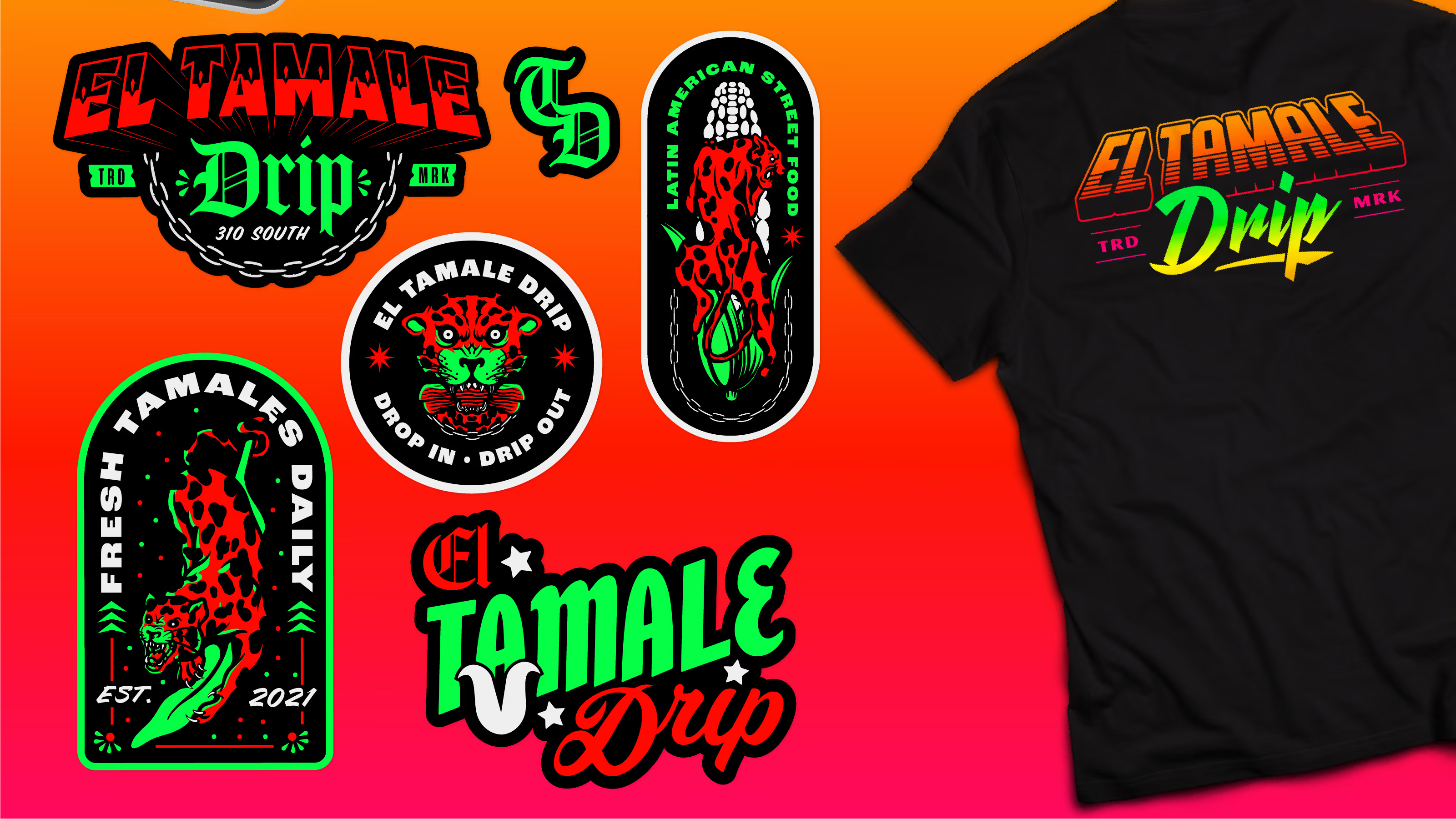
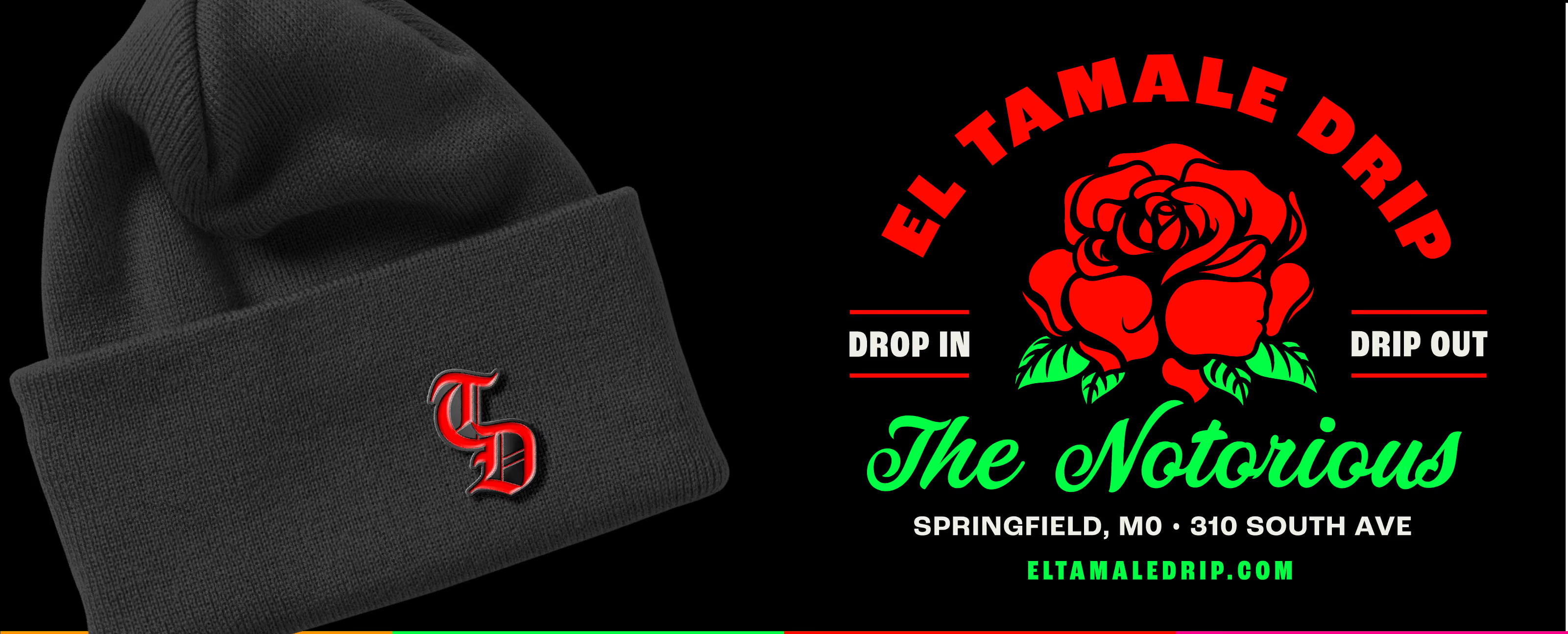
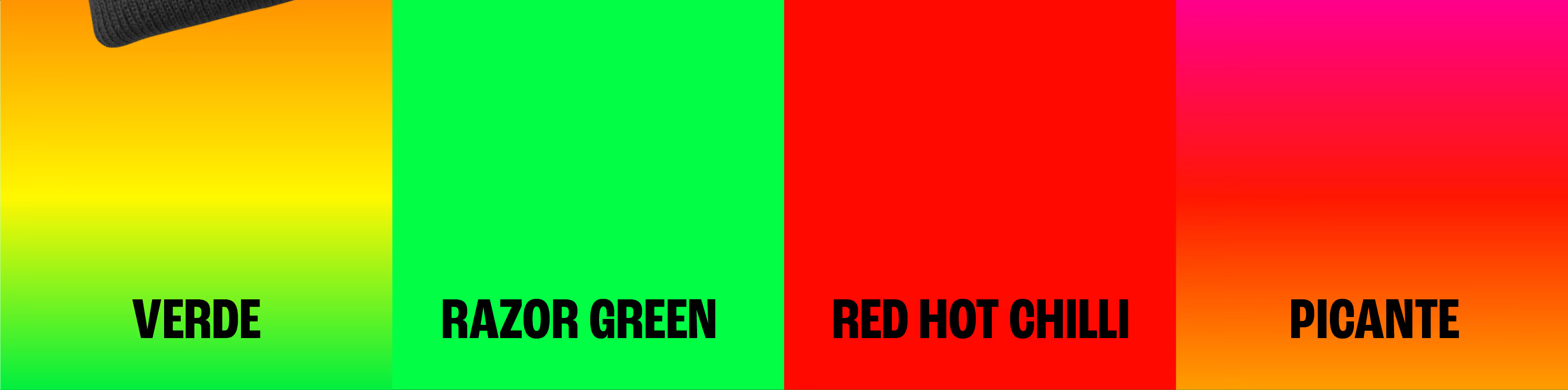
This rad brand package was developed for some of our new pals at El Tamale Drip. Super fun dudes who let us get weird with this one. Gradients. Leopards. Chains. Mexican street lettering. Hot damn. Hot tamales!
Awards
Silver American Advertising Award
Share this page
Insight
Mexican restaurant branding is stuck in a rut of clip-art sombreros, cactuses, and faux-hacienda script. El Tamale Drip is nothing like that. It's street food with real swagger, closer to a hip-hop record cover than a sit-down cantina, and the name says it: this thing has drip. The opportunity was to throw out the tired Mexican-restaurant playbook entirely and build a brand with the boldness and street energy the food actually has, for a client happy to get loud.
Solution
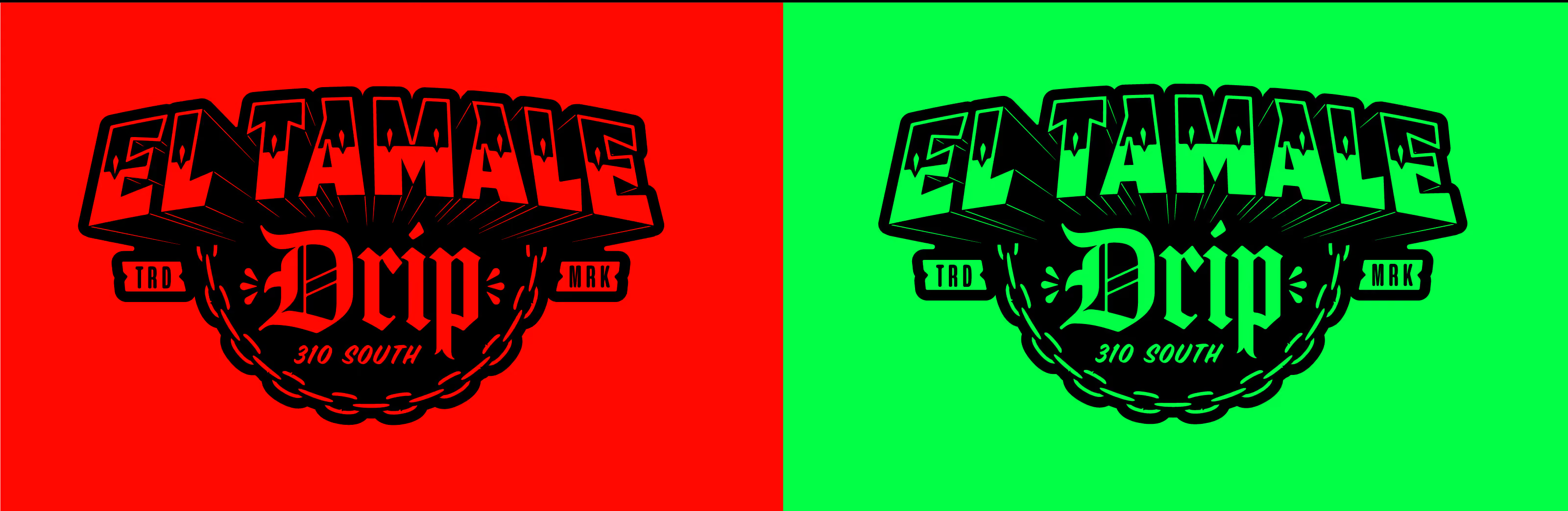
We got weird with it, on purpose. The brand pulls from Mexican street art and street-culture style rather than restaurant convention: gradients, leopard print, chains, and bold Mexican street lettering, all pushed loud and unapologetic. The system is built to grab you, high-contrast and high-personality across every touchpoint, so a street-food spot reads as a brand with real attitude instead of another taco place. Nothing about it is quiet or careful. It leans all the way into the drip the name promises. The result gave El Tamale Drip a brand as bold and street-smart as the food, impossible to confuse with anyone else on the block.






Explore more work