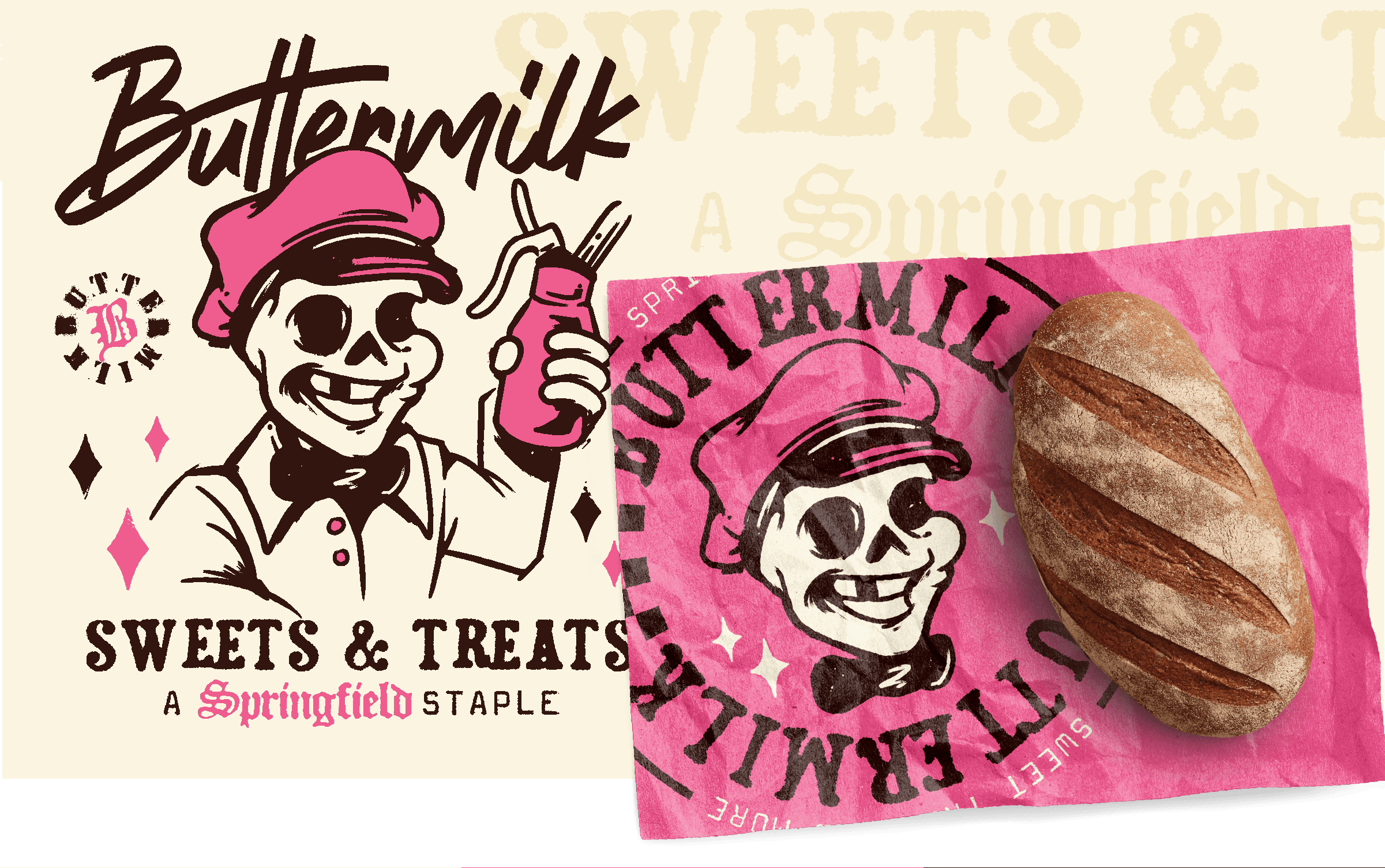
Buttermilk
Buttermilk is Springfield’s renegade dessert shop — a place for folks who like their sweets loud, bold, and a little weird. They needed more than a logo: they needed a visual punch that stops people mid-scroll, mid-drive, mid-ice cream run.
We stepped in to build a brand identity that’s as confident as it is charming — nostalgia with rebel sprinkles.
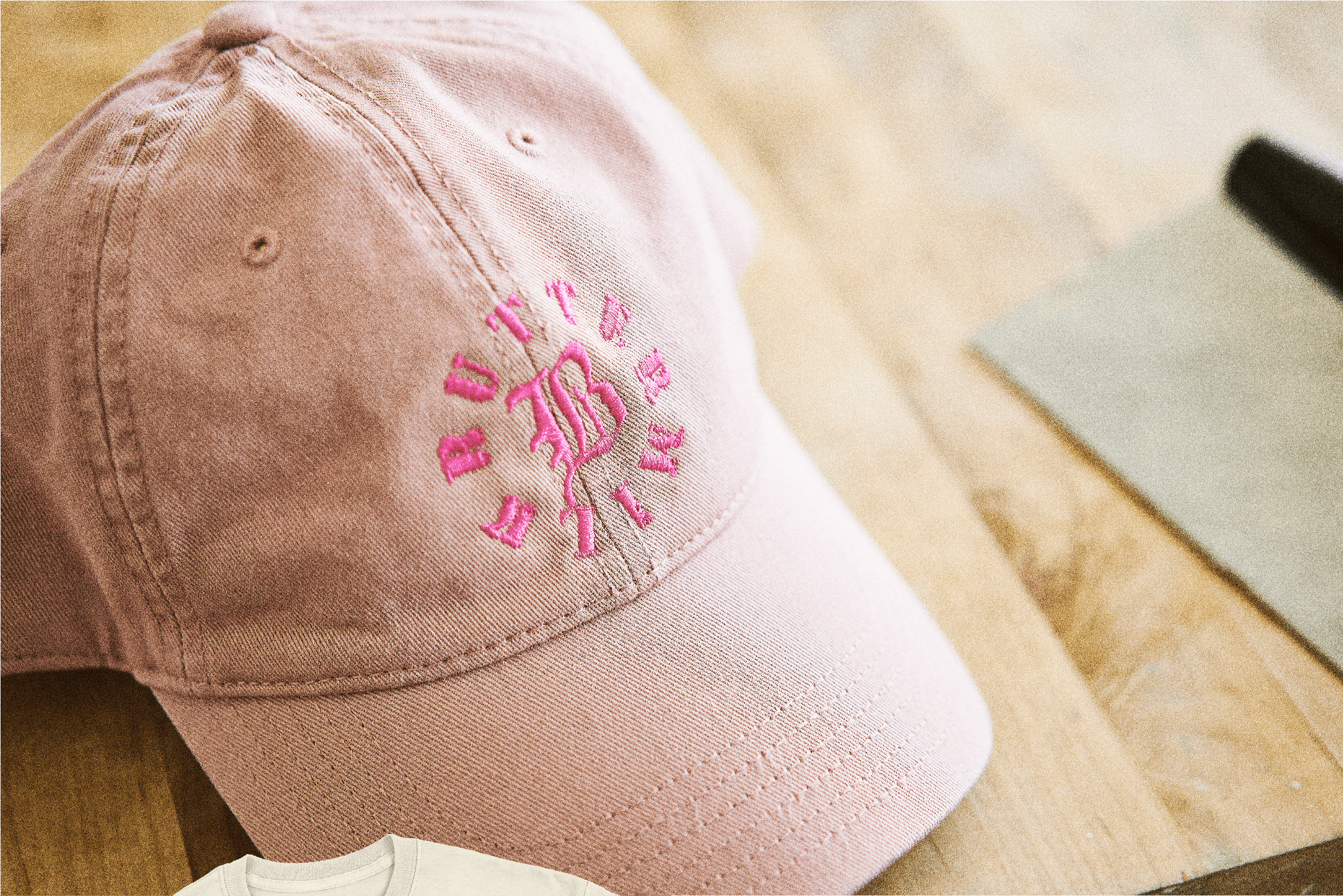
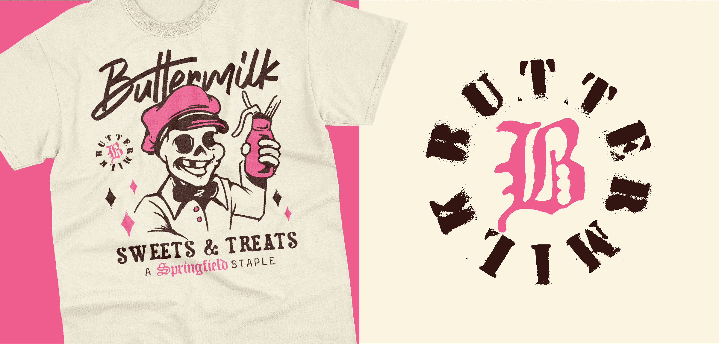
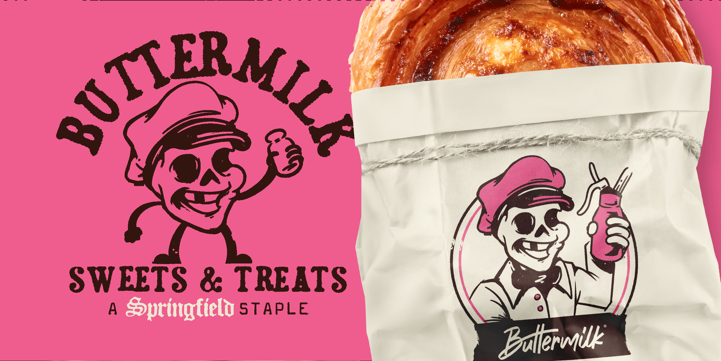
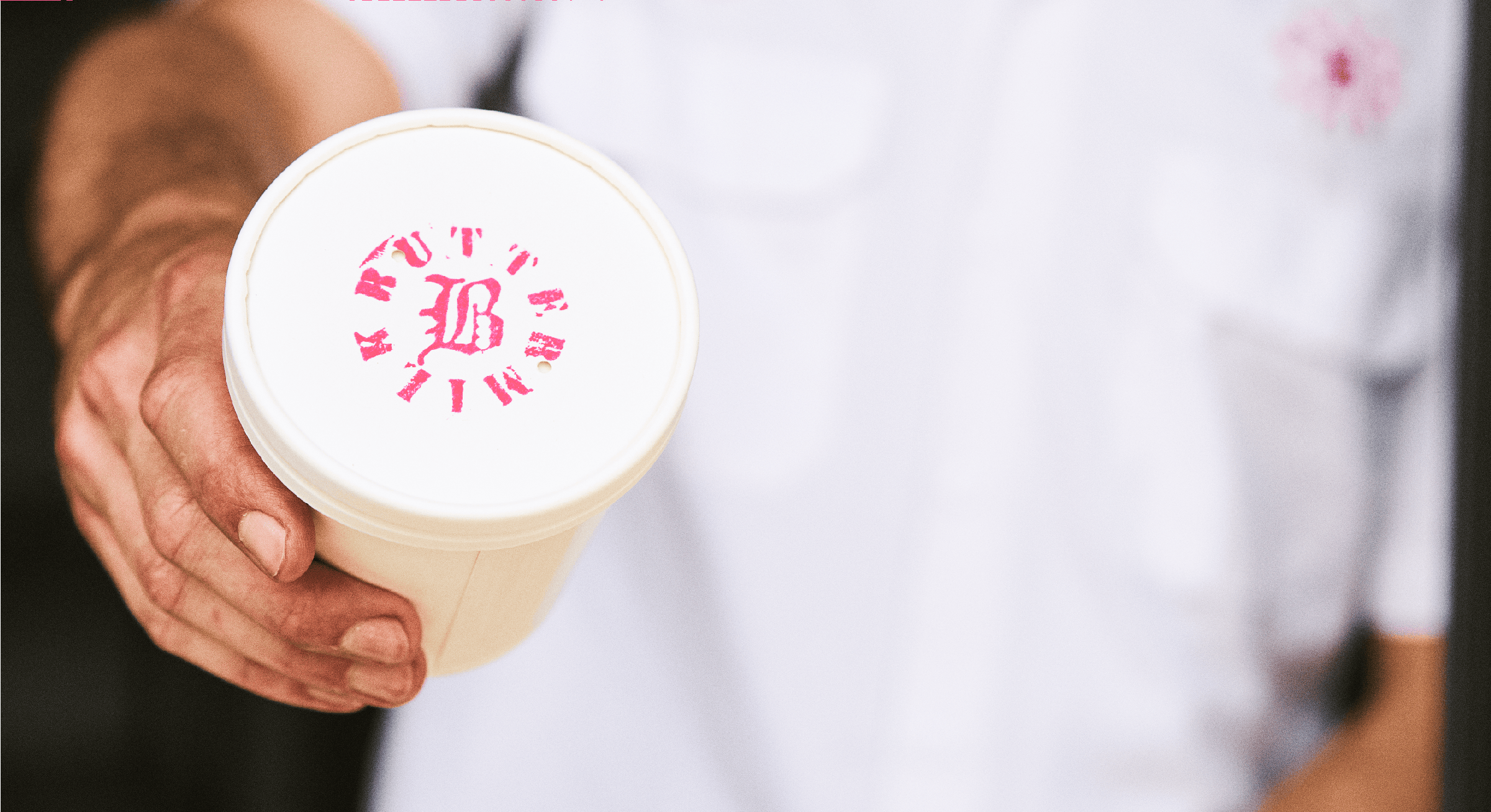
The moment Buttermilk’s brand identity hit the streets, people noticed. That pink-and-brown color combo became unforgettable — playful, bold, and impossible to miss. The skeleton baker mascot turned into a Springfield icon, instantly tying Buttermilk to the city’s growing food and dessert scene.
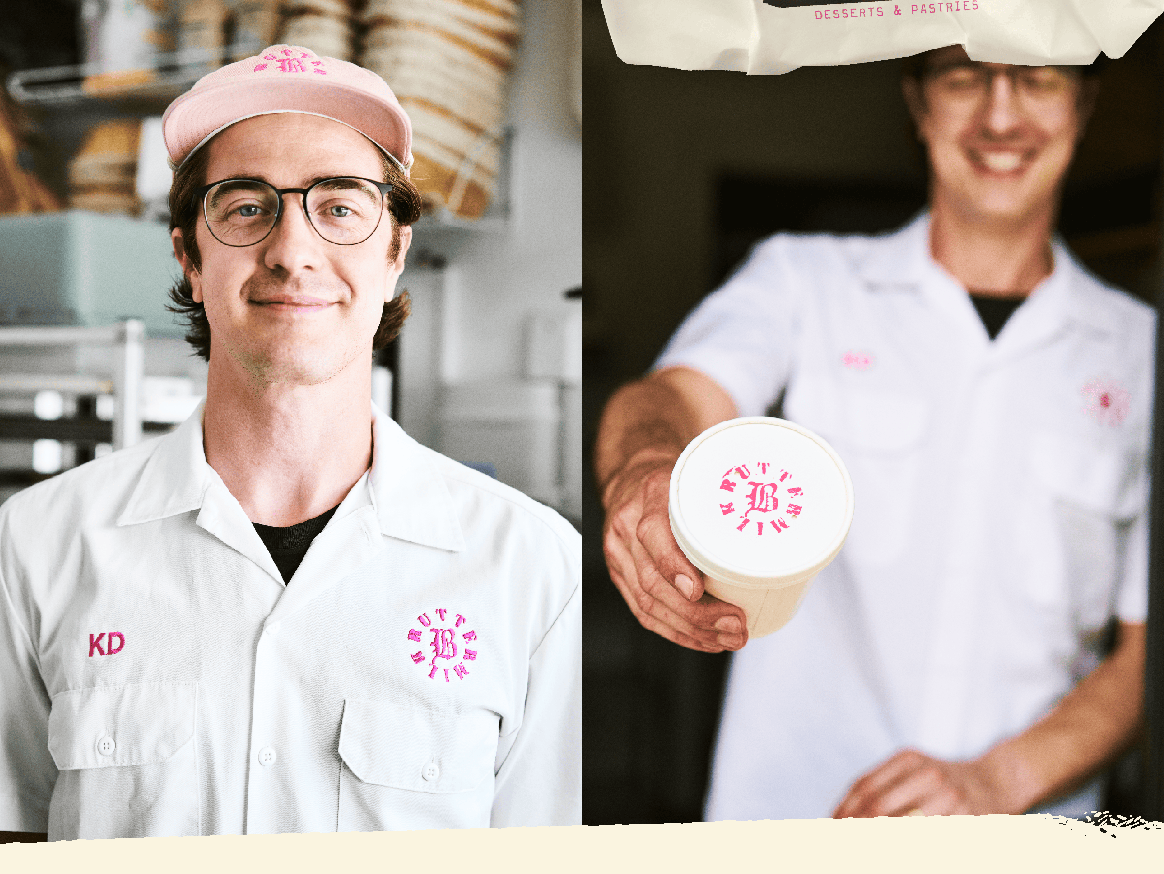
The brand didn’t just look good — it worked. Branded merch started selling, foot traffic spiked, and locals began snapping photos of the logo before taking a bite. The new bakery logo design and visual identity system helped Buttermilk stand apart from every coffee shop and pastry counter in town.
Now, when Springfield thinks desserts, pastries, or ice cream, they think Buttermilk — not just for what’s inside, but for the brand experience. It’s what happens when a restaurant branding project nails both flavor and attitude.